Page (Layout Paragraphs)
Creating a Page
The Page content type is used for static content that can be (but not required to be) linked into the main navigation bar. This is one of the most used content types and can be very flexible.
To create a Basic Page:
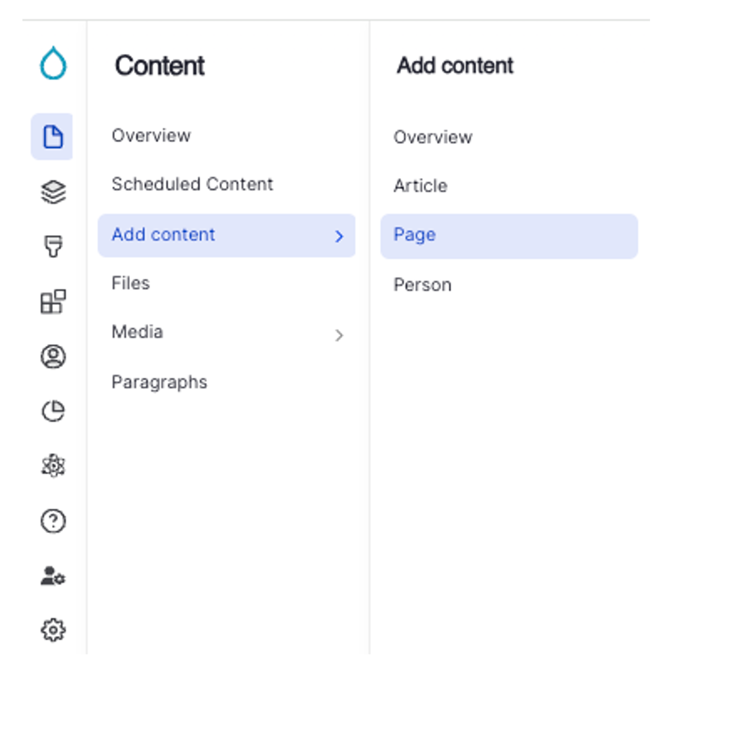
- Click Content on the second panel.
- Click Add content button.
- Select Page from the list of content types.
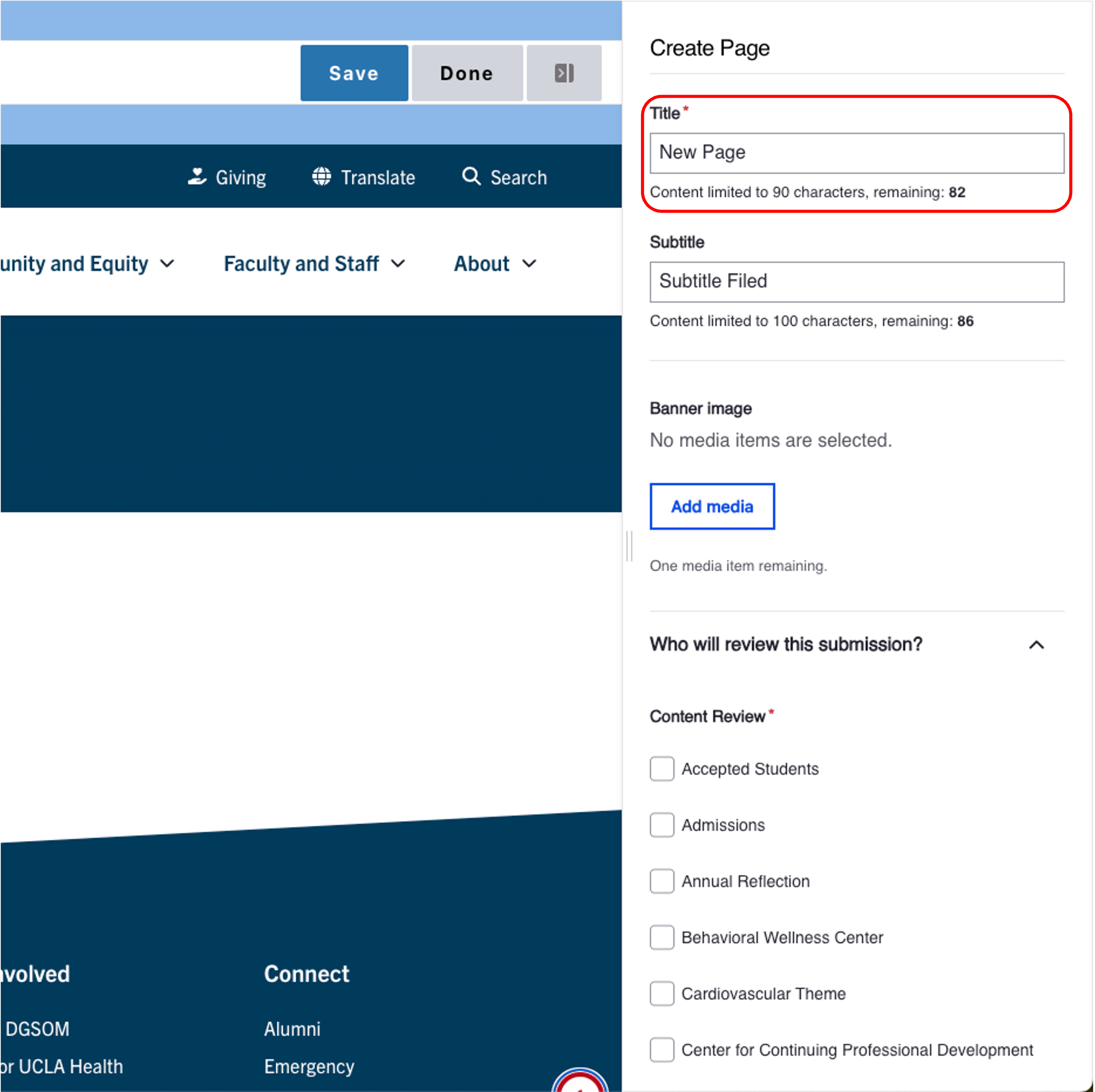
- Title [required] - The text entered in the title field will be included in the breadcrumbs and will become the page's URL unless otherwise configured.
- Subtitle [recommended] Add a subtitle.
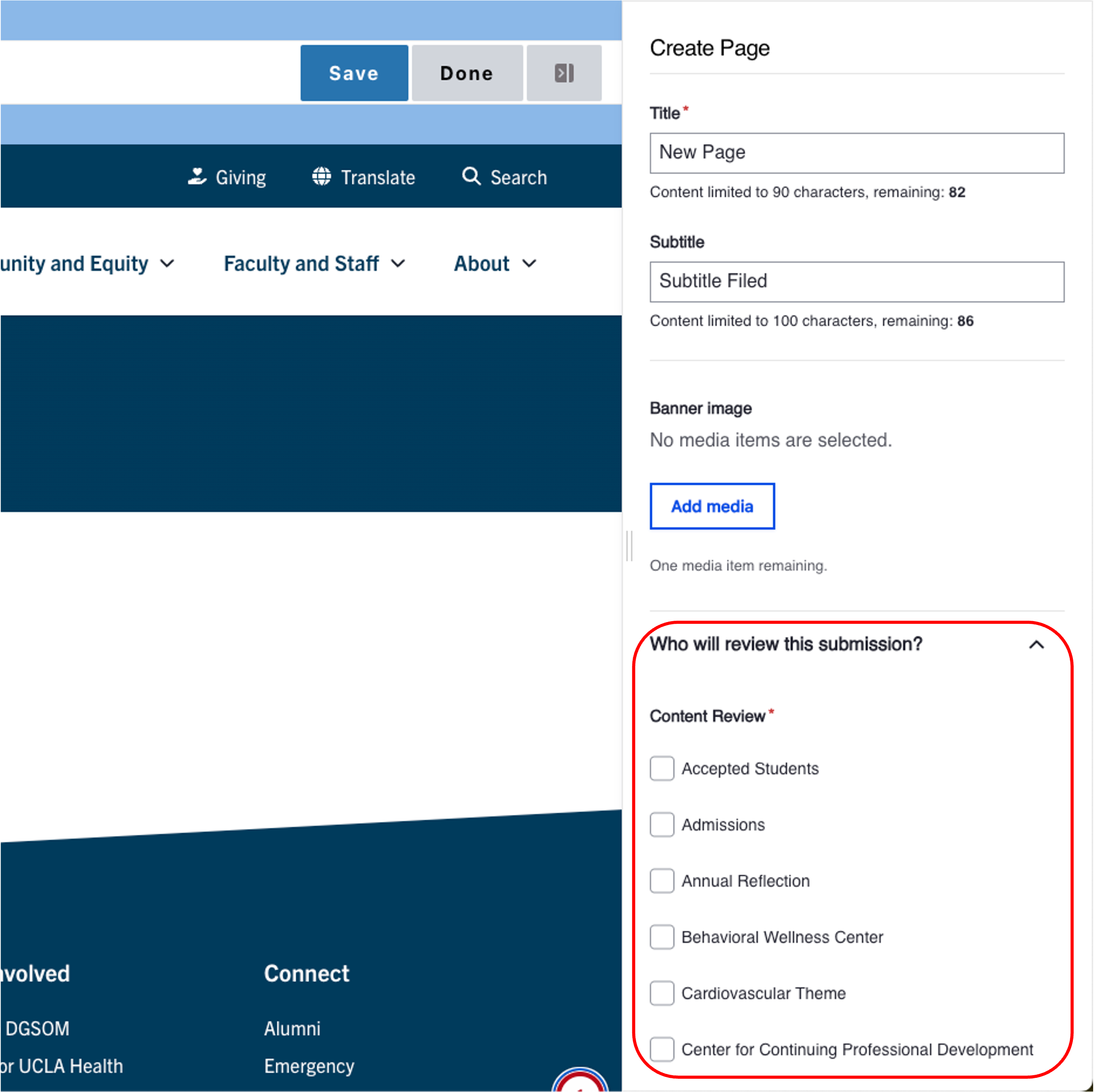
- Select Who Will Review This submission? [required] For DGSOM Sites Only
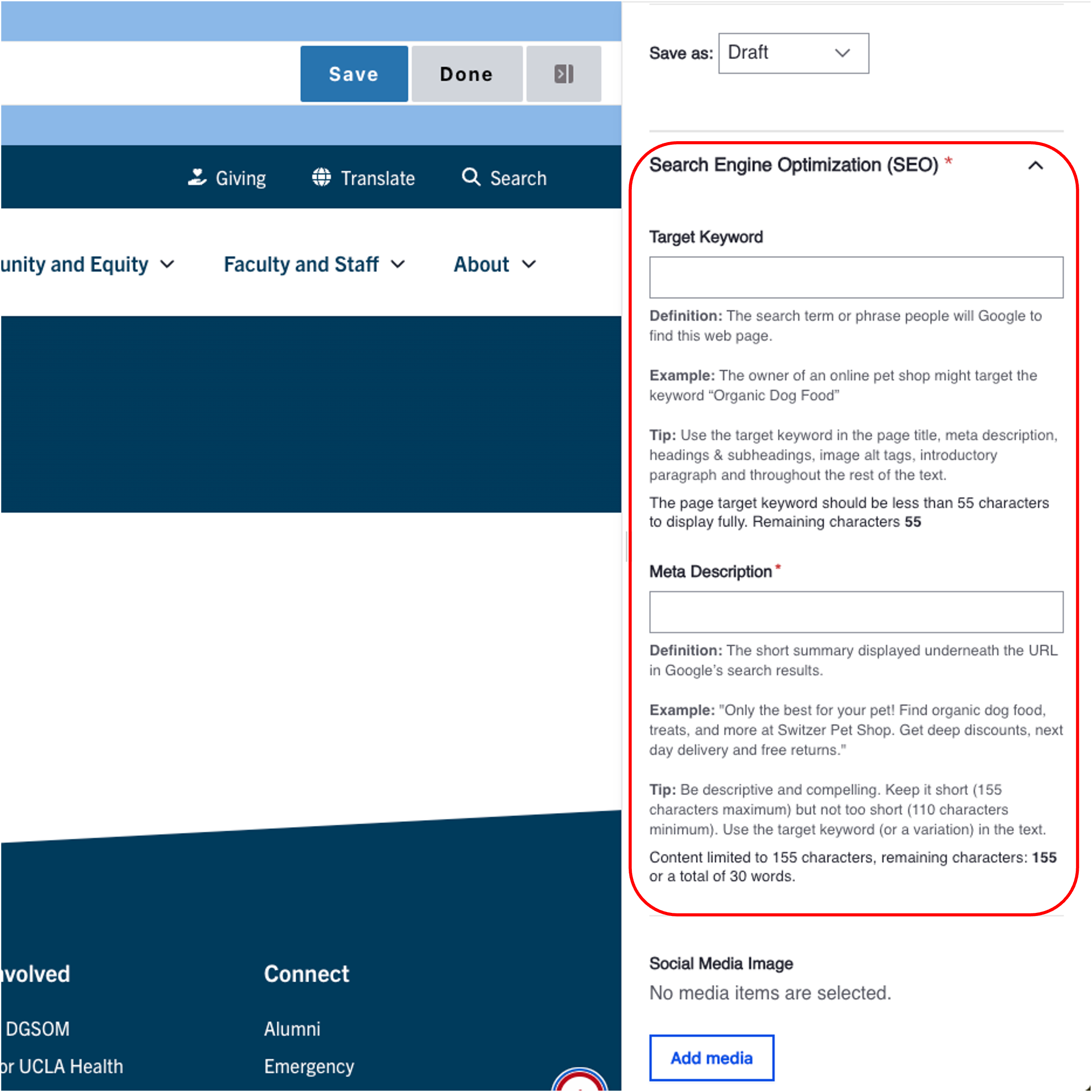
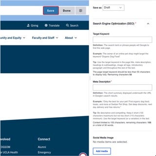
- Search Engine Optimization (SEO) [recommended]
- Target Keyword: The search term or phrase people will Google to find this web page.
- Meta Description: The short summary displayed underneath the URL in Google’s search results.
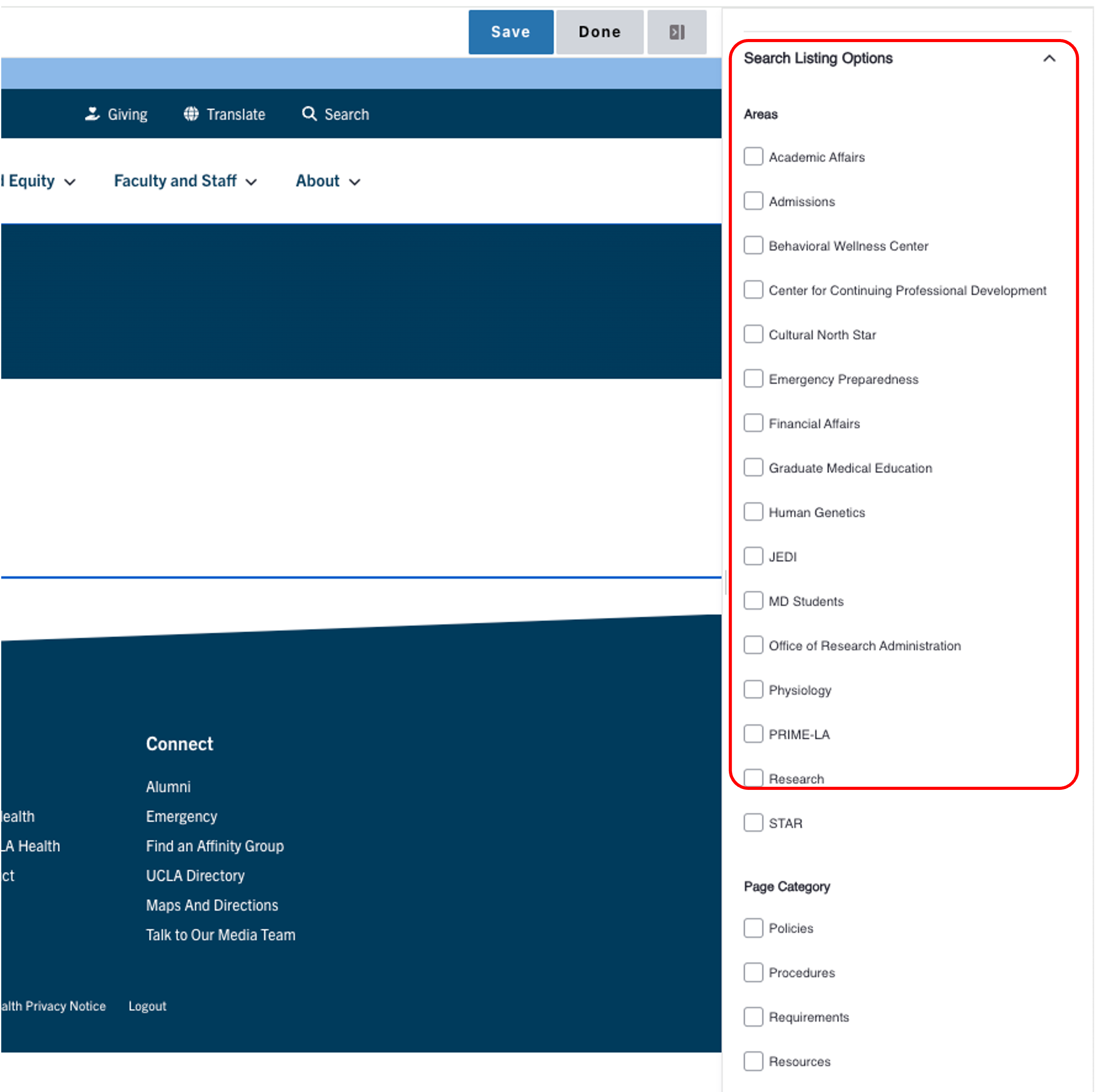
- Select Search Listing Options [recommended] - Once you have made your selections, the categories will appear as part of the faceted search. This means that site visitors can easily filter to your content.
- Areas & Page Category: Used as a page search results.
Page Tag: Adds topics to your page.
To have additional taxonomy terms added, please contact your Site Administrator or fill out a Support Form.
- Click Save to publish the page.
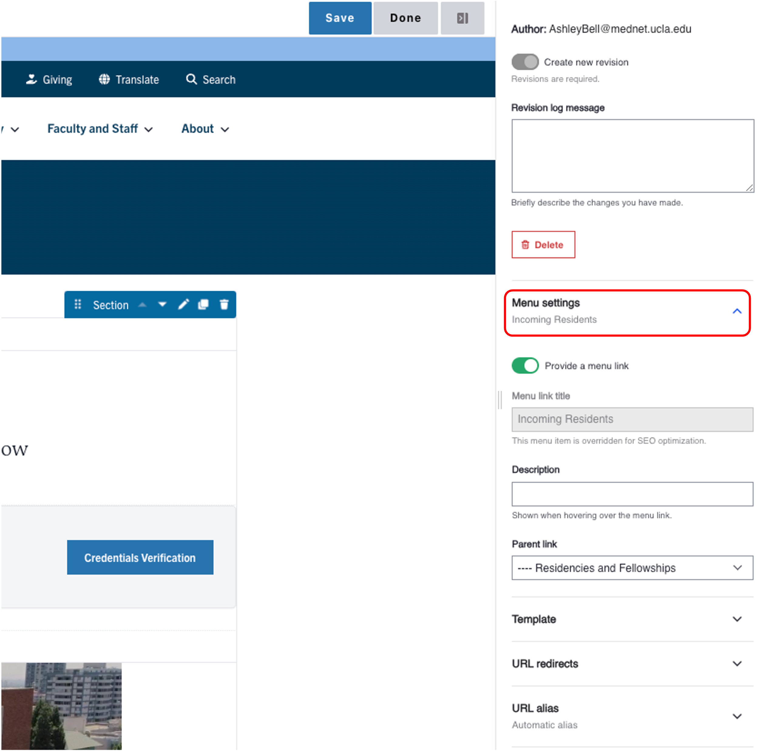
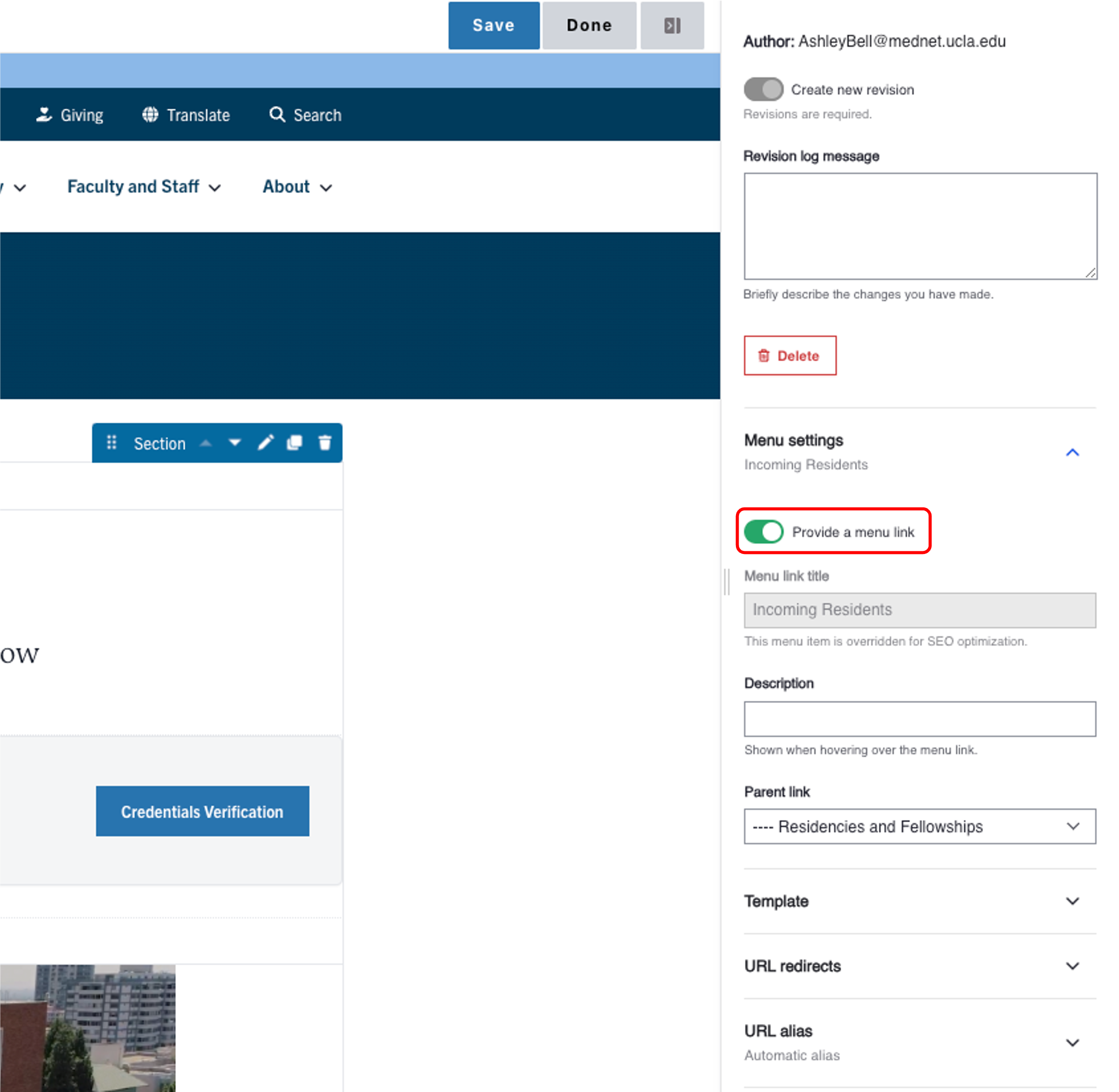
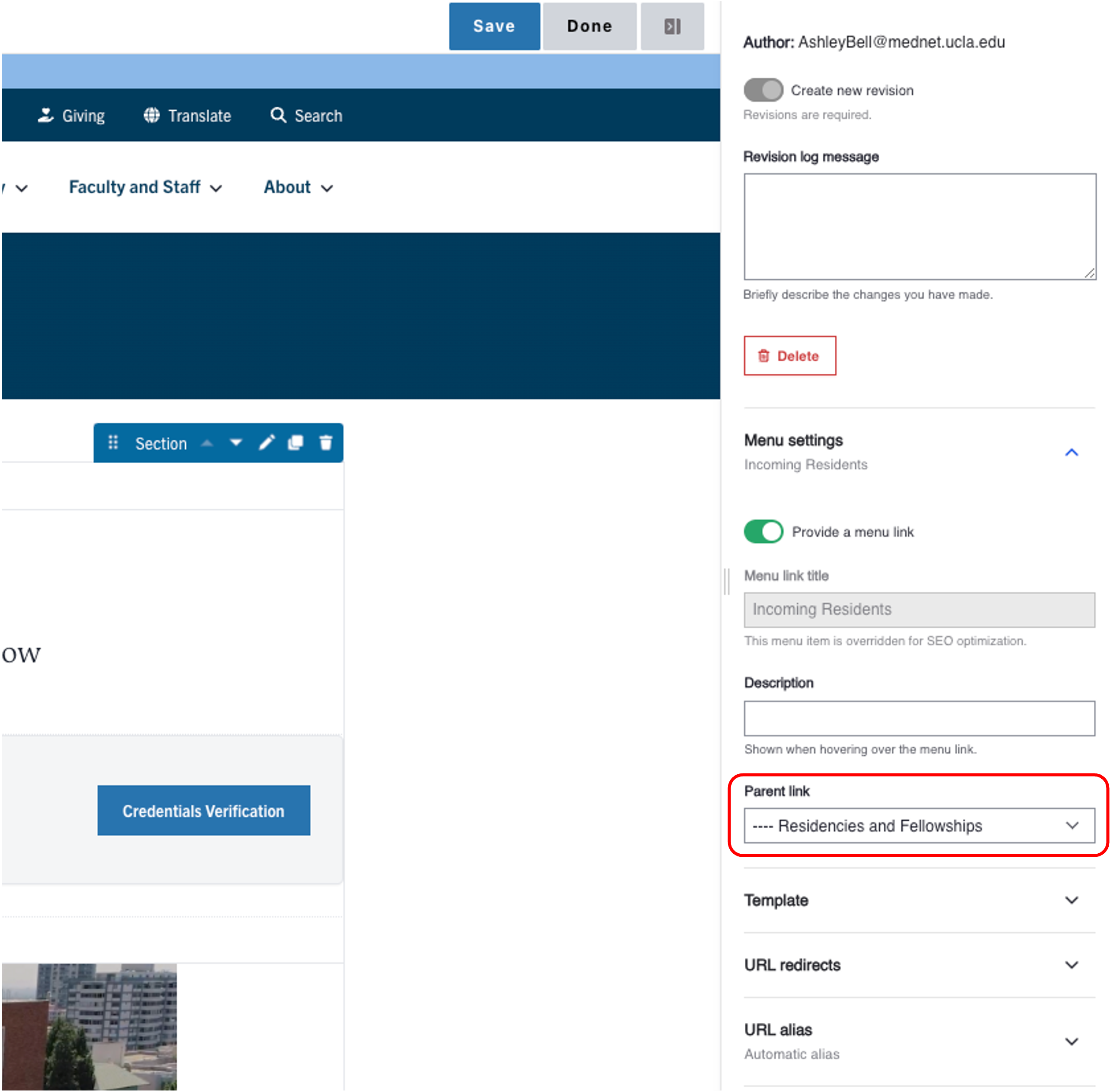
- Start adding your content.
- Go to your page.
- Click Edit link.
- Expand the Menu Settings in the Additional Options section.
- Toggle the Provide a menu link.
- Select the Parent Link dropdown menu. If this is not selected, the page will appear on the top navigation.
- Select the appropriate Parent page in the correct page structure location.
- Scroll to the bottom of the page and click Save.
Content Layout
Within Pages (Layout Paragraphs) there are two types of containers to hold your content. You can think of this like tables in software such as Microsoft Word or Excel. First you need to define the number of columns in your row which Pages (Layout Paragraphs) refers to as Sections. You can have up to four columns in a row. Once you have defined the number columns you would like in a Section, you can add a component(s) to each of your columns. A component can hold various types of content, such as images or text. An easy way to think of a component is a unique container that holds a piece(s) of content.
Section
A section is the primary way to layout your content in a visually appealing way. The section is the foundation on which all your components will be inserted. You can have as many components as you like on your page. Typically a one column section at the top of the page with breadcrumbs and the page title is used most commonly. The section below would then be two columns 30% and 70% and hold your main menu navigation in the left column.
For users whose content resides on the medschool.ucla.edu, the above mentioned sections are mandatory fields unless there is a specific exemption. Every site has a Pages (Layout Paragraphs) template that you can copy. Please contact your Site Manager to obtain the URL for these templates. For medschool.ucla.edu users, please use the following two links to access your templates:
Live Site
Test Site
- Log in to your site.
- Hover your mouse over Content (2).
- Hover your mouse over Add content (3).
- Click Page (4).
- Add in your page Title (5).
- Select Additional Options as needed (6).
- Select the appropriate save state (7).
- Click Save (you will now be taken to a new page) (8).
- Click Start Creating Content.
- Click Add section.
- Select the layout with the appropriate number of columns (11).
- Expand Layout Options (12).
- In the Constraints section, you can select Full Width if you would like your section to span the entire width of the page (13). Only available in a One Column Section.
Example of a standard width section
Example of a full-width section
- In the Spacer section, you can select the amount of additional space you would like below the section.
Note: By default, there is no space below a section (14). - Expand the Content region (15).
- In the Display section, you can select Columns to place your section horizontally. This should be used only with the Icon component (16). Only available in a One Column Section.
Example of Columns Unselected
Example of Columns Selected
- Click Save (17)
- Repeat steps 10 to 17 to add other sections.
- Scroll to the bottom of the page and click Save.
-
Click Edit content at the top of the page.
-
Hover your mouse over the section you would like to move.
-
You will see the section menu appear on the right side, click on the 6 dots.
-
Drag the section to the new location.
-
Scroll to the bottom of the page and click Save.
-
Click Edit content at the top of the page.
-
Hover your mouse over the section.
-
You will see the section menu appear on the right side, click the Pencil icon.
-
Select the desired Column layout.
-
Depending on your selection, you may be presented with Move Orphaned Items. You are able to select where you want to place the existing content.
-
Scroll to the bottom of the page and click Save.
Copying a Section
-
When you copy a section, all the content is copied as well.
-
Click Edit content at the top of the page.
-
Hover your mouse over the section.
-
Click the duplicate button.
-
Your copied section will appear below the current section.
-
Scroll to the bottom of the page and click Save.
Deleting a Section
-
Scroll to the bottom of the page and click Save.
-
Click Edit content at the top of the page.
-
Hover your mouse over the section.
-
Click on the trash can icon.
-
Confirm you want to delete the section.
Note: The ability to add background color can only be applied to a one column section. This feature is also restricted to those with Site Administrator access.
To utilize this feature on your page:
- Select "Add Section"
- Select "One Column" under "Choose a Layout"
- Expand "Layout Options"
- Expand "Layout"
- Select the background color. (None, Santa Barbara Sand or Venice Canal) Note: default background color of a One Column section is None.
- Click Save
Now you will have a background color behind whatever component you place in this section. When using the Santa Barbara Sand background color text will appear white. When using the Venice Canal background color, the text will appear black.
Components
You can use many types of components to customize your content. The instructions below on how to create a component provide an example of what each component looks like, followed by details about how to create and format a components. While UCLA Health has many different themes or looks to its sites, the instructions below are the same regardless of the theme used on your site. Branding and formatting will be updated based on the theme in which you create the content.
Once you have created your components, you can easily drag and move them to the new location. It is simple to copy and delete components in Pages (Layout Paragraphs). Learn more about how to use these features. (see bottom of the page)
A Section is an effective way to make your content more visually stimulating. You can use this to place a Section within a Section.
- Example
Configuring the Section Component
-
Click Edit content.
-
Click the plus icon where you want to place the component.
-
Select Section from the menu.
The referenced media source is missing and needs to be re-embedded. -
Select the layout with the appropriate number of columns.
-
Expand the Layout Options.
-
In Constraints field under Layout options, select full width if you would like your Section to span the entire width of the page.
- In the Spacer dropdown under Layout Options, you can select the amount of additional space you would like below the section. Note: By default, there is no space below a section.
- Expand the Content region. Note: Applies only to One Column Sections.
-
- Example of Columns Unselected
- Example of Columns Selected
- Example of Columns Unselected
- Click Save
-
Scroll to the bottom of the page and click Save.
An Accordion is a vertically stacked list. The nested text appears when the user clicks on the title.
Please note that any text in an Accordion is not searchable for users looking to find your content.
- Example of a Collapsed Accordion
- Example of an Opened Accordion
Configuring the Accordion Component
-
Click Edit content.
-
Click the plus icon where you want to place the component.
-
Select Accordion from the menu.
-
Add your Title.
-
Add your Text.
-
Expand Layout Options.
-
In the Spacer section, you can select the amount of additional space you would like below the component.
Note: By default, there is no space below a component. -
Click Save.
-
Scroll to the bottom of the page and click Save.
When you use this component, the system automatically displays and updates the page name based on the name of the page in the edit node section. This section will only display once the page is saved and refreshed. “placeholder Page title" will appear while you are editing the page.
- Example Error Alert Style
- Example Warning Alert Style
- Example Success Alert Style
Configuring the Alerts Component
-
Click Edit content.
-
Click the plus icon where you want to place the component.
-
Select Alerts from the menu.
-
Add your message into the Text Editor.
Note: Visit this page to learn more about how to use the WYSIWYG Content Editor.
-
Expand Layout Options.
-
Select the desired Alert style.
-
In the Spacer section, you can select the amount of additional space you would like below the component.
Note: By default, there is no space below a component.
-
Click Save
-
Scroll to the bottom of the page and click Save.
The Article Highlight component is a visually appealing news view that allows you to add articles to any page.
Example Article Highlight
Views for Events
Creating an Article View
-
Click Edit content.
-
Click the plus icon where you want to place the component.
-
Select Article Highlight from the menu.
-
Add a custom Title for your Article Highlight.
-
Optional: Feature an article at the top of the list. In the Featured article field, start typing the title. Select the title you want to feature.
-
Optional: Filter the articles displayed in the view. In the Filter articles by field, start by typing an article type, category, topic, or tag. Select the term.
-
Optional: Add a link to all articles. To find a list of all the articles, enter your website and add /articles/search at the end of the path (e.g. medschool.ucla.edu/articles/search).
- Filter the articles by categories and/ or topics.
- Copy and paste the filtered search URL into the URL field.
-
Add Link Text for the URL.
- Expand Layout Options.
- In the Spacer section, you can select the amount of additional space you would like below the component. Note: By default, there is no space below a component.
- Click Save
-
Scroll to the bottom of the page and click Save.
The Call to Action Block has a light gray background, some text, and a linked button.
Example:
Configuring the Call to Action Component
-
Click Edit content.
-
Click the plus icon where you want to place the component.
-
Select Call to action from the menu.
-
Add the Title of the component.
-
Add an internal page or external link.
-
Add the Button text.
-
Expand Layout Options.
-
In the Spacer section, you can select the amount of additional space you would like below the component.
Note: By default, there is no space below a component.
-
Click Save.
-
Scroll to the bottom of the page and click Save.
The Callout component allows you to place images and text either on alternating sides of the page or vertically.
- Example of a Standard Callout Component
- Layout Options settings used to create this component are: Callout style: Normal, Orientation: Stacked and Direction: Normal
- Layout Options settings used to create this component are: Callout style: Normal, Orientation: Horizontal and Direction: Normal
- Layout Options settings used to create this component are: Callout style: Normal, Orientation: Stacked and Direction: Normal
- Example of a Quote Callout
- Layout Options settings used to create this component are: Callout style: Quote, Orientation: Stacked and Direction: Normal
- Layout Options settings used to create this component are: Callout style: Quote, Orientation: Horizontal and Direction: Normal
- Layout Options settings used to create this component are: Callout style: Quote, Orientation: Stacked and Direction: Normal
- Example of Direction Normal Vs Reversed
Configuring the Callout Component
-
Click Edit content.
-
Click the plus icon where you want to place the component.
-
Select Callout from the menu.
-
Click Add media. Select the appropriate image or upload the image to the Image Library. Recommended Image Dimensions: 3:2 - Maximum image size is 4MB.
-
Add a Title.
Note: Not all configurations can properly display a title. See above examples to establish if you should add a title. -
Add Teaser text.
-
Add an internal page or external link.
Note: Not all configurations can properly display a URL button. -
Add the Button text.
Note: Not all configurations can properly display a URL button. -
Expand Layout Options.
-
Select the appropriate Layout Option based on your desired layout. See the above examples for the appropriate settings.
-
In the Spacer section, you can select the amount of additional space you would like below the component.
Note: By default, there is no space below a component. -
Click Save.
-
Scroll to the bottom of the page and click Save.
The Carousel enables you to create a slideshow gallery with an unlimited number of images, a stationary text box and an optional button. We recommend using a maximum of four images so the Carousel does not become too busy.
- Example of a Carousel With No Button
- Example of a Carousel With Button
Configuring the Carousel Component
-
Click Edit content.
-
Click the plus icon where you want to place the component.
-
Select Carousel from the menu.
The referenced media source is missing and needs to be re-embedded. -
Click Add media.
-
Select the appropriate image or upload the image to the Image Library.
Recommended Image Dimensions: 21:9 - Maximum image size is 4MB -
Add a Title.
-
Add Teaser text.
-
Add an internal page or external link (optional).
-
Add Link text (optional).
-
Expand Layout Options.
-
For the Image Overlay option, select No if you would like most of the text to appear below the image.
-
In the Spacer section, you can select the amount of additional space you would like below the component.
Note: By default, there is no space below a component. -
Click Save.
-
Scroll to the bottom of the page and click Save.
A CTA Banner is a stylized image and button. The CTA Banner is used to encourage web users to fill out a Qualtrics form or access a Matterport interactive map.
- Example of a Qualtrics CTA Banner:
- Example of a Matterport CTA Banner
- Example of a Qualtrics CTA Banner in a narrow column:
- Example of a Matterport CTA Banner in a narrow column:
Configuring the CTA Banner Component
- Click Edit content.
- Click the plus icon where you want to place the component.
- Select CTA Banner from the menu.
- Add your Title.
- Add your Teaser text.
- Add your external link (Required).
- Note: The URL must start with the following domains https://my.matterport.com/ or https://uclahs.az1.qualtrics.com/
- Add the Button text (Required).
- Expand Layout Options.
- In the dropdown that asks "Are you adding the banner in a narrow column?", select Yes when you are placing the component in a 2 column or smaller section.
- In the Spacer section, select the amount of additional space you would like below the component.
- Note: By default, there is no space below a component.
- Click Save.
- Scroll to the bottom of the page and click Save.
The Event Calendar component is used to display your upcoming events on your page. Visitors can navigate your calendar by scrolling through months with the arrow keys or highlight the current day by clicking the "today" button. Visitors can also choose how they view your events by toggling between a calendar or list view. Clicking the name of the Event will take visitors to the event listing itself for more details.
Example of an Event Calendar Component in Month View:
Example of an Event Calendar Component in list view:
Configuring the Event Calendar Component:
- Click Edit content.
- Click the plus icon where you want to place the component.
- Select Event Calendar from the menu.
- Add a custom Title for your Event Calendar. (required)
- Optional: Filter the events displayed in the view. In the Filter events by field, start by typing an event type, category, topic, or tag. Select the term.
- Optional: Add a link to the event calendar component. Start typing the title of a piece of content to select it. You can also enter an internal path such as /node/add or an external URL such as http://example.com.
- Add Link Text for the URL.
- Expand Layout Options.
- In the Spacer section, you can select the amount of additional space you would like below the component. Note: By default, there is no space below a component.
- Click Save
- Scroll to the bottom of the page and click Save.
Note: Only use one Event calendar component per page to avoid error.
The Event Highlight component is a visually appealing event view that allows you to add events to any page.
-
Example Event Highlight
Adding an Event Highlight:
-
Click Edit content.
-
Click the plus icon within the section where you want to place the component.
-
Select Event Highlight from the menu.
-
Add a custom Title for your Event Highlight.
-
Optional: Feature an event at the top of the list. In the Featured event field, start typing the title of an event. Select the event you want to feature.
-
Optional: Filter the view you have the option to filter the articles displayed in the view.
-
Optional: Filter articles by field, start by typing an event type, category, topic, or tag. Select the term.
-
Optional: Add a filtered search link. To find a list of all the articles, enter your website and add /events/search at the end of the path (e.g. medschool.ucla.edu/events/search).
- Filter the events by categories and/ or topics.
- Copy and paste the filtered search URL into the URL field.
-
Add Link Text for the URL.
- Expand Layout Options.
- In the Spacer section, you can select the amount of additional space you would like below the component. Note: By default, there is no space below a component.
- Click Save
-
Scroll to the bottom of the page and click Save.
Flockler is a third-party, paid for service that enables you to collate and embed social media feeds on a website. Display content automatically or moderate and pick all the content one-by-one from Instagram, TikTok, X (formerly Twitter), Facebook, YouTube, Linkedin, Pinterest, and more.
If you already or plan on utilizing the Flockler services, the Flockler Embed Component for the Web Platform makes it easy to place all your social content on a site page. For more information on Flockler, or to purchase their services please visit their website.
- Example of the Flocker Embed Component, used on the DGSOM site:
Configuring the Flockler Embed Component:
- Click Edit Content.
- Click the plus icon where you want to place the component.
- Select "Flocker Embed" from the menu.
- Enter the Title and Description of your Flockler Embed Component (optional)
- Enter the Flockler ID (required) The Flockler ID is unique for each widget embed and it can be obtained from your account at flockler.com.
- Enter the Script Source (required) The Script source string is unique for each widget embed and it can be obtained from your account at flockler.com.
- Expand Layout Options
- In the Spacer section, select the amount of additional space you would like below the component.
- Note: By default, there is no space below a component.
- Click Save.
- Scroll to the bottom of the page and click Save.
If you would like to reuse a component on multiple pages, the instructions below review the steps. For users who previously used Layout Builder, this was called a Custom Reusable Block.
Creating a Reusable Component
-
Hover your mouse over Content.
-
Click Paragraphs.
-
Click the + Add library item
-
Add the Name of your reusable component.
Note: This is the name you will need each time you want to place the block. -
Select the component that you want to use from the dropdown menu.
-
Complete the necessary fields for your component.
-
Scroll to the bottom of the page and click Save.
Placing a Reusable Component
-
Go to the page where you want to place the component.
-
Click Edit content.
-
Click the plus icon where you want to place the component.
-
Select From Library, from the menu.
-
Start typing the name that you gave to the content you created and select the applicable Reusable component.
-
Click Save.
-
Scroll to the bottom of the page and click Save.
The Gallery component provides a flexible way to display a number of images on your site.
- Example of the Gallery Component:
Configuring the Gallery Component
- Click Edit content.
- Click the plus icon where you want to place the component.
- Select Gallery from the menu.
- Add your Title (optional).
- Click Add media. Select the appropriate images or upload the images to the Image Library.
Note: Recommended Image Dimensions: 3:2 – Maximum image size is 4MB.
- Expand Layout Options.
- In the Spacer section, select the amount of additional space you would like below the component.
Note: By default, there is no space below a component. - Click Save.
- Scroll to the bottom of the page and click Save
The Hero component gives you the ability to create a block that is full width, with a call to action link, and a link to media. The Hero Banner is ideal for home pages. You are able to add multiple images and have a stationary text box. We recommend using a maximum of four images so the Hero component does not become too busy.
- Example of a Hero Banner
- Example of a Video Hero
Configuring the Hero Component
-
Click Edit content.
-
Click the plus icon where you want to place the component.
-
Select Hero from the menu.
-
Click on Add media in the Image Section if you are creating a Hero component with an image.
-
Select the appropriate image or upload the image to the Image Library.
Recommended Image Dimensions: Landscape 4:3 - Maximum image size is 4MB -
Click on Add media in the Video section if you are creating a Hero component with a video.
-
Select the appropriate video or add the URL from Vimeo or YouTube.
Add a Title.
-
Add a Subtitle.
Note: The subtitle may not appear in all configurations. The examples above display the best configurations. -
Add an internal page or external link (optional).
-
Add the Button text (optional).
-
Expand the Layout Options.
-
Select one of the following Hero styles as applicable:
-
Banner if you added an image
-
Video if you added a video.
-
- In the Spacer section, you can select the amount of additional space you would like below the component.
Note: By default, there is no space below a component. -
Click Save.
-
Scroll to the bottom of the page and click Save.
The Highlight component is an attention-getting block that uses an image and is linked to content.
- Example of a Stacked Highlight
Layout Options settings used to create this component are: Orientation: Stacked - Example of a Horizontal Highlight
- Layout Options settings used to create this component are: Orientation: Horizontal and Direction: Normal
- Layout Options settings used to create this component are: Orientation: Horizontal and Direction: Reversed
- Layout Options settings used to create this component are: Orientation: Horizontal and Direction: Normal
Configuring the Horizontal Highlight Component
-
Click Edit content.
-
Click the plus icon where you want to place the component.
-
Select Horizontal Highlight from the menu.
-
Click Add media in the Image Section.
-
Select the appropriate image or upload the image to the Image Library.
Recommended Image Dimensions: 3:2 - Maximum image size is 4MB -
Add your Title.
-
Add Teaser text (optional).
-
Add an internal page or external link (optional).
-
Add the Button text (optional).
-
Expand the Layout Options.
-
Select the appropriate orientation (i.e. Stacked or Horizontal) based on the desired layout (see example above).
-
Select the appropriate direction based on the orientation selected. This option only applies if the Horizontal orientation has been selected. That is, by selecting Reverse Direction, the image appears on the left hand side with the text on the right side (see example above).
- In the Spacer section, you can select the amount of additional space you would like below the component.
Note: By default, there is no space below a component. -
Click Save.
-
Scroll to the bottom of the page and click Save.
The Icon allows you to have an icon image with or without text and with or without a URL. This is a great way to attract your readers' attention.
- Layout Options setting used to create this component is Border Radius None.
The referenced media source is missing and needs to be re-embedded.
- Layout Options setting used to create this component is Border Radius Square.
The referenced media source is missing and needs to be re-embedded.
- Layout Options setting used to create this component is Border Radius Round.
The referenced media source is missing and needs to be re-embedded.
- Layout Options setting used to create this component is from Border size 1 to 5.
Configuring the Icon Component
-
If you are in a One Column Section, you are able to configure the column to display vertically or horizontally. To learn more about how to configure this option, please refer to Steps to Add a Section at the top of this page.
-
Click Edit content.
-
Click the plus icon where you want to place the component.
-
Select Icon from the menu.
-
Examples of each icon type are available.
-
Add an internal page or external link (optional).
- Add Teaser text (optional).
- Expand Layout Options.
- Select the desired text color.
- Select the desired Border radius.
- Select the desired Border size.
- In the Spacer section, you can select the amount of additional space you would like below the component.
Note: By default, there is no space below a component. - Click Save.
-
Scroll to the bottom of the page and click Save.
The image component allows you to place an image that extends to the full width of the column in which it is placed.
- Example
Configuring the Image Component
-
Click Edit content.
-
Click the plus icon where you want to place the component.
-
Select Image from the menu.
-
Click Add media.
-
Select the appropriate image or upload the image to the Image Library.
Recommended Image Dimensions: 3:2 - Maximum image size is 4MB - Expand Layout Options.
- In the Aspect section, you can change the aspect ratio of the image.
- In the Spacer section, you can select the amount of dditional space you would like below the component.
Note: By default, there is no space below a component. -
Click Save.
-
Scroll to the bottom of the page and click Save.
The Media Callout component enables you to create a callout with a video or an image. When you add a video, it appears as an image until it is selected. When selected, the video will play
- Example
Configuring the Media Callout Component
-
Click Edit content.
-
Click the plus icon where you want to place the component.
-
Select Media Callout from the menu.
-
Add a Title.
-
Add Teaser text (optional).
-
Click Add media in the Image Section.
-
Select the appropriate image or upload the image to the Image Library.
Recommended Image Dimensions: 3:2 - Maximum image size is 4MB. -
Click Add media in the video section. When you add a video, a play icon will appear over the image (optional).
-
Select the appropriate video or add the URL from Vimeo or YouTube.
- Expand Layout Options.
- In the Spacer section, you can select the amount of additional space you would like below the component.
Note: By default, there is no space below a component. -
Click Save.
-
Scroll to the bottom of the page and click Save.
The Media quote component allows a visitor to clearly understand that the quote and the image are connected.
- Example
Configuring the Media Quote Component
-
Click Edit content.
-
Click the plus icon where you want to place the component.
-
Select Media quote from the menu.
-
Add your quote into the WYSIWYG Content Editor.
Note: Visit this page to learn more about how to use the WYSIWYG Content Editor. -
Click Add media in the Image Section.
-
Select the appropriate image or upload the image to the Image Library.
Recommended Image Dimensions: Photo 3:2 - Maximum image size is 4MB -
Add the Author of the quote.
- Expand Layout Options.
- In the Spacer section, you can select the amount of additional space you would like below the component.
Note: By default, there is no space below a component. -
Click Save.
-
Scroll to the bottom of the page and click Save.
The Metric content displays key metrics and is best viewed when multiple metrics are placed side by side.
- Example
Configuring the Metric Component
-
Click Edit content.
-
Click the plus icon where you want to place the component.
-
Select Metric from the menu.
-
Add a Title for the metric.
-
Add a Subtitle (optional).
-
Add any additional information into the WYSIWYG Content Editor.
Note: Visit this page to learn more about how to use the WYSIWYG Content Editor. - Expand Layout Options.
- In the Spacer section, you can select the amount of additional space you would like below the component.
Note: By default, there is no space below a component. -
Click Save.
-
Scroll to the bottom of the page and click Save.
The Person Listing component allows you to place person profile cards on a page. The Person Listing can be displayed either vertically or horizontally.
- Example of a Person Listing
- Layout Options settings used to create this component are: Display as: Grid
The referenced media source is missing and needs to be re-embedded.
- Layout Options settings used to create this component are: Display as: List
The referenced media source is missing and needs to be re-embedded.
- Layout Options settings used to create this component are: Display as: Grid
Configuring the Person Listing
-
Click Edit content.
-
Click the plus icon where you want to place the component.
-
Select Person Listing.
-
Add the Title of the group you are creating.
-
Start typing the name of the person(s) you would like to add in the person field.
-
Click the Add another item to add additional persons.
-
You are able to reorder the person listing by clicking the all direction arrows.
-
Expand Layout Options.
-
Select Grid to have your person page displayed horizontally.
-
Select List to have your person page displayed vertically.
-
In the Spacer section, you can select the amount of additional space you would like below the component.
Note: By default, there is no space below a component.
-
-
Click Save.
-
Scroll to the bottom of the page and click Save.
A Quote will draw the attention of your readers to this part of the page. If you are using this component on the medschool.ucla.edu site, the section should be set to full width page.
- Example
Configuring the Quote Component
-
Click Edit content.
-
Click the plus icon where you want to place the component.
-
Select Quote from the menu.
-
Add any additional information into the WYSIWYG Content Editor.
Note: Visit this page to learn more about how to use the WYSIWYG Content Editor. -
Add the Author of the quote.
- Expand Layout Options.
- In the Spacer section, you can select the amount of additional space you would like below the component.
Note: By default, there is no space below a component. -
Click Save.
-
Scroll to the bottom of the page and click Save.
The Slider component enables you to create a slideshow with images, a text box and button for each image. We recommend using a maximum of four images so the Slider does not become too busy.
- Example of a Slider With Botton
- Example of a Slider With No Botton
Configuring the Slider Component
-
Click Edit content.
-
Click the plus icon where you want to place the component.
-
Select Slider from the menu.
The referenced media source is missing and needs to be re-embedded. -
Add your first slide.
-
Click Add media in the Image Section.
-
Select the appropriate image or upload the image to the Image Library.
Recommended Image Dimensions: 21:9 - Maximum image size is 4MB -
Add a Title.
-
Add any additional information into the WYSIWYG Content Editor.
Note: Visit this page to learn more about how to use the WYSIWYG Content Editor. -
Add an internal page or external link (optional).
-
Add the Button text (optional).
- Expand Layout Options.
-
For the Image Overlay option, select No if you would like most of the text to appear below the image.
-
Select the Button placement if you added a button in Step 9.
-
Click Add slider item.
-
Repeat steps 5 to 14 for each Slider.
-
You can click on the all directions arrow and drag the Slider into the desired order.
- Expand the second Layout Options for the Spacer section. You ou can select the amount of additional space you would like below the component.
Note: By default, there is no space below a component. - Click Save.
-
Scroll to the bottom of the page and click Save.
Tables should be used only for tabular data and when no other component will display the information properly. When data is added to a table that could be in another content type, it is difficult for individuals using accessibility tools to understand the message you are trying to convey.
- Default Table Example
- No Border Table Example
- Striped Table Example
- Primary Table Example
- Primary Striped Example
Configuring the Table Component
-
Click Edit content.
-
Click the plus icon where you want to place the component.
-
Select Table from the menu.
-
Add a Title Caption (optional).
-
Add table content.
Note: The table will properly display HTML code added to the cells. Only basic HTML code should be used such as adding a URL. -
Add a single row at a time.
-
Expand the Change number of rows/columns if you would like to add multiple rows and columns at once.
-
Change the table size as needed.
-
Click Rebuild Table.
Note: When you rebuild the table any content already added will not be lost unless you remove the cells. -
The Table Component can accept some basic HTML code. Below is the code that the Table can accept. You must follow accessibility standards when using HTML code
-
<b> Bold text</b>
-
<i>Italic text</i>
-
<a href="https://www.medschool.ucla.edu">Sample Link</a>
-
<a href="mailto:email@sample.com"target="_blank"> Sample Email </a>
-
<a href="tel:5556667777"target="_blank">Call us at 555-666-7777</a>
-
-
Expand the Import from CSV if you would like to upload a CSV file to complete your table.
-
Click Choose file and select the file from your computer.
-
Click Upload CSV.
- Expand Layout Options.
- In the Spacer section, you can select the amount of additional space you would like below the component.
Note: By default, there is no space below a component. - Click Save.
-
Scroll to the bottom of the page and click Save.
Tabs is a clickable area at the top of the component that displays a new page area when selected.
- Example
Configuring the Tabs Component
-
Click Edit content.
-
Click the plus icon where you want to place the component.
-
Select Tabs from the menu.
-
Add a Title.
-
Add your Text into the WYSIWYG Content Editor.
Note: Visit this page to learn more about how to use the WYSIWYG Content Editor. -
Click Add Tab.
-
Repeat steps 4 to 6 for each Tab.
- Expand Layout Options.
- In the Spacer section, you can select the amount of additional space you would like below the component.
Note: By default, there is no space below a component. -
Click Save.
-
Scroll to the bottom of the page and click Save.
Text is one of the most commonly used components. The Text component is also known as a WYSIWYG Content Editor. This page describes how to use the WYSIWYG Content Editor.
- Example When in Edit Mode
- Example When in Final Saved State
Configuring the Text Component
-
Click Edit content.
-
Click the plus icon where you want to place the component.
-
Select Text from the menu.
-
Add your Text into the WYSIWYG Content Editor.
Note: Visit this page to learn more about how to use the WYSIWYG Content Editor - Expand Layout Options.
- In the Spacer section, you can select the amount of additional space you would like below the component.
Note: By default, there is no space below a component. -
Click Save.
-
Scroll to the bottom of the page and click Save.
A Typewriter CTA is a Call to Action component that has a moving "typewriter" like effect that is eye catching.
- Example of Typewriter CTA
Configuring the Typewriter CTA Component:
- Click Edit content.
- Click the plus icon where you want to place the component.
- Select Typewriter CTA from the menu.
- Add the lines of text you would like your Typewriter CTA to showcase. Treat each content box as one line or sentence and be mindful of the character limit. (You can have up to five lines.)
- Expand Layout Options.
- In the Spacer section, select the amount of additional space you would like below the component.
- Note: By default, there is no space below a component.
- Click Save.
- Scroll to the bottom of the page and click Save.
The Video component allows you to embed a video with no text or styling into a section.
- Example
Configuring the Video Component
-
Click Edit content.
-
Click the plus icon where you want to place the component.
-
Select Video from the menu.
-
Click Add media.
-
Select the appropriate video or add the URL from Vimeo or YouTube.
- Expand Layout Options.
- In the Spacer section, you can select the amount of additional space you would like below the component.
Note: By default, there is no space below a component. -
Click Save.
-
Scroll to the bottom of the page and click Save.
Managing Components That Are Already Created
-
Click Edit content at the top of the page.
-
Hover your mouse over the component you would like to move.
-
You will see the component menu appear on the right side, click on the 6 dots.
-
Drag the component to the new location.
-
Scroll to the bottom of the page and click Save.
Copying a Component
-
When you copy a section, all the content is copied as well.
-
Click Edit content at the top of the page.
-
Hover your mouse over the component.
-
Click the duplicate button.
-
Your copied component will appear below the current component.
-
Scroll to the bottom of the page and click Save
Deleting a Component
-
Click Edit content at the top of the page.
-
Hover your mouse over the component.
-
Click on the trash can icon.
-
Confirm you want to delete the component.
-
Scroll to the bottom of the page and click Save.