Alert example

Alert

Example Alert

Sit amet curabitur tristique suspendisse dignissim. Interdum id diam egestas ultricies at natoque odio sodales mi eu praesent. Cubilia blandit consectetuer vestibulum in augue. A accumsan porttitor condimentum taciti commodo. Molestie quam mi cursus nunc senectus nam. Auctor fusce cursus ridiculus gravida convallis magnis metus consequat torquent. Aliquet ipsum felis mus sagittis

What is an alert?

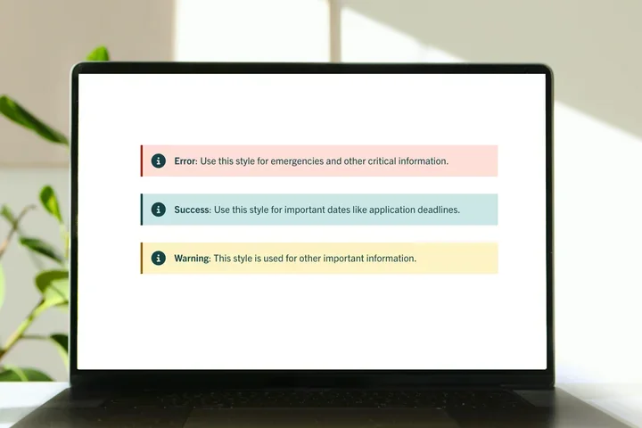
The alert ensures users are promptly informed visitors about important information such as deadlines and safety notifications.
How to add an alert

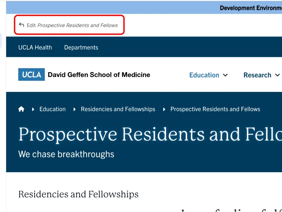
  1. Click the edit link at the top of the page

    Example of selecting the edit button on a page
  2. Move your cursor where you want to place the component. (Add a section if needed). 
  3. Click the plus icon.

    Example of the plus icon with a red square around the icon


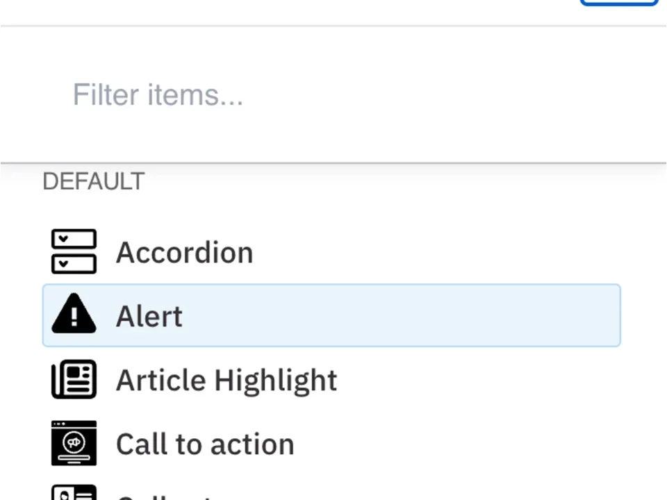
  4. Select Alet from the menu.

    Example of the Alert menu selected

Content 

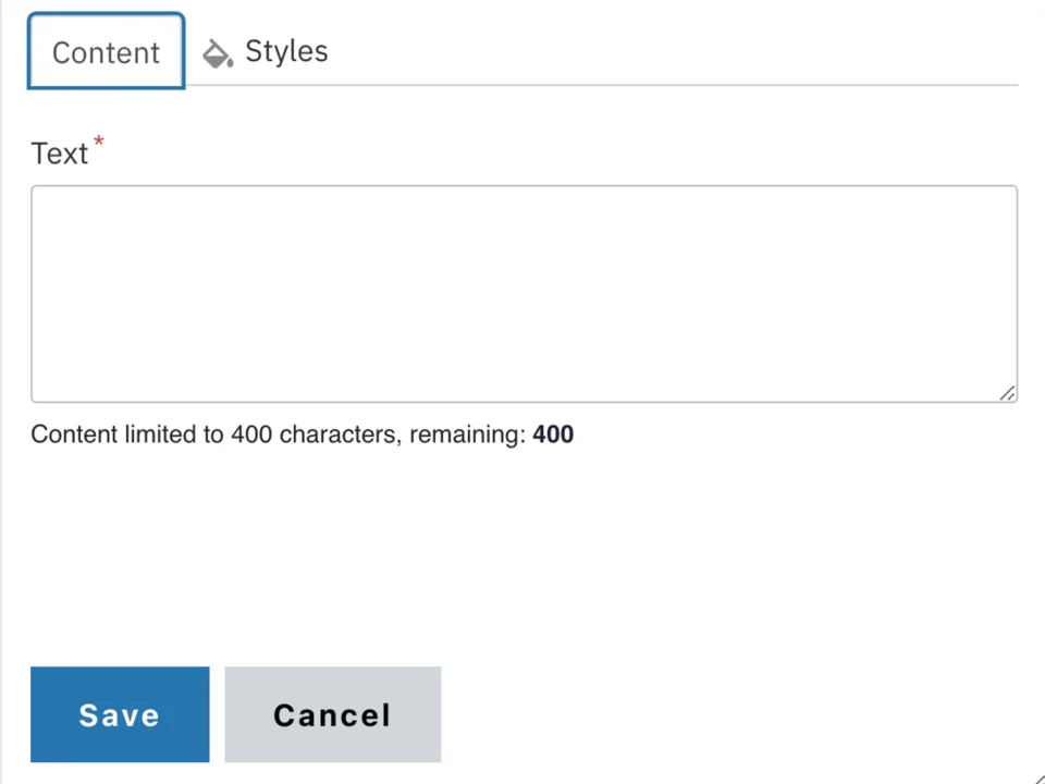
  1. Add your Text. See the WYSIWYG Content Editor page to learn how to edit text. 
    Note: The alert component is limited to 400 characters.

    Example of the alert content text filed

Styles 

  1. Toggle to the Styles tab. 
     

    Example of the Styles option selected
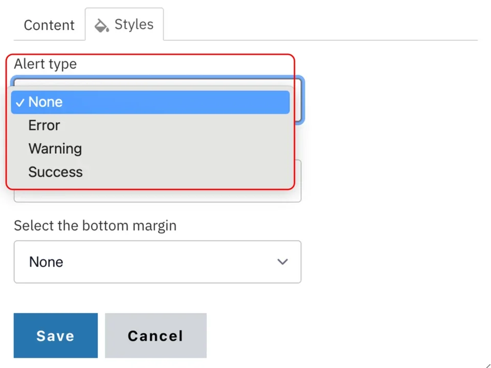
  2. Select the desired Alert style (see below for examples).

    Example of the alert type dropdown
  3. Select the amount of additional space you would like above the component. 
  4. Select the amount of additional space you would like below the component. 
    Note: By default, there is no space below a component.

    Example of the top and bottom margin drop-down section with a red box around it

Save

  1. Click Save.
  2. Scroll to the top of the page and click Save.

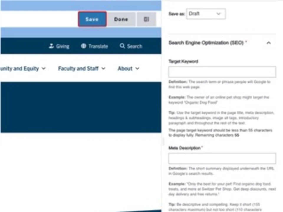
    An example of how to save both the component and the page. The save buttons for both are outlined in red to emphasize the action.
  3. Click the Done button beside the save button.
    Note: This will display the page in the closest representation of how site visitors will view it. All links and actions that are disabled in editing mode will be functional now.

    Example: of the Done button outlined


Style options 

Alert

Error Example Alert

Sit amet curabitur tristique suspendisse dignissim. Interdum id diam egestas ultricies at natoque odio sodales mi eu praesent. Cubilia blandit consectetuer vestibulum in augue. A accumsan porttitor condimentum taciti commodo. Molestie quam mi cursus nunc senectus nam. Auctor fusce cursus ridiculus gravida convallis magnis metus consequat torquent. Aliquet ipsum felis mus sagittis

Alert

Warning Example Alert

Sit amet curabitur tristique suspendisse dignissim. Interdum id diam egestas ultricies at natoque odio sodales mi eu praesent. Cubilia blandit consectetuer vestibulum in augue. A accumsan porttitor condimentum taciti commodo. Molestie quam mi cursus nunc senectus nam. Auctor fusce cursus ridiculus gravida convallis magnis metus consequat torquent. Aliquet ipsum felis mus

Alert

Success Example Alert

Sit amet curabitur tristique suspendisse dignissim. Interdum id diam egestas ultricies at natoque odio sodales mi eu praesent. Cubilia blandit consectetuer vestibulum in augue. A accumsan porttitor condimentum taciti commodo. Molestie quam mi cursus nunc senectus nam. Auctor fusce cursus ridiculus gravida convallis magnis metus consequat torquent. Aliquet ipsum felis mus