Image Component
What is the Image Component?
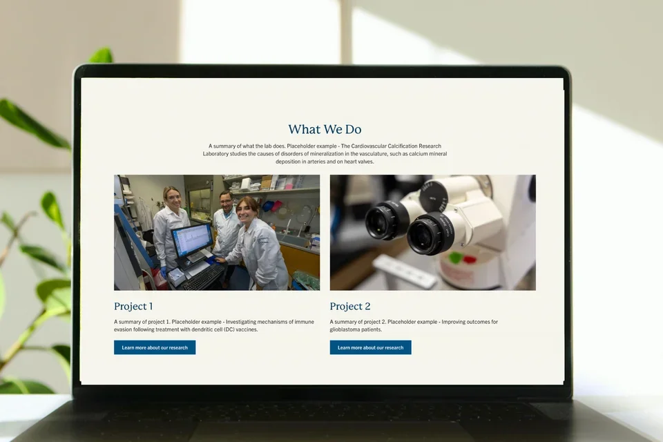
The Image Component displays an image within the layout that automatically scales to fit the width of its column.

Step-by-Step Instructions
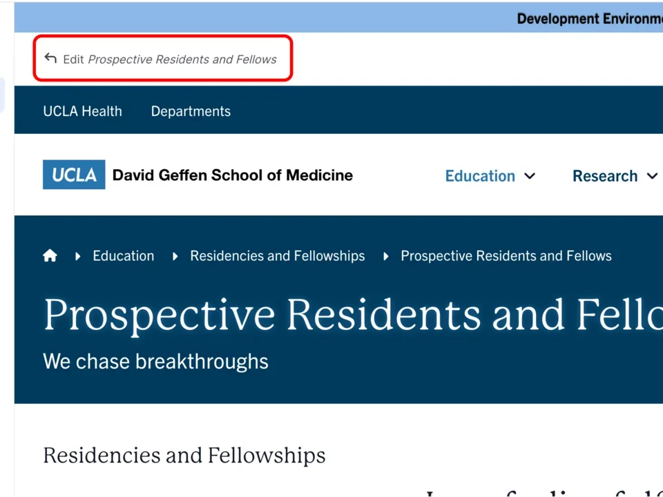
- Click the edit link at the top of the page
- Move your cursor where you want to place the component.
- Click the plus icon.
- Select Image from the menu
Content
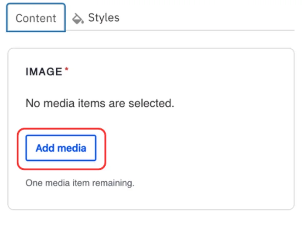
- Click Add media.
- Select the appropriate image or upload the image to the Image Library.
Recommended Image Dimensions: 3:2 - Maximum image size is 4MB
Styles
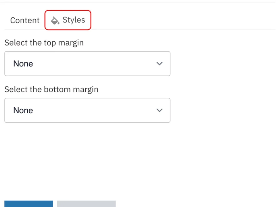
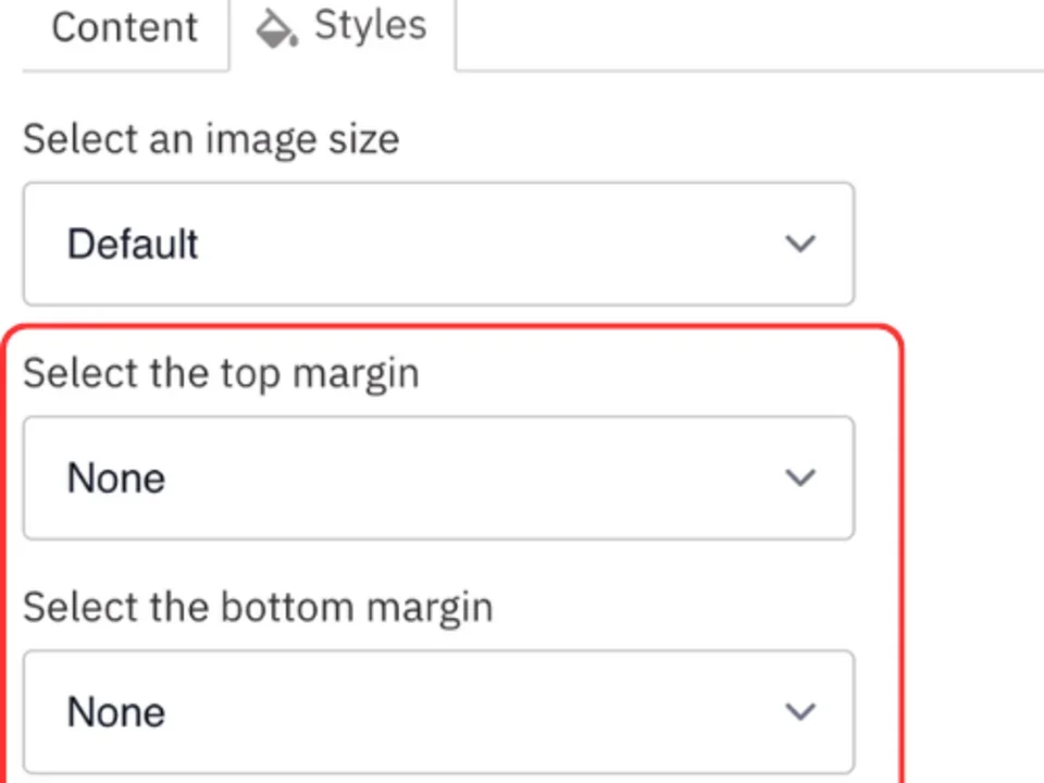
- Toggle to the Styles tab.
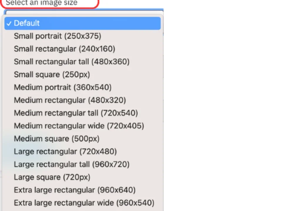
- In the Aspect section, you can change the aspect ratio of the image (see below for examples).
- Select the amount of additional space you would like above the component.
- Select the amount of additional space you would like below the component.
Note: By default, there is no space below a component.
Save
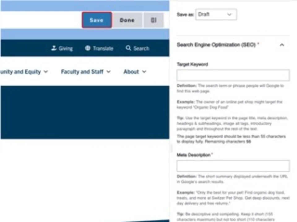
- Click Save.
- Scroll to the top of the page and click Save.
- Click the Done button beside the save button.
Note: This will display the page in the closest representation of how site visitors will view it. All links and actions that are disabled in editing mode will be functional now.
Style options
Example of a Default image

Small portrait (250x375)

Small rectangular (240x160)

Small square (250px)

Medium portrait (360x540)

Medium rectangular (480x320)

Medium rectangular tall (720x540)

Medium rectangular wide (720x405)

Medium square (500px)

Large rectangular (720x480)

Large rectangular tall (960x720)

Large square (720px)

Extra large rectangular (960x640)

- Extra large rectangular wide (960x540)
- Super large full width (1376px)

