Person Listing Component
Creating Components
Person Listing example
Use this feature to showcase faculty, staff, or team members in a clean, searchable format, making it easy for users to find key information like names, roles, departments, and contact details all in one place.
Custom Title


Step-by-Step Instructions
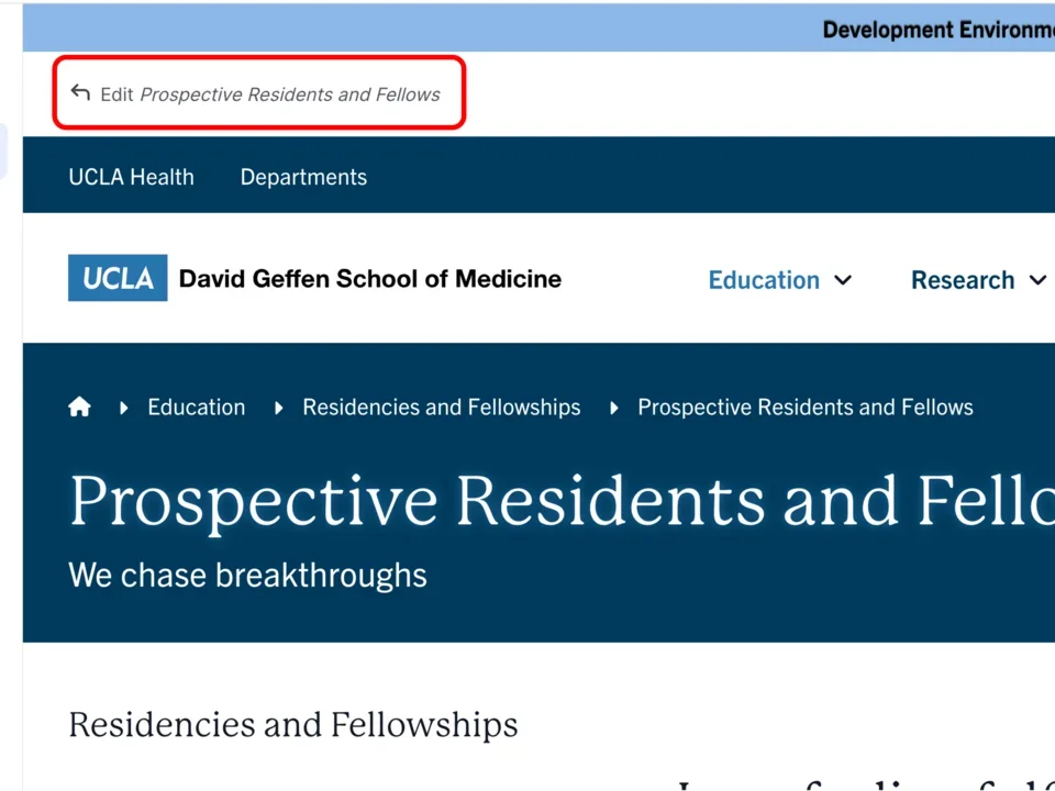
- Click the edit link at the top of the page
- Move your cursor where you want to place the component.
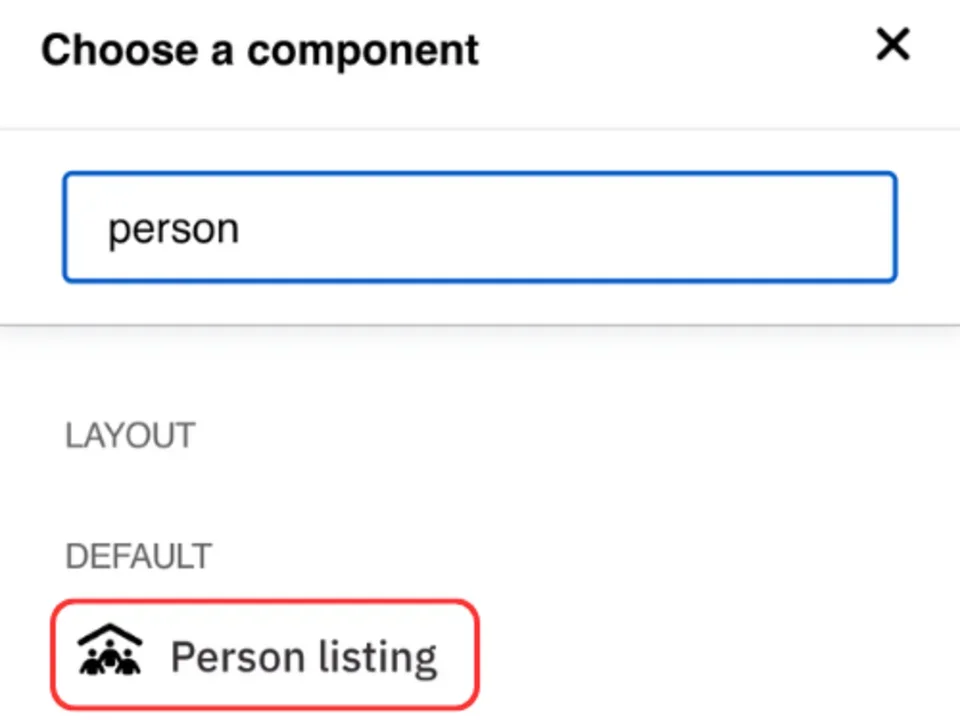
- Click the plus icon.
- Select Person Listing from the menu
Content
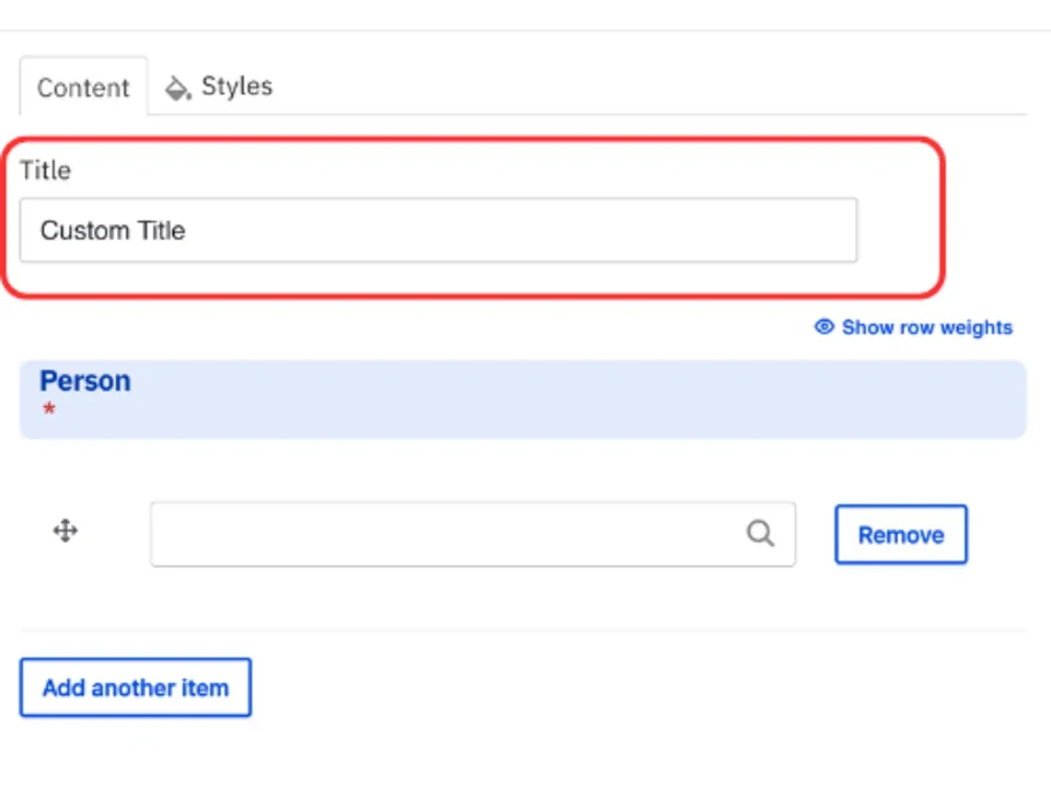
- Add the Title of the group you are creating.
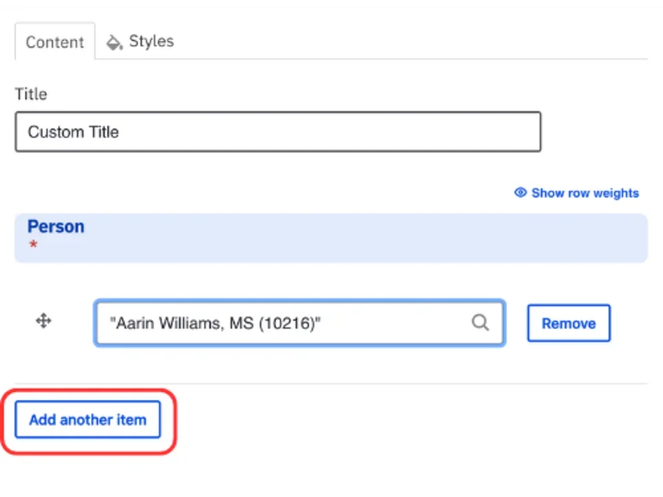
Note: Title field text is limited to 70 characters. - Start typing the name of the person(s) you would like to add in the person field.
- Click the Add another item to add additional persons.
- You are able to reorder the person listing by clicking the all direction arrows.
Styles
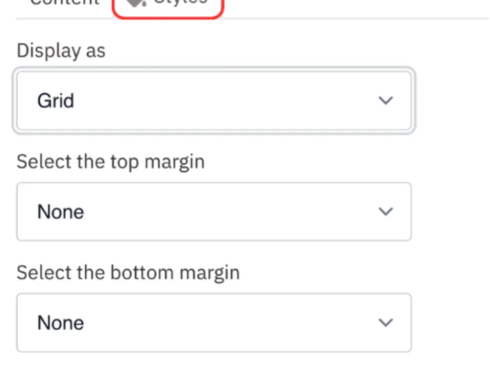
- Toggle to the Styles tab.
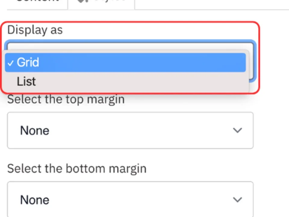
- Select the appropriate Display option based on your desired layout. (See below for examples).
Save
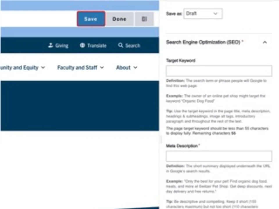
- Click Save.
- Scroll to the top of the page and click Save.
- Click the Done button beside the save button.
Note: This will display the page in the closest representation of how site visitors will view it. All links and actions that are disabled in editing mode will be functional now.
Style options
- Layout Options settings used to create this component are: Display as: Grid
Custom Title


- Layout Options settings used to create this component are: Display as: List
Custom Title


