New Image Component Functionality
Greater Flexibility

This article covers the following topics:
- Overview of the Changes
- When the Changes will Occur
- What's Changing
- Demonstration of Changing the Aspect Ratio
- Additional Resources
Overview of the Changes
Previously when using the image component, the component would always try to fill the container within the section. This led to some images being stretched out or being of uneven size when multiple image components were side by side. This was because the original images were of varying sizes. You now have the ability to change the image size in the image component to help resolve this issue. To learn more, please visit the page that lists all the components and what aspect ratios they use. All of our components are mobile friendly and scale the image size based on the aspect ratio.
When the Changes will Occur
This functionality is available now.
What’s Changing
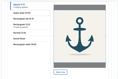
- When you use the image component, you are able to change the aspect ratio.
- You can select the desired aspect ratio in the layout options section.
Demonstration of Changing the Aspect Ratio
Additional Resources
Below is a list of articles where you can learn more about these changes:
- Introducing Our New Web Platform Healthsciences 2.0
- An Easier Way to Login to Your Site
- An Easier Way to Access the Test Site
- Page Title and Breadcrumbs Are Automatically Added to All Content Types
- A New Way to Create a Menu with a Section
- Updated Text Editor (WYSIWYG)
- Site Sections Are Now Available for All Sites
- Views for Articles and Events
- Opening External URLs in a New Tab
- SEO Features: Canonical & No Index Tags
- New Access for All Site Administrators
- Adding HTML to a Web Platform Healthsciences Page
- Finding All Instances of a Placed Component
Co-working Sessions
Register for the next Co-working Session for answers to your questions about this update.

