Person
What is the Person Content Type?
The Person content type allows you to create profiles for individuals and directories of people in a department or research area.
Creating a Person Profile
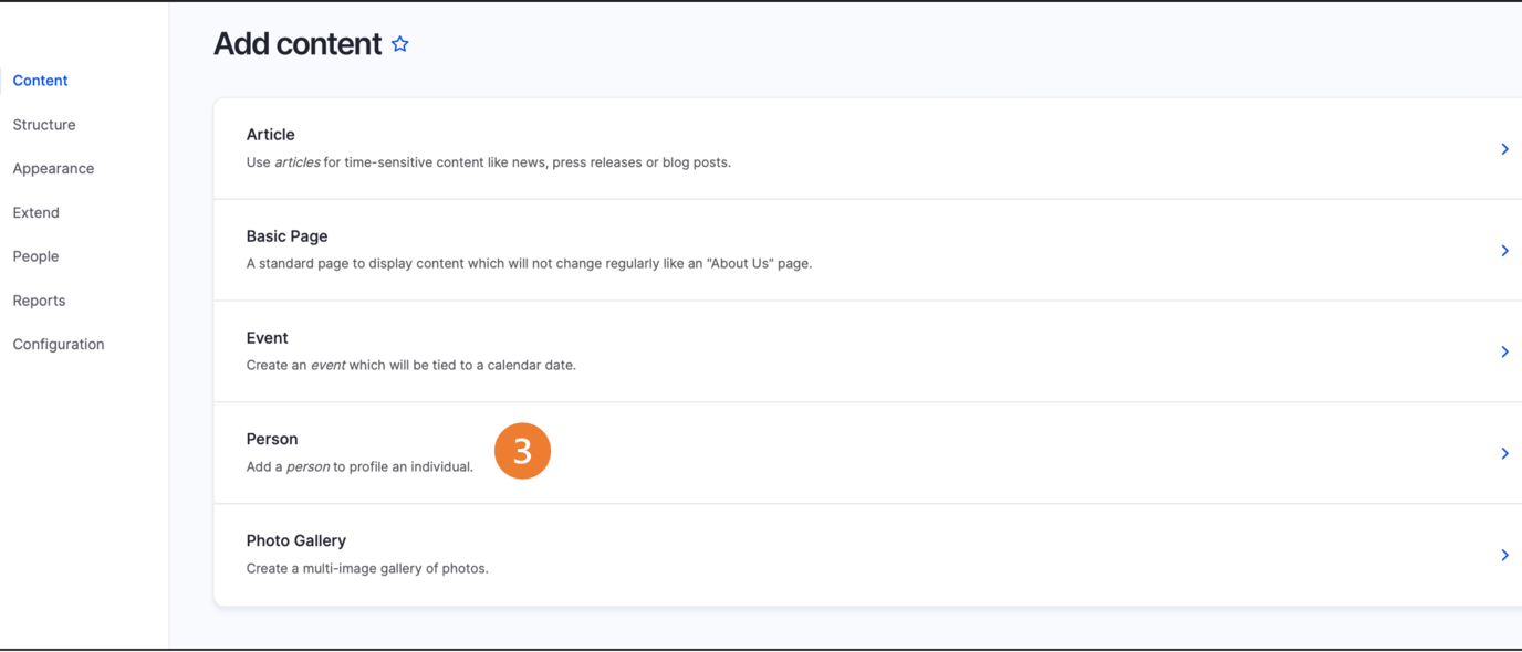
Click Content on the second panel.
Click Add content button
Select Person from the list of content types.
Fill out the person form. The only required field is the person's last name. Fill out the sections you would like to appear on the Person page and leave the other fields blank. Only fields with content will appear on the Person page.
Click Save to publish the Person page.
Creating a Person Listing
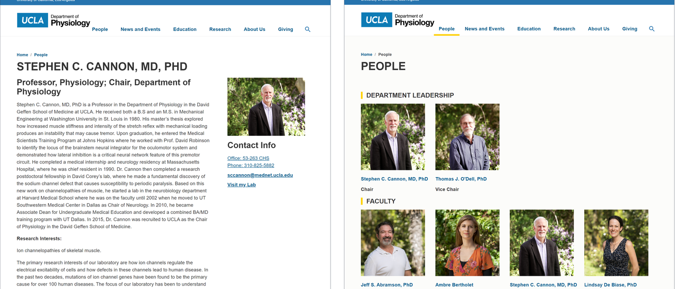
Use the Person Listing component to add a person spotlight or create a directory of people.
The Person Listing component allows you to place person profile cards on a page. The Person Listing can be displayed either vertically or horizontally.
- Example of a Person Listing
- Layout Options settings used to create this component are: Display as: Grid
The referenced media source is missing and needs to be re-embedded.
- Layout Options settings used to create this component are: Display as: List
The referenced media source is missing and needs to be re-embedded.
- Layout Options settings used to create this component are: Display as: Grid
Configuring the Person Listing
-
Click Edit content.
-
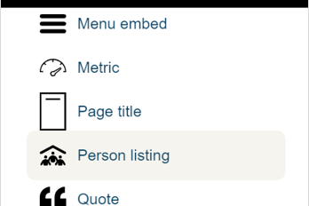
Click the plus icon where you want to place the component.
-
Select Person Listing.
-
Add the Title of the group you are creating.
-
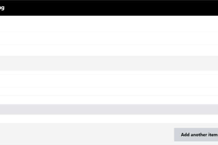
Start typing the name of the person(s) you would like to add in the person field.
-
Click the Add another item to add additional persons.
-
You are able to reorder the person listing by clicking the all direction arrows.
-
Expand Layout Options.

-
Select Grid to have your person page displayed horizontally.
-
Select List to have your person page displayed vertically.
-
In the Spacer section, you can select the amount of additional space you would like below the component.
Note: By default, there is no space below a component.
-
-
Click Save.
-
Scroll to the bottom of the page and click Save.