Understanding How Users on Different Devices See Your Site

This article covers the following topics:
- Understanding How the Web Platform Healthsciences Displays Your Site
- How to View Your Site Like You Are on a Different Device
- Understanding the Optimized Breakpoints (For Advanced Users)
Understanding How the Web Platform Healthsciences Displays Your Site
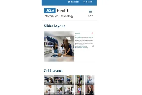
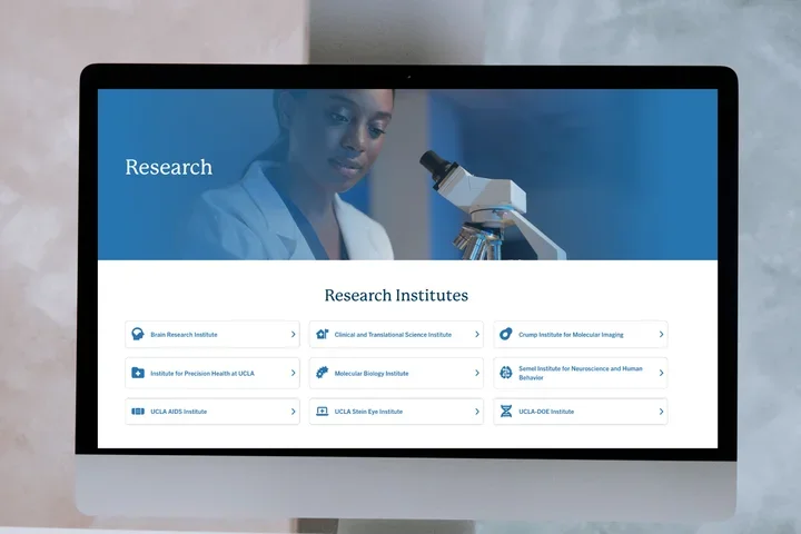
Many users have asked how they can know the way their site displays to visitors who use various devices. If you view the site on a laptop, desktop or smartphone, the page displays differently. This is because of the different sizes of the screens and aspect ratio. The Web Platform Healthsciences scales the images to different sizes and may crop the image. Some menus on mobile devices display a hamburger button. These are examples of changes that may occur. Your page will always display in this order: top to bottom and left to right. Our Web Developers have optimized the site for the most common devices, however not all devices will display the site optimally.
How to View Your Site Like You Are on a Different Device
- Open Chrome.
- Go to the page you want to test.
- Right click anywhere on the page.
- Click Inspect from the drop-down menu.
- Click the Mobile device icon.
- Click Dimensions: Responsive at the top of the page.
- Choose the desired device from the drop-down menu.
Understanding the Optimized Breakpoints (For Advanced Users)
Breakpoints are the specific sizes that our Developers have optimized for the Web Platform Healthsciences. You can see the sizes by simply resizing your browser's window. A breakpoint is where the size and order of the items change. The breakpoints are as follows:
- 357 px – Extra Small (Mobile)
- 576 px – Small
- 768 px – Medium (Tablet)
- 992 px – Large
- 1200 px – Extra Large (Laptop)
- 1400 px – Extra Extra Large (Desktop)

