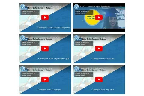
New Video Gallery Option
Making Interactive and Engaging Content

This article addresses the following topics:
Video Gallery Overview
The Video Gallery allows you to create visually engaging content and easily present multiple views within a single component, enabling interactive experiences.
Implementation Timeline
This feature is available as of December 6, 2024.
Creating a Video Gallery
- Click the Edit link at the top of the page where you’d like to add the Video Gallery.
- Navigate to the section where you want to place the component. (Add a new section if necessary.)
- Click the plus icon.
- Select Gallery from the menu.
- Add your Title (optional).
Note: Title field text is limited to 70 characters. - Click Add Media, then select the appropriate images or upload new ones to the Image Library.
- Switch to the Styles tab.
- Choose a gallery display style: Grid, Carousel, Slider, or Video.
- Select the amount of additional space you’d like above the component.
- Select the amount of additional space you’d like below the component.
Note: By default, there is no space below a component. - Click Save.
- Scroll to the top of the page and click Save.
- To learn more about creating the Video Gallery component, please refer to this page.
Additional Resources
Co-working Sessions
Register for the next Co-working Session for answers to your questions about this update.

