Gallery Component Enhancements
Phasing out the Carousel and Slider Components

In this article:
Overview of Changes
The updated Gallery component provides a modern and flexible way to display multiple images on your site. New display options allow users to choose from a grid, carousel, or slider layout.
As part of this update, we will phase out the current carousel and slider components. Users will no longer have the ability to edit pre-existing carousel and slider components. Instead, users should add a new gallery component.
At the end of 2024, the carousels and sliders will automatically be migrated to the new gallery component, which does not support links.
We made these changes to meet industry standards and accessibility requirements.
New Display Options
Grid

New features:
- Thumbnails: Smaller preview images that users can click to view the image larger
- Captions: Optional descriptions for each image.
Carousel

New Features:
- Arrows: Buttons on either side of the slider to move forward or backward through the images.
- Captions: Optional descriptions for each image.
Slider

New Features:
- Thumbnails: Smaller preview images that users can click to jump to a specific image.
- Arrows: Buttons on either side of the slider to move forward or backward through the images.
- Captions: Optional descriptions for each image.
How to Add a Gallery
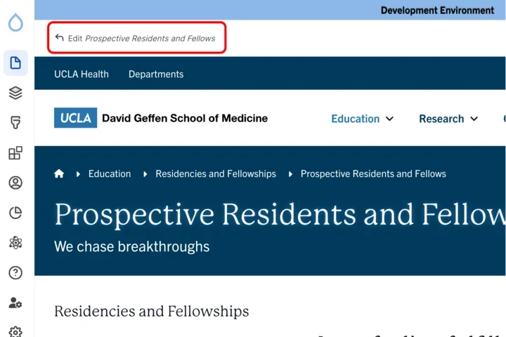
Click the edit link at the top of the page
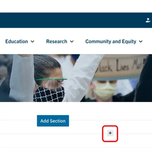
- Move your cursor where you want to place the component. (Add a section if needed).
Click the plus icon.
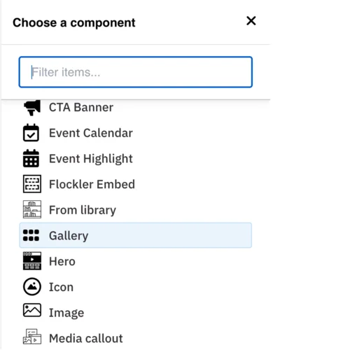
Select Gallery from the menu
Content
Add your Title (optional).
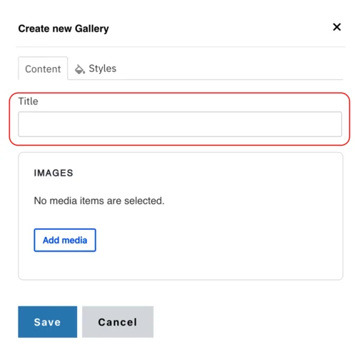
- Click Add media. Select the appropriate images or upload the images to the Image Library.
Note: Recommended Image Dimensions: 3:2 – Maximum image size is 4MB.
Styles
Toggle to the Styles tab.
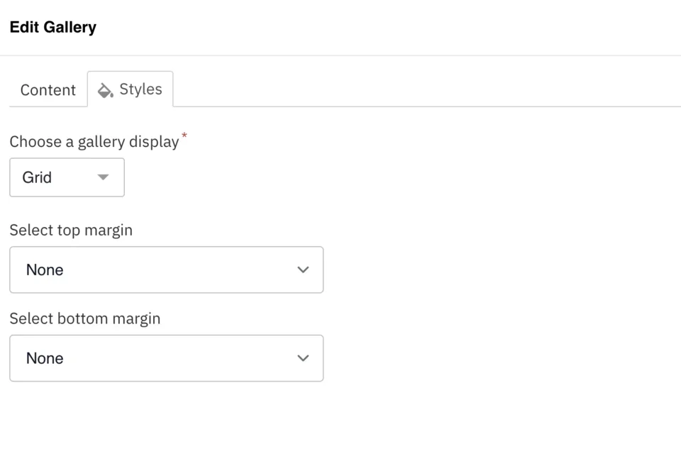
- Choose a gallery display from the dropdown: Grid, Carousel, or Slider.
- Select the amount of additional space you would like above the component.
- Select the amount of additional space you would like below the component.
Note: By default, there is no space below a component.
Save
- Click Save.
Scroll to the top of the page and click Save.
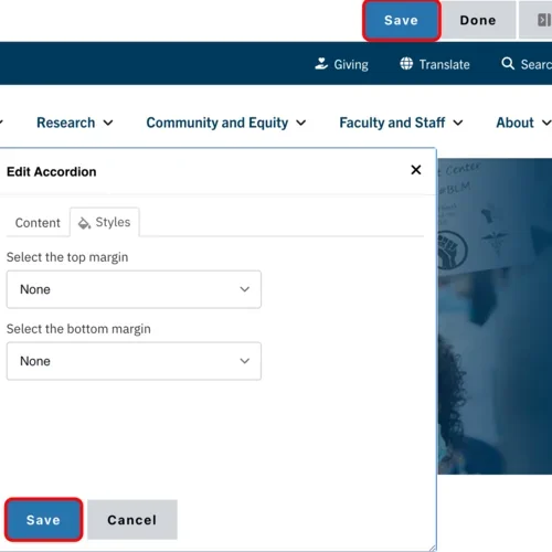
Click the Done button beside the save button.
Note: This will display the page in the closest representation of how site visitors will view it. All links and actions that are disabled in editing mode will be functional now.