Icon Link Component
Components
What is an Icon Link?
The Icon Link is a visually appealing component for displaying multiple links in three or four columns to allow for greater flexibility and to guide users through clear navigation choices across a website. They are intended for use with multiple links.

Example of Icon Links
Step-by-Step Instructions
How to create the Icon Links
1. Add a Cards Grid Section
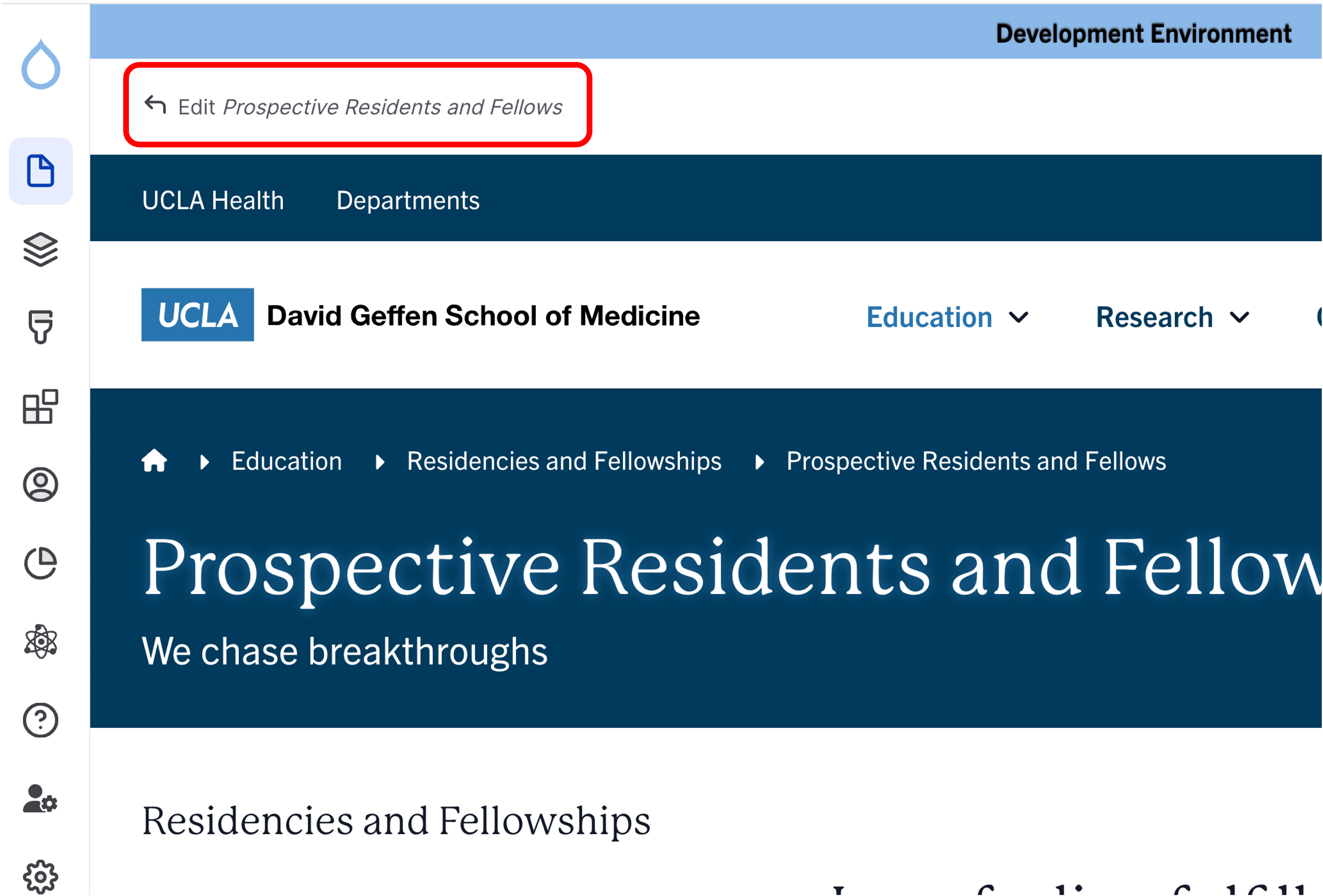
- Click the Edit link at the top of the page.
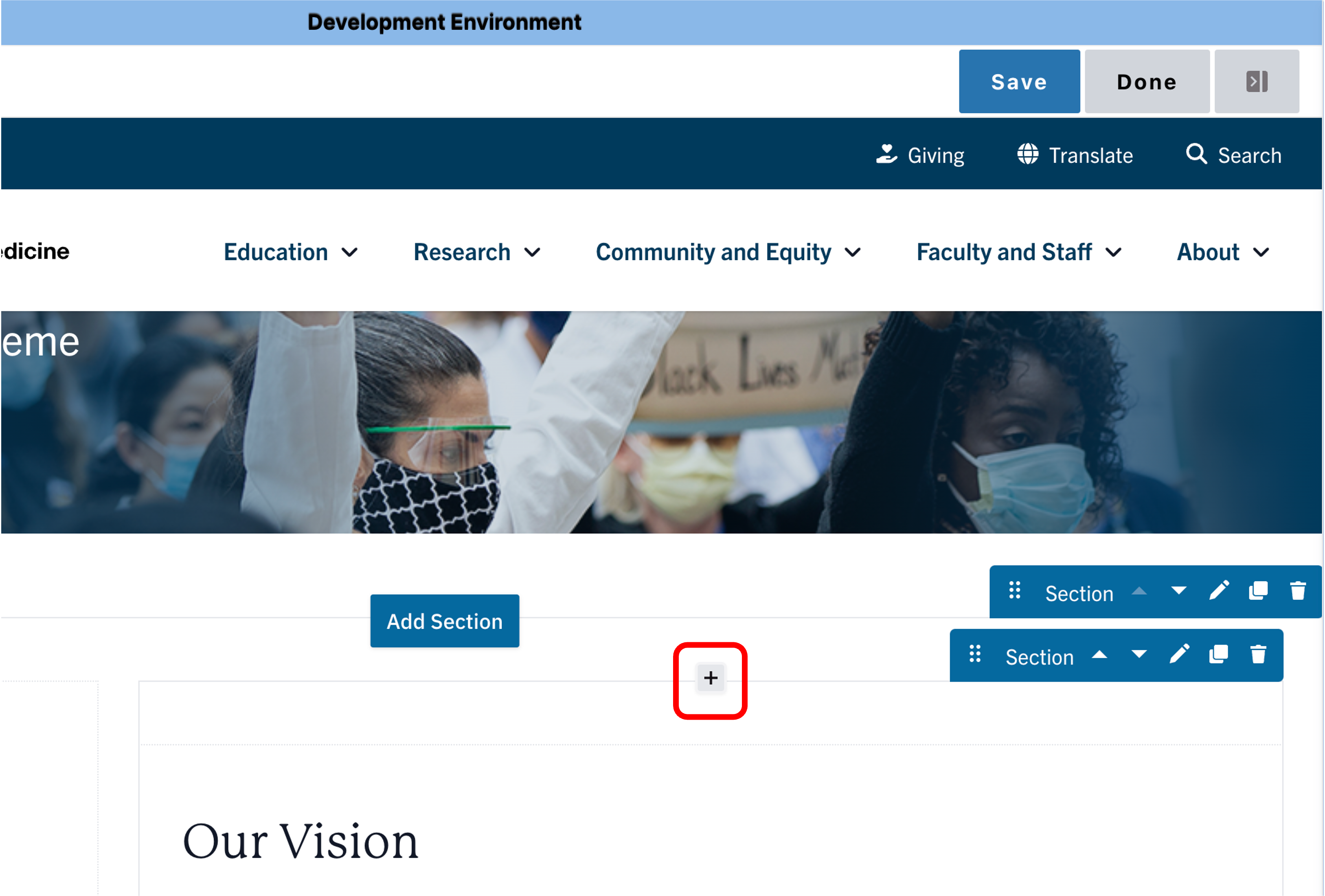
- Place your cursor in the section where you want the cards.
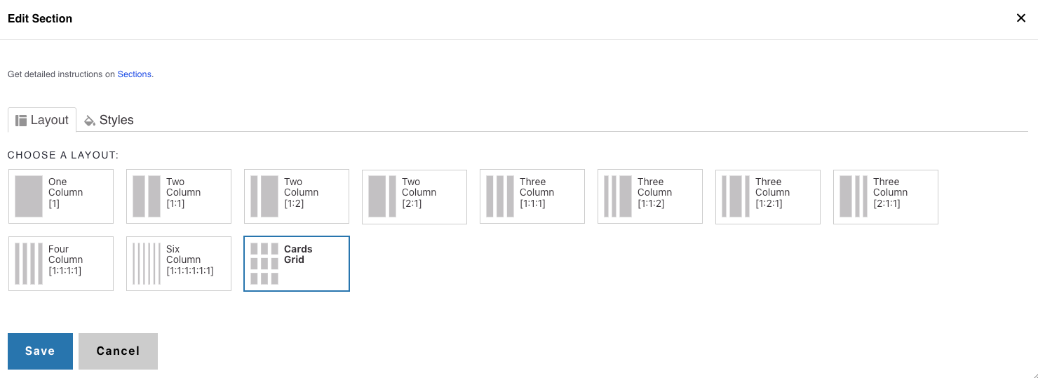
- Click the plus icon → Select Cards Grid.
2. Add a Section Header (Optional)
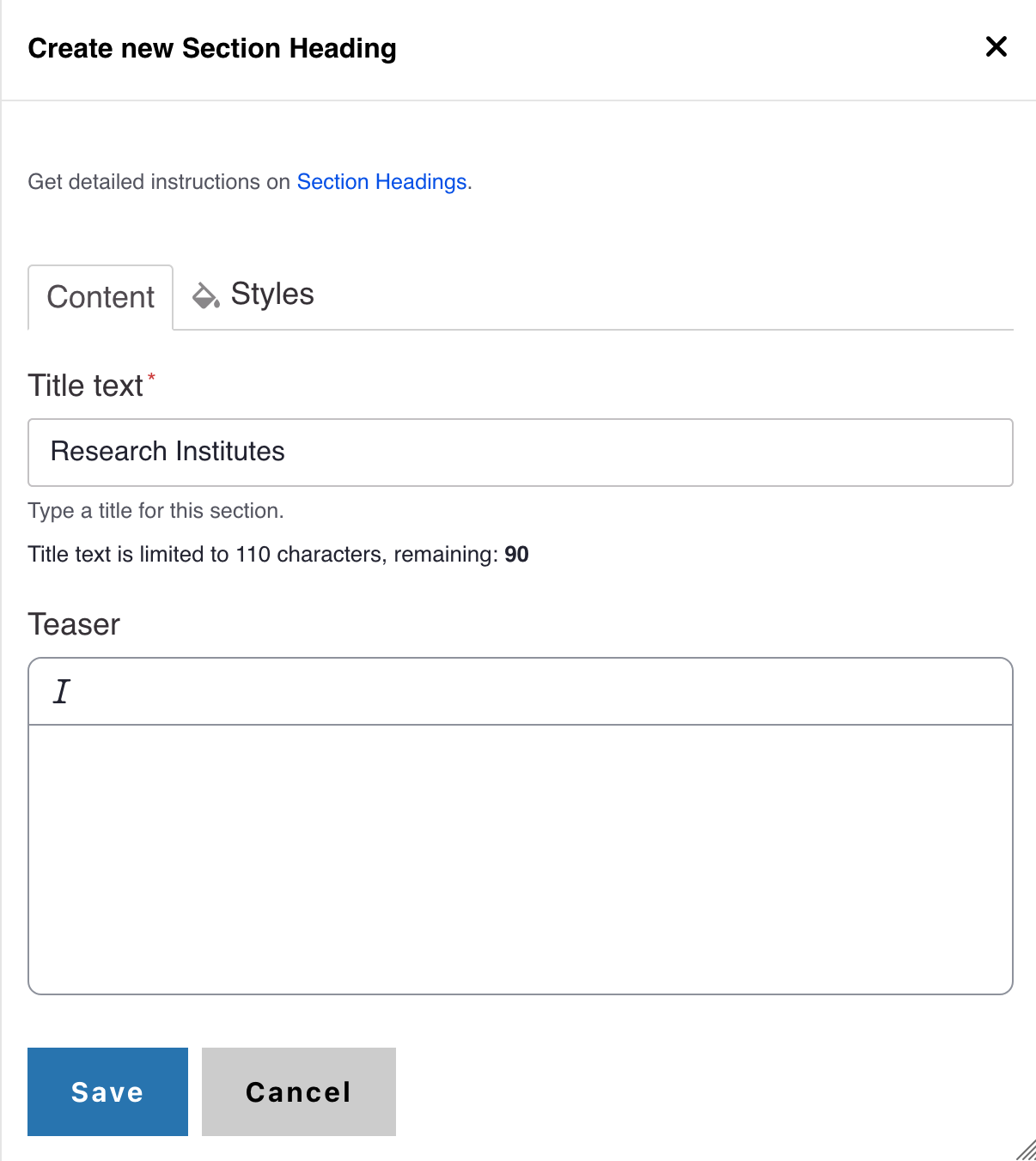
- (Optional) Add a Section Header above your cards.
- (Optional) Add a teaser that provides supporting context.
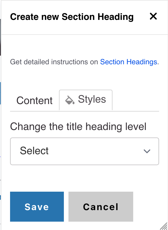
- In Styles, set the header level to H3 if needed.
3. Add Icon Links
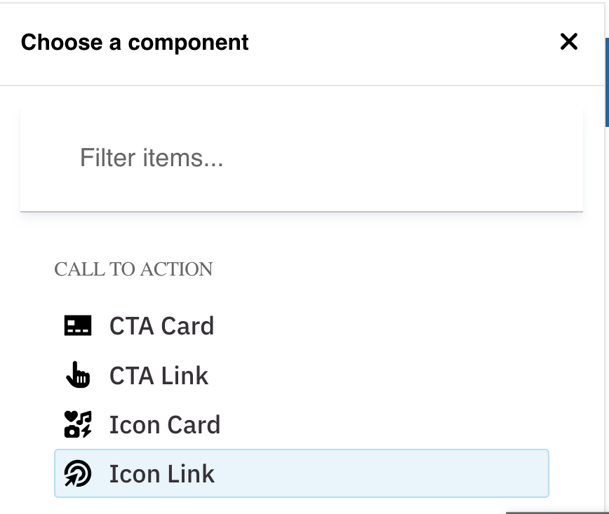
- Select Icon Link from the list of components which can be found under the Call to Action group
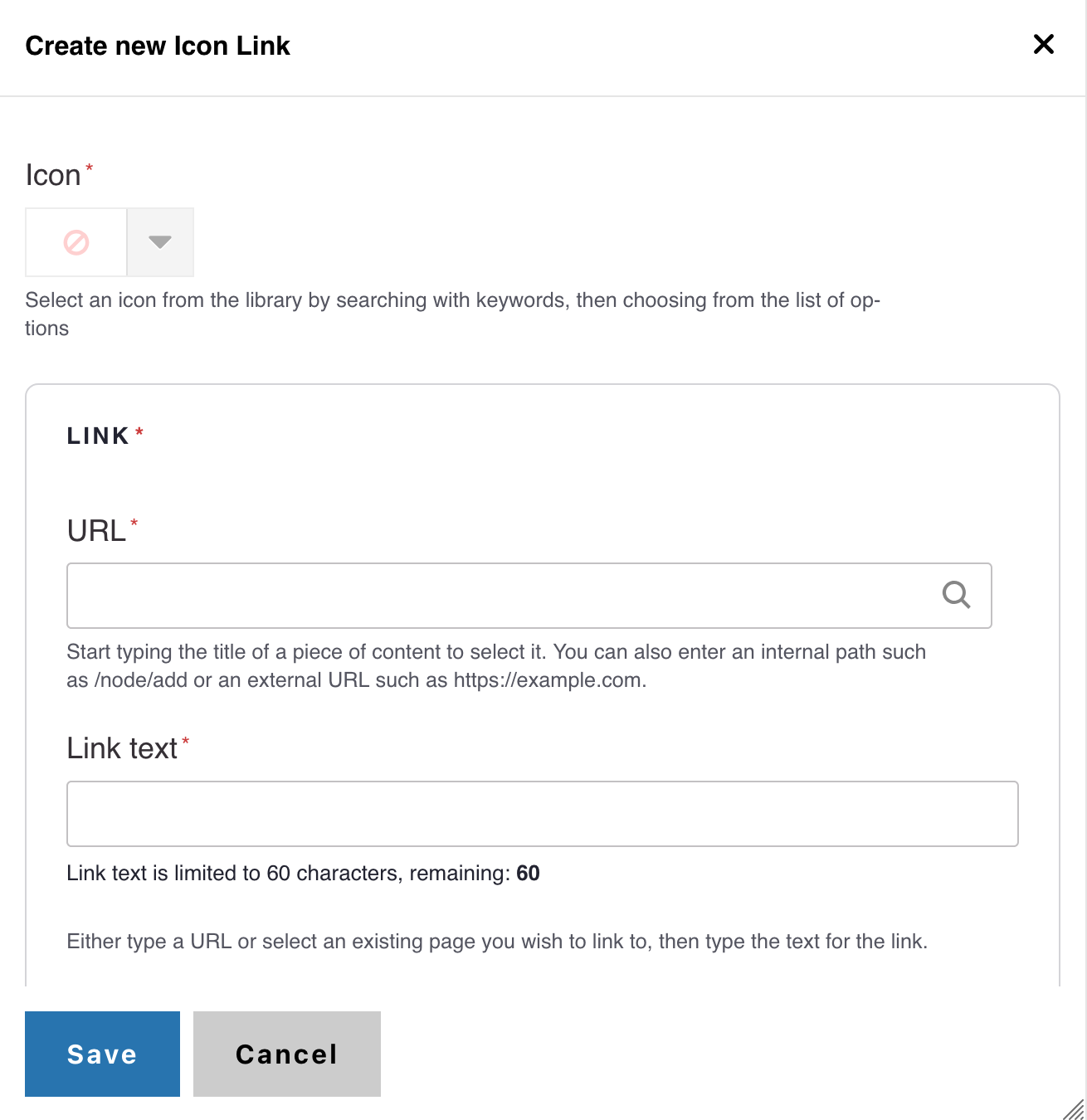
- Select an icon of your choice from the Icon picker widget
- Add desired link text and URL
- Note: Title text is limited to 70 characters
- Click Save


4. Styles
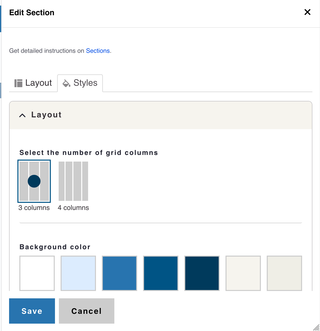
- Click the Styles tab then click the Layout to expand the section
- The layout field set expands showing options for Grid Columns
- The default state of columns is three columns (recommended for link sets of 3, 6, 9, 12, 15, 18, and 21)
- If desired, you can change the Grid columns to four columns (recommended for link sets of 4, 8, 10, 14, 18, 22)
Alert
Only Site Administrators can add background colors.
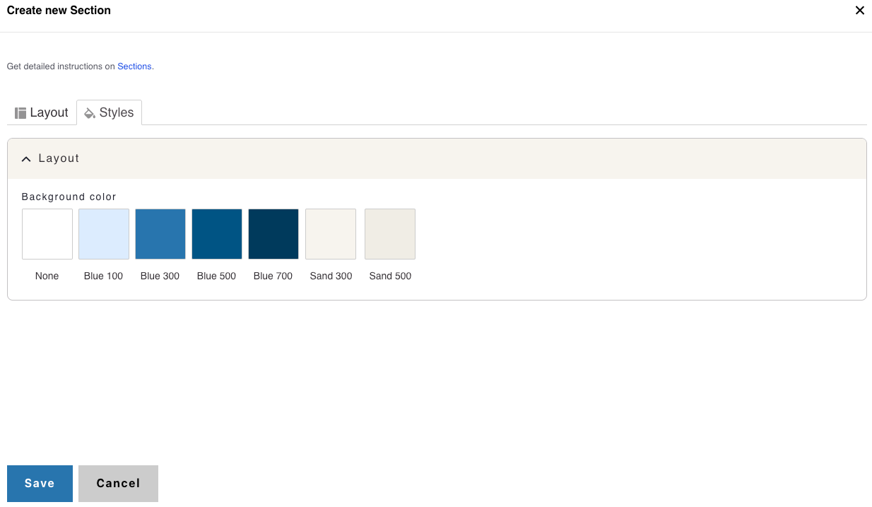
Background Colors
We recommend working with a Site Administrator to apply background colors to Card Grids and standalone Icon links when you need them to stand out.
Note: Background colors can be applied only within One Column and Card Grid sections.
How to Apply a Background Highlight
- Open the Styles tab.
- Choose one of the approved background colors:
- None (default)
- Blue 100
- Blue 300
- Blue 500
- Blue 700
- Sand 300
- Sand 500