Alerts Component
Creating Components
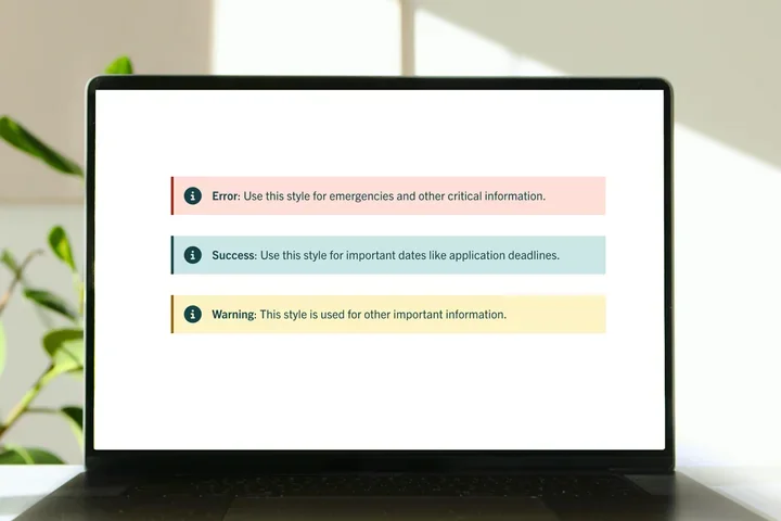
What is an Alert?
The alert ensures users are promptly informed visitors about important information such as deadlines and safety notifications.
Step-by-Step Instructions
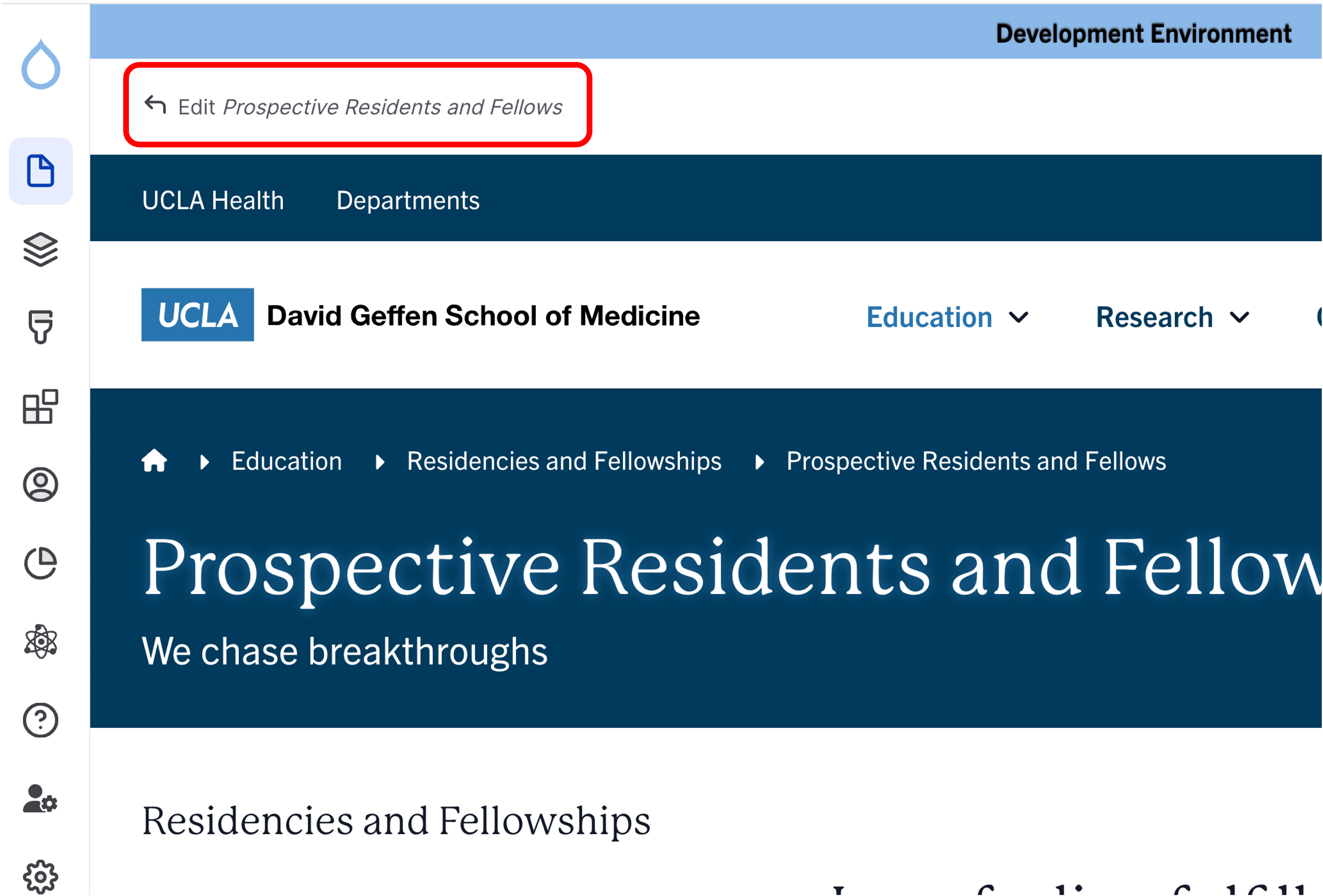
- Click the edit link at the top of the page
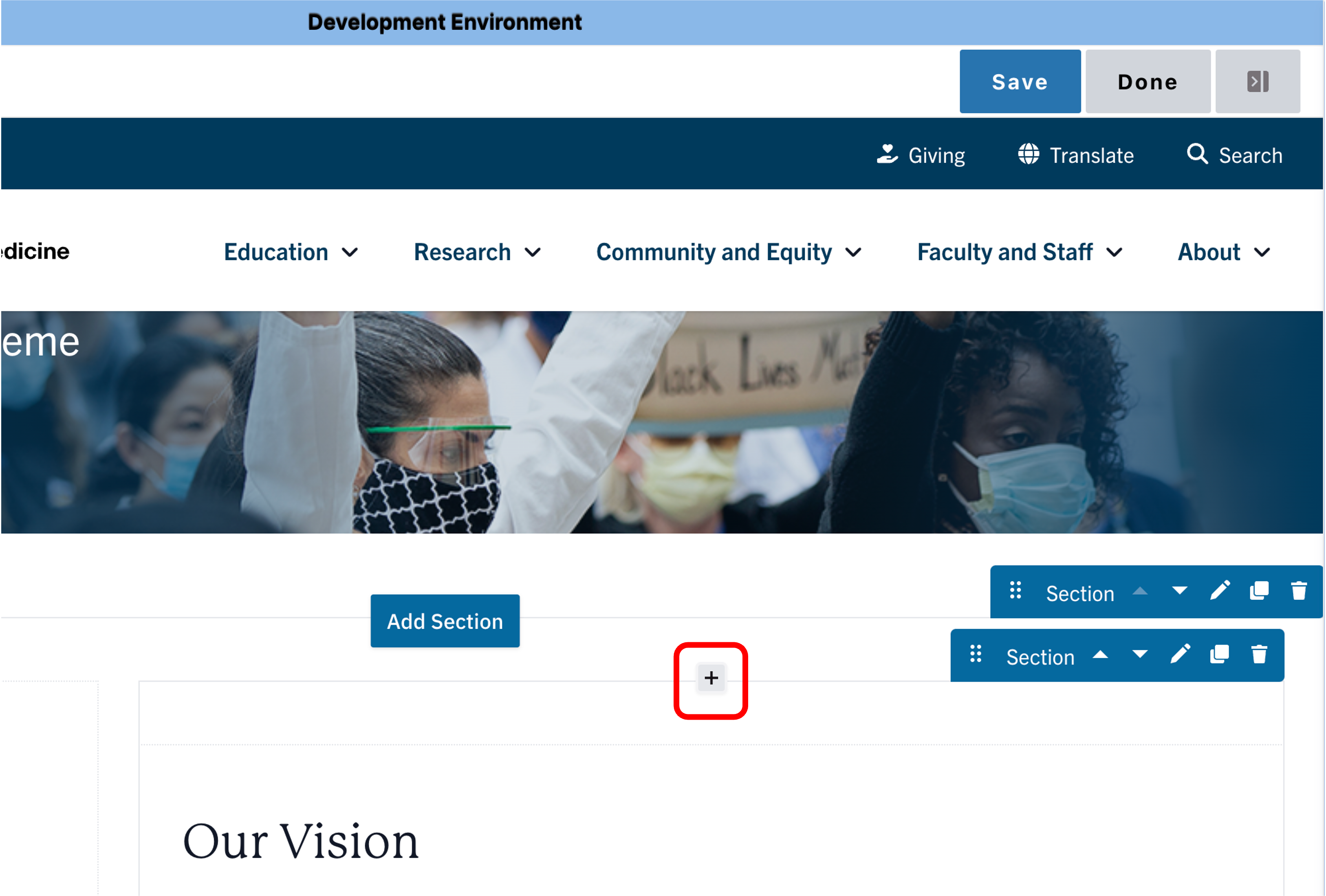
- Move your cursor where you want to place the component.
- Click the plus icon.
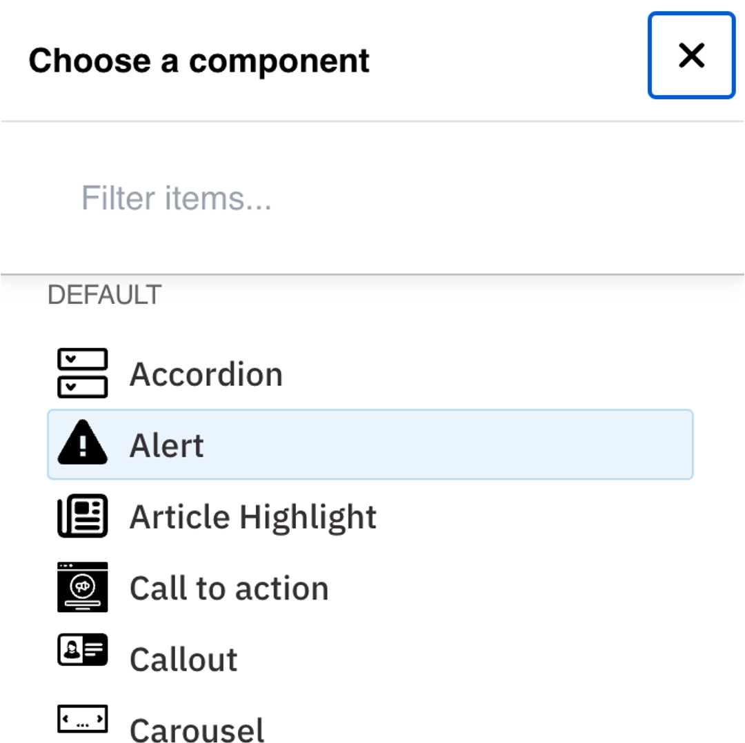
- Select Alert from the menu.
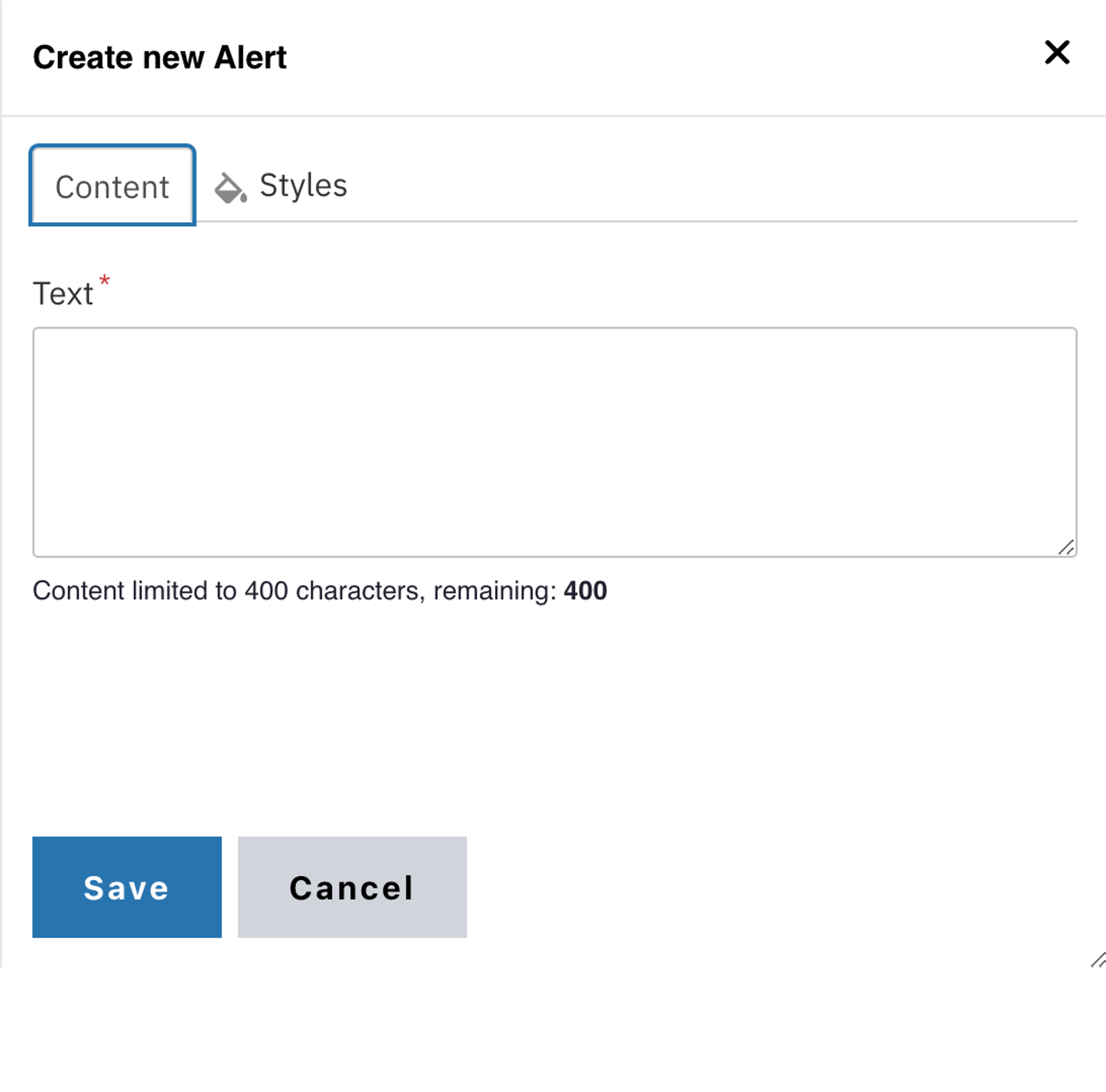
Content
- Add your Text. See the WYSIWYG Content Editor page to learn how to edit text.
Note: The alert component is limited to 400 characters.
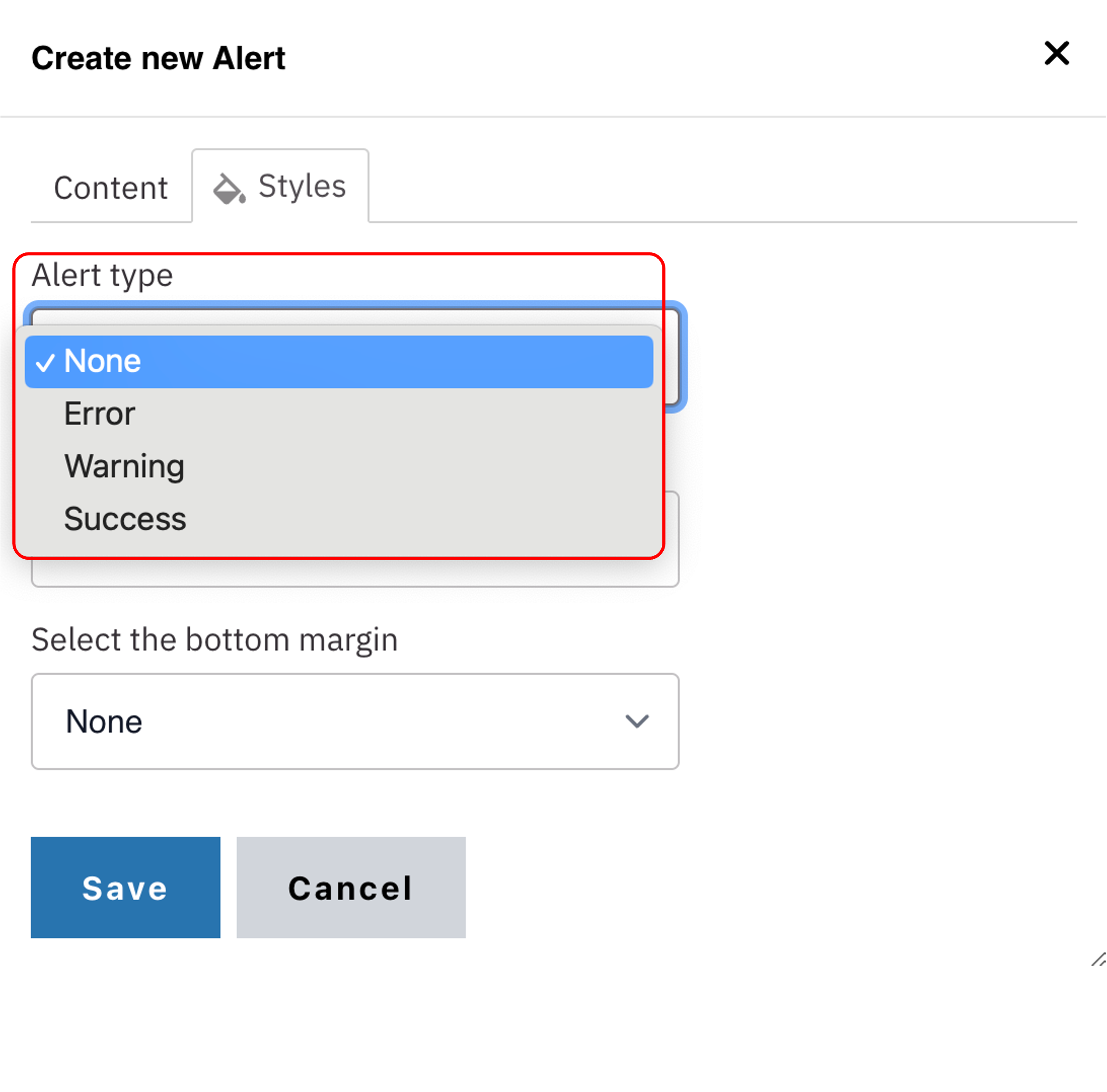
Styles
- Toggle to the Styles tab.
- Select the desired Alert style (see below for examples).
Save
Style options
Use these styles to clearly communicate different levels of urgency or importance.