Event Calendar Component
Display your events in a calendar view on your site.
This article covers the following topics:
Overview
In Q1 of 2024 the Web Platform Healthsciences development team has dedicated effort to release various new features for users. One of the new features now available is the Event Calendar component. This new component showcases your events in a calendar view on your page.
New Features
The Event Calendar component is used to display your upcoming events on your page. Visitors can navigate your calendar by scrolling through months with the arrow keys or highlight the current day by clicking the "today" button. Visitors can also choose how they view your events by toggling between a calendar or list view. Clicking the name of the Event will take visitors to the event listing itself for more details.
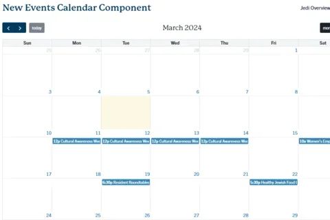
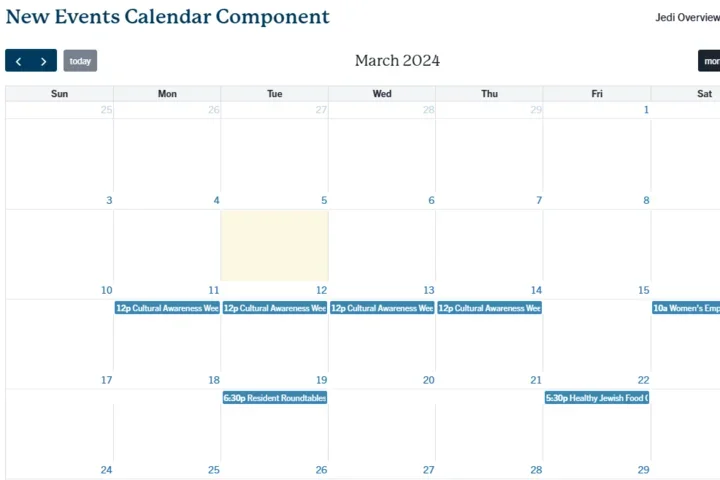
Example of an Event Calendar Component in Month View:
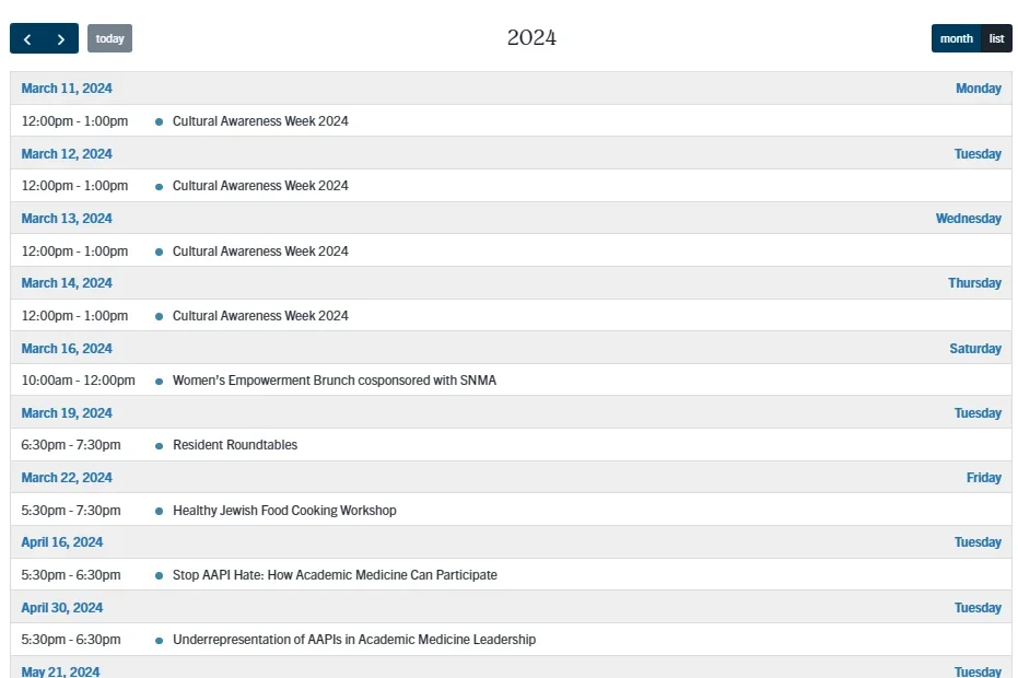
Example of an Event Calendar Component in list view:
Instructions
Configuring the Event Calendar Component:
- Click Edit content.
- Click the plus icon where you want to place the component.
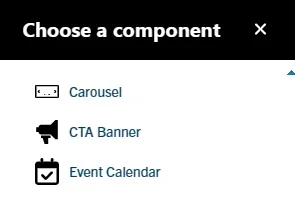
- Select Event Calendar from the menu.
- Add a custom Title for your Event Calendar. (required)
- Optional: Filter the events displayed in the view. In the Filter events by field, start by typing an event type, category, topic, or tag. Select the term.
- Optional: Add a link to the event calendar component. Start typing the title of a piece of content to select it. You can also enter an internal path such as /node/add or an external URL such as http://example.com.
- Add Link Text for the URL.
- Expand Layout Options.
- In the Spacer section, you can select the amount of additional space you would like below the component. Note: By default, there is no space below a component.
- Click Save
- Scroll to the bottom of the page and click Save.
Note: Only use one Event calendar component per page to avoid error.
Resources
For additional details on this new component, and all others available, please visit the Layout Paragraphs Page in our Web platform knowledge base.