Introducing the New Section Header
Brand Refresh
As part of our ongoing brand refresh and design enhancements, we’re excited to introduce the Section Header, a component that clearly labels and organizes sections of content. Based on user feedback, Section Headers are centered to improve readability and create a balanced visual layout. They act as dividers, helping users understand the hierarchy of information and quickly scan the page.
Specifically, a Section Header:
- Identifies a content section: Lets users know what the following content is about.
- Improves page hierarchy: Helps structure the page for accessibility and SEO by using proper heading levels (H2 or H3)
- Enhances readability: Breaks up long pages, making them easier to scan.
- Supports visual design: Gives consistent spacing, font style, and prominence to differentiate sections.
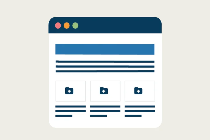
For example, on a top-level page, a Section Header might introduce a Card Grid or CTA Cards, making it clear to users that the cards are grouped around a specific topic or action.
We encourage all site owners and content editors to use the new Section Header to introduce important content on top navigation pages.
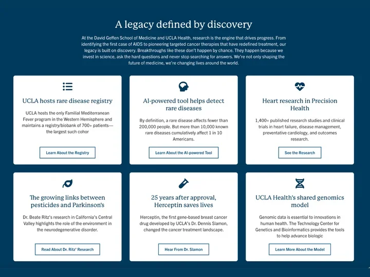
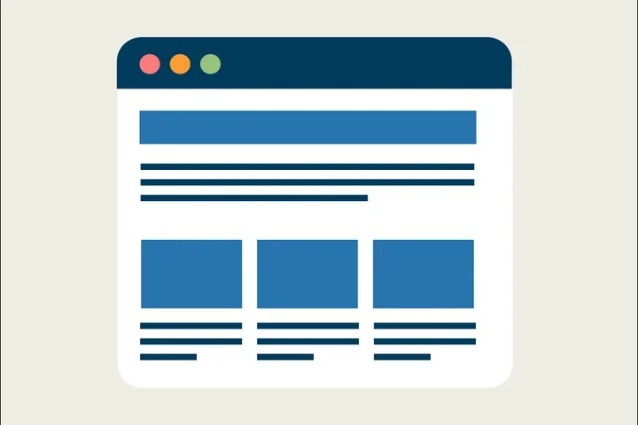
Section Header Example
In this example, the Section Header is used to introduce the Icon Cards below.
Section Header Elements
Content
Each Section Header includes:
- Title – Short heading (max 70 characters)
- Optional Teaser – Brief description providing context (max 300 characters)
Styles
Adjust header levels (H2 → H3) to maintain proper page hierarchy
How to Add Section Headers
1. Add a Cards Grid or One Column Section
- Click the Edit link at the top of the page.
- Place your cursor where you want the cards.
- Click the plus icon
- Select Cards Grid if you want to place the section header above a CTA card or Icon Card grid.
- Select One Column to place the Section Header above all other components.
2. Add a Section Header
- Add a Title
- (Optional) Add a teaser for supporting context.
- In Styles, set the header level to H2 or H3
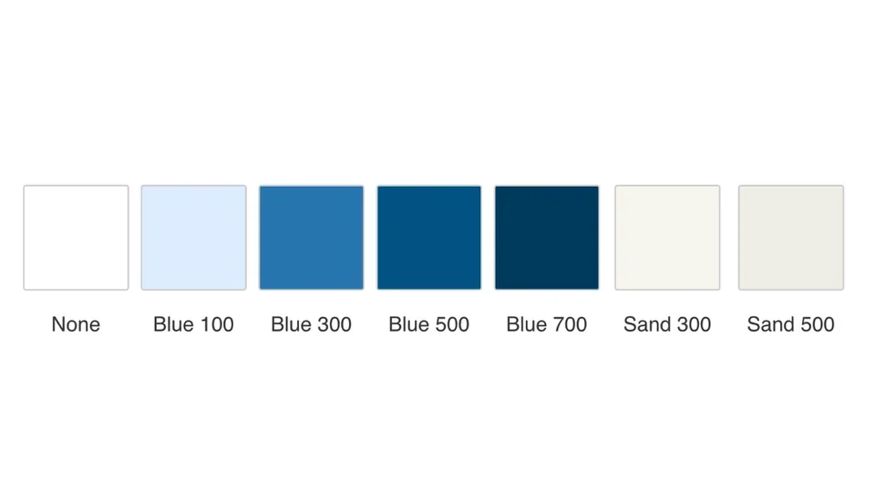
Background Colors
- Work with a Site Administrator to apply background colors for emphasis.
- Available only in One Column and Card Grid sections.
Background Color Options:
- None (default)
- Blue 100 / 300 / 500 / 700
- Sand 300 / 500
Implementation Timeline
- Launch Date: December 15
- Review the new process ahead of the launch to ensure a smooth transition.
Additional Resources
Co-working Sessions
Need help creating Section Headers and adding Background Colors? Register for the next Co-working Session for support.
