Section Header
Components
What is a Section Header?
A Section Header clearly labels and organizes sections of content. Based on user feedback, Section Headers are centered to improve readability and create a balanced visual layout. They act as dividers, helping users understand the hierarchy of information and quickly scan the page.

Section Header Example
Step-by-Step Instructions
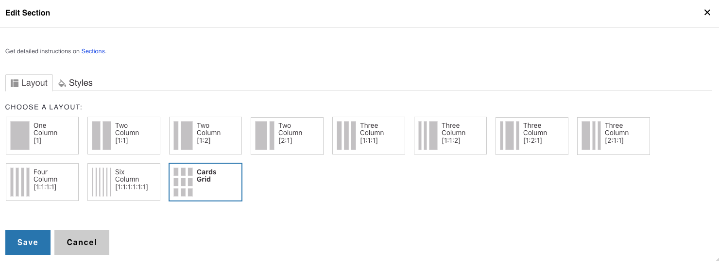
1. Add a Cards Grid or One Column Section
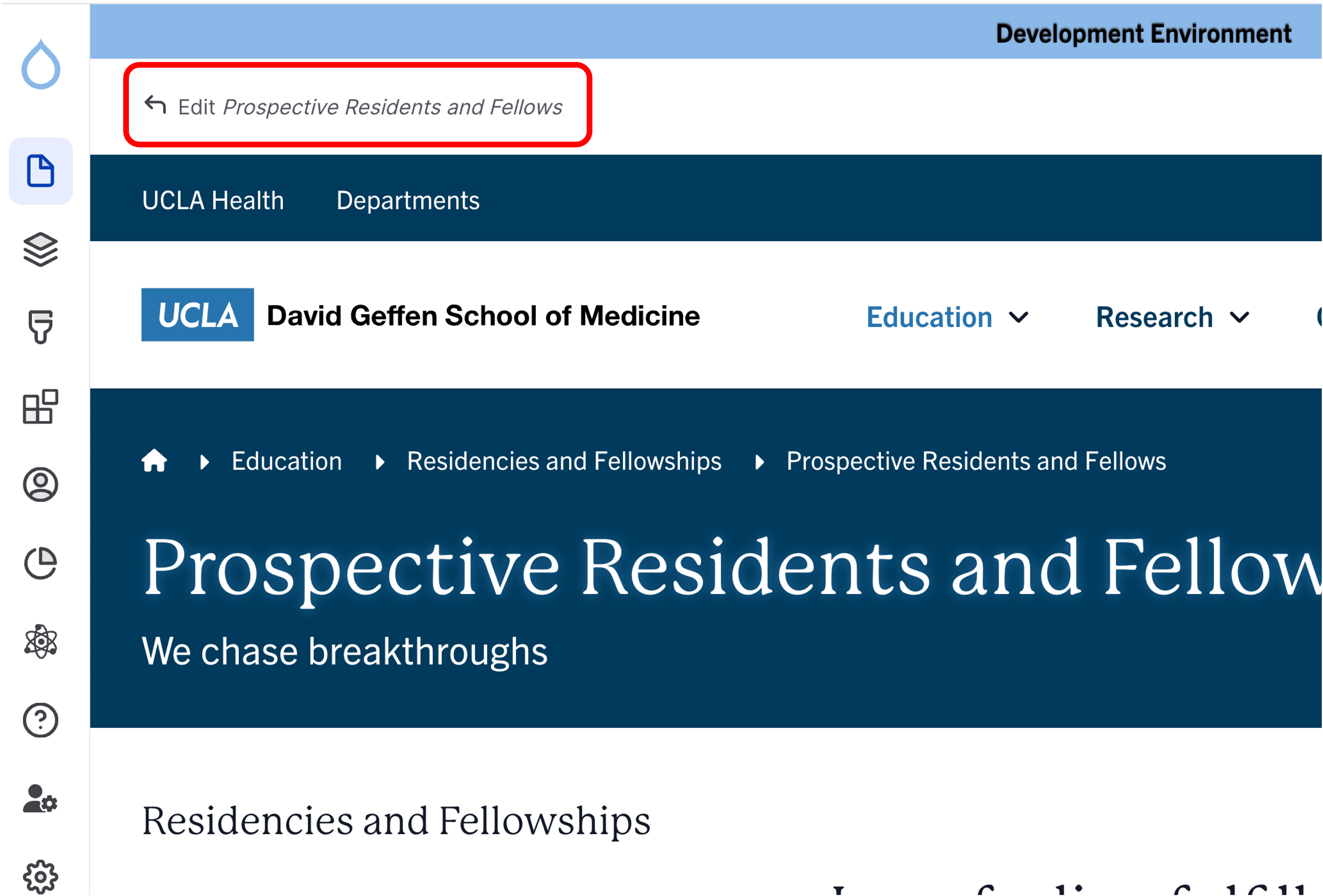
- Click the Edit link at the top of the page.
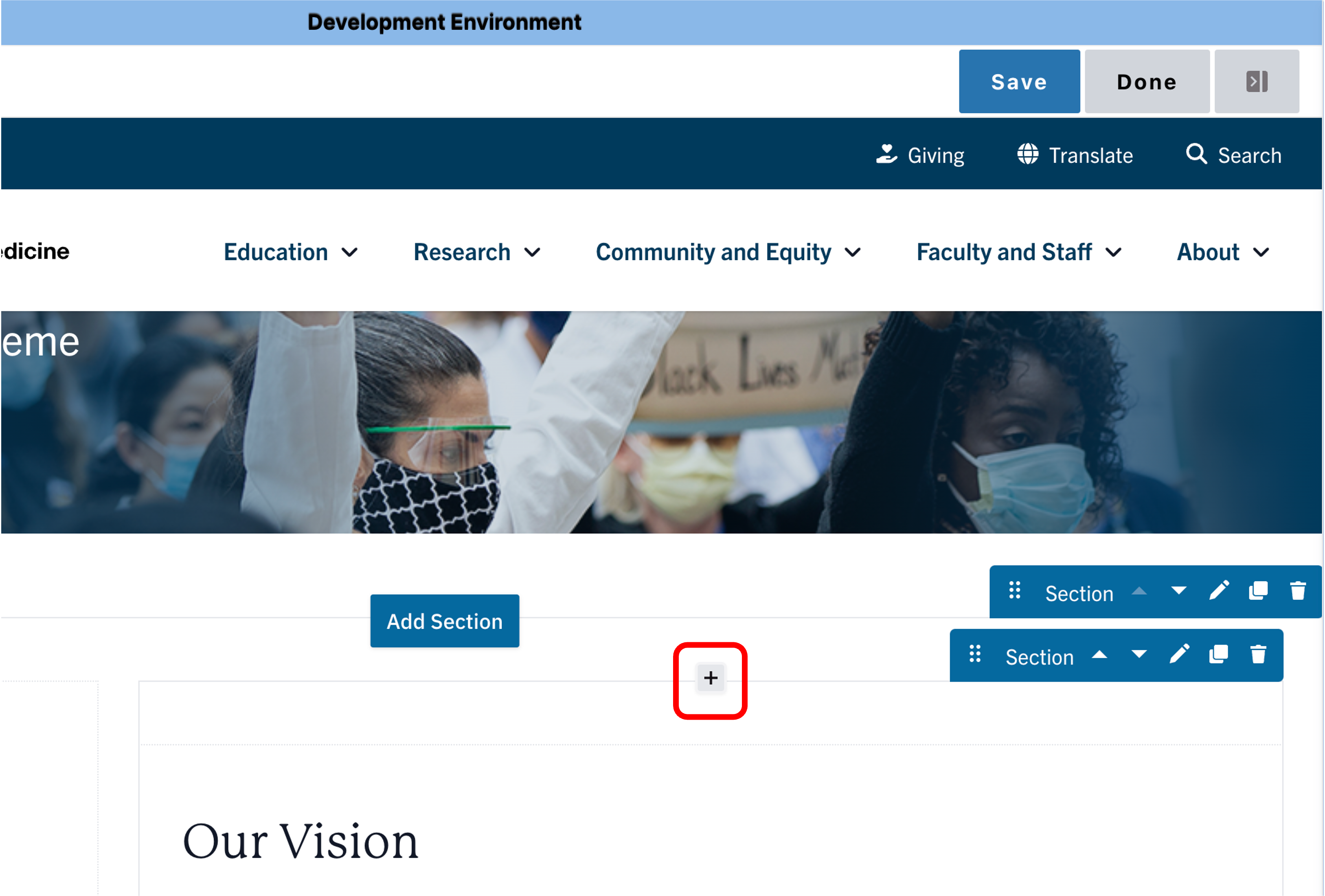
- Place your cursor where you want the cards.
- Click the plus icon
- Select Cards Grid if you want to place the section header above a CTA card or Icon Card grid.
- Select One Column to place the Section Header above all other components.
2. Add a Section Header
- Add a Title
- (Optional) Add a teaser for supporting context.
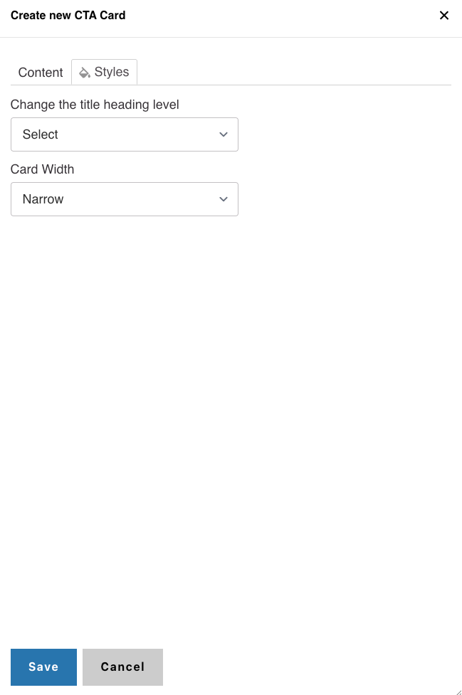
- In Styles, set the header level to H2 or H3
Alert
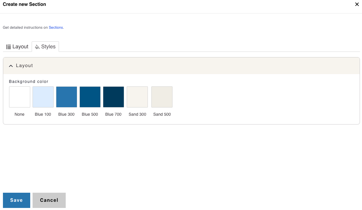
Background Colors
We recommend working with a Site Administrator to apply background colors to CTA Card Grids and standalone CTA Cards when you need them to stand out.
Note: Background colors can be applied only within One Column and Card Grid sections.
How to Apply a Background Highlight
- Open the Styles tab.
- Choose one of the approved background colors:
- None (default)
- Blue 100
- Blue 300
- Blue 500
- Blue 700
- Sand 300
- Sand 500