Callout
Creating Components


Callout Example
Callout LinkStep-by-Step Instructions
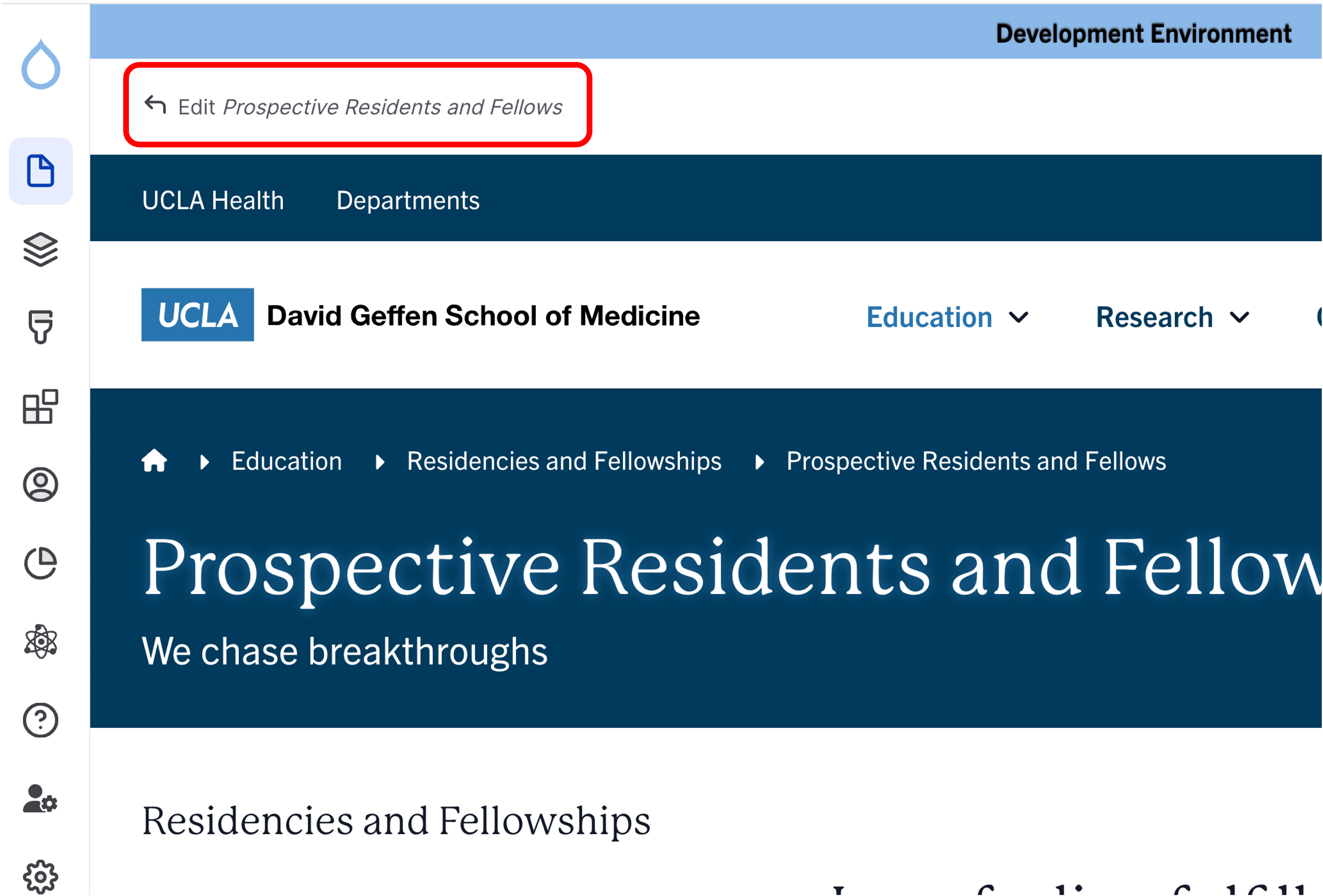
- Click the edit link at the top of the page
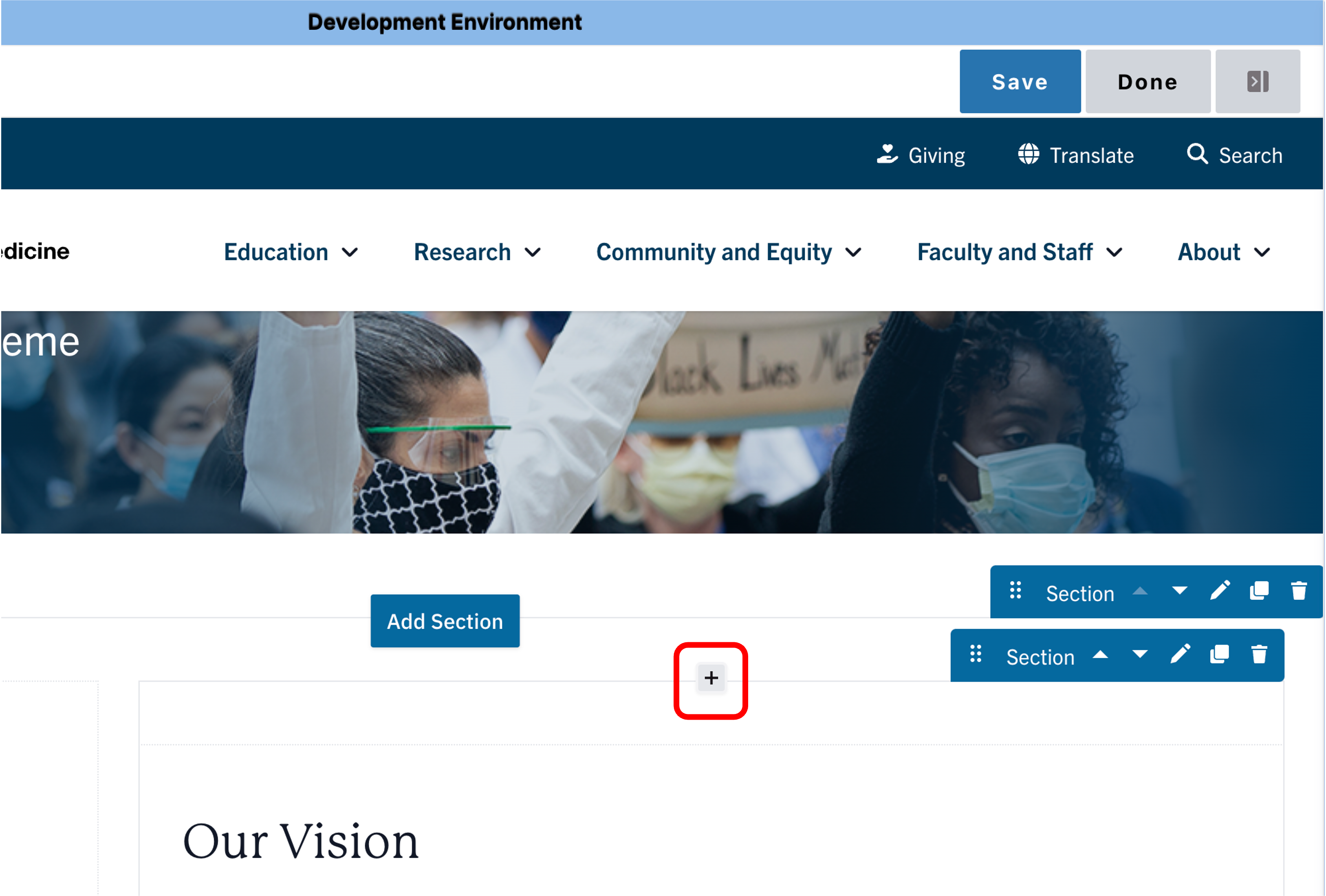
- Move your cursor where you want to place the component.
- Click the plus icon.
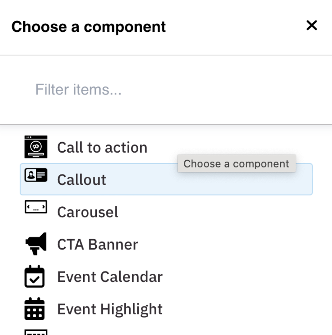
- Select Callout from the menu
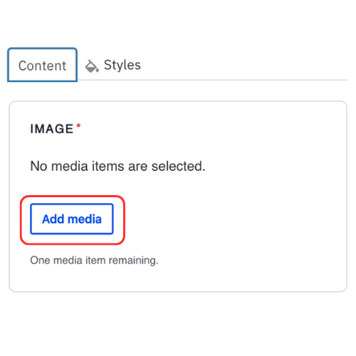
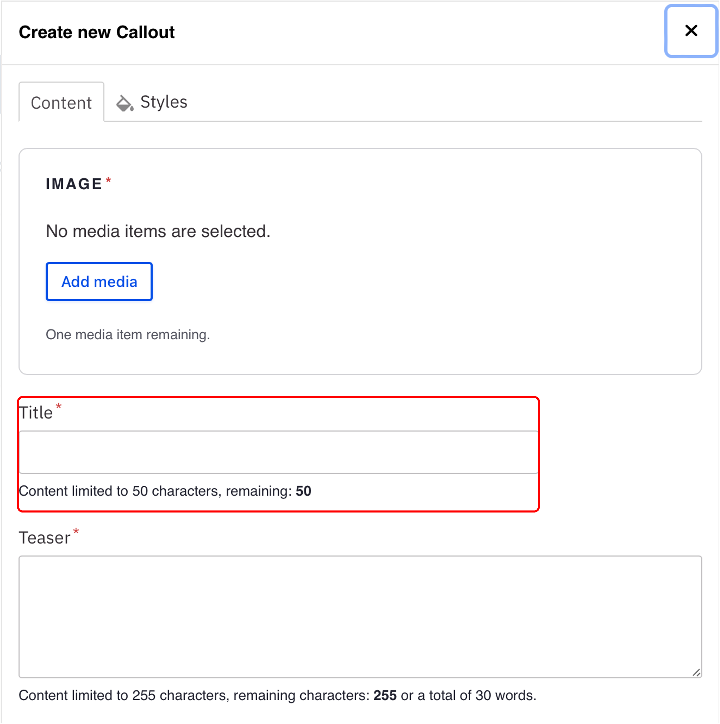
Content
- Click Add media. Select the appropriate image or upload the image to the Image Library. Recommended Image Dimensions: 3:2 - Maximum image size is 4MB.
- Add a Title.
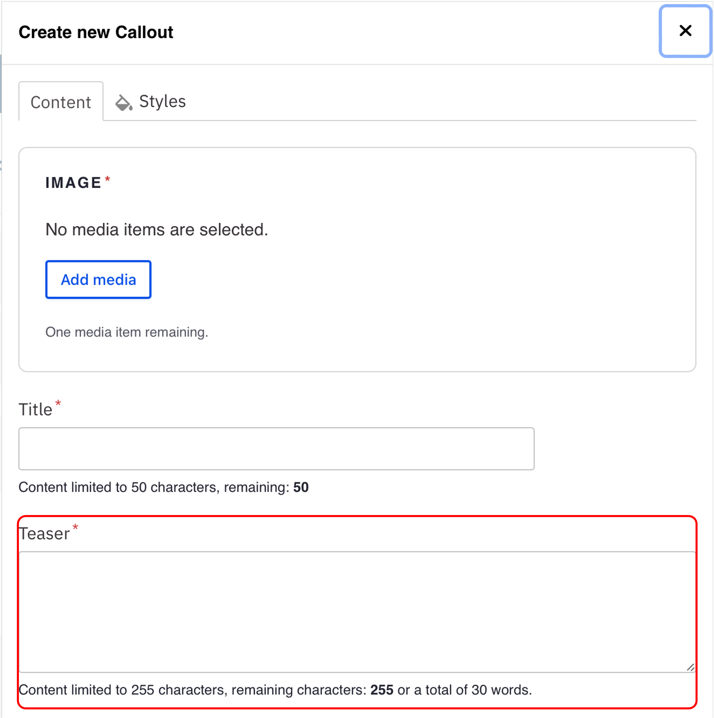
Note: Title field text is limited to 70 characters. - Add Teaser text.
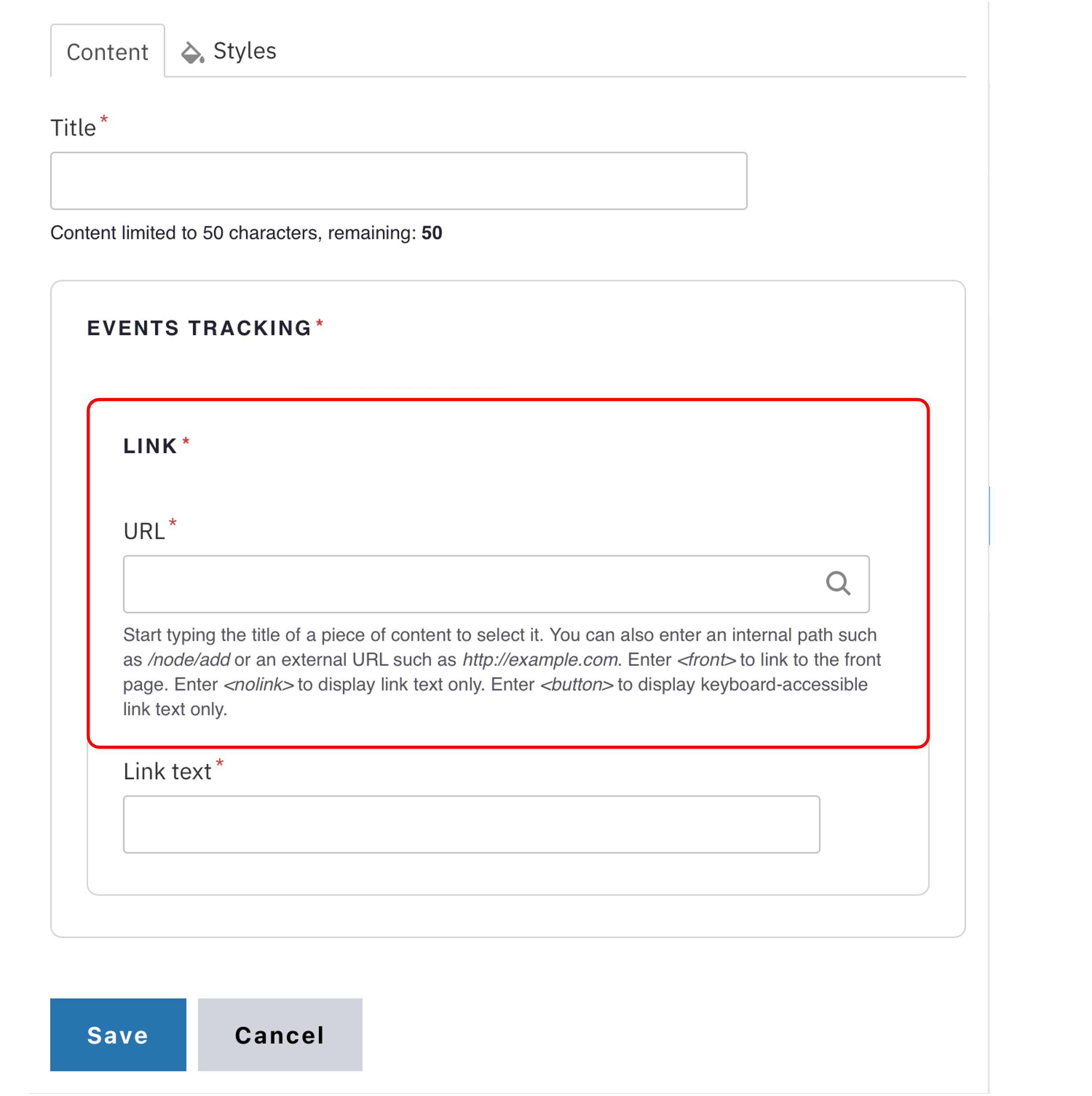
Note: Teaser text is limited to 300 characters - Add an internal page or external link.
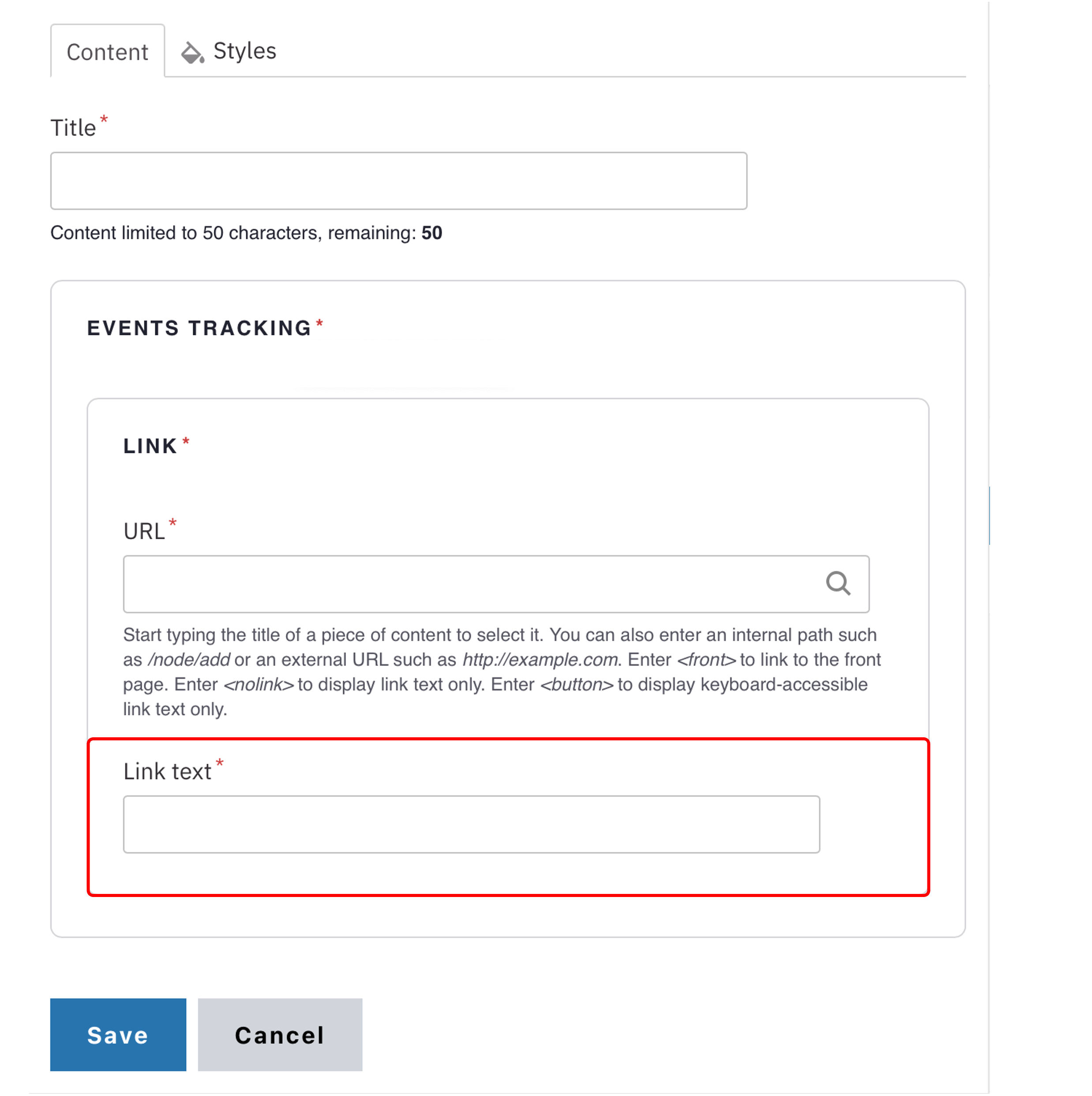
- Add the Button text.
Note: This is optional. Button text is limited to 45 characters.
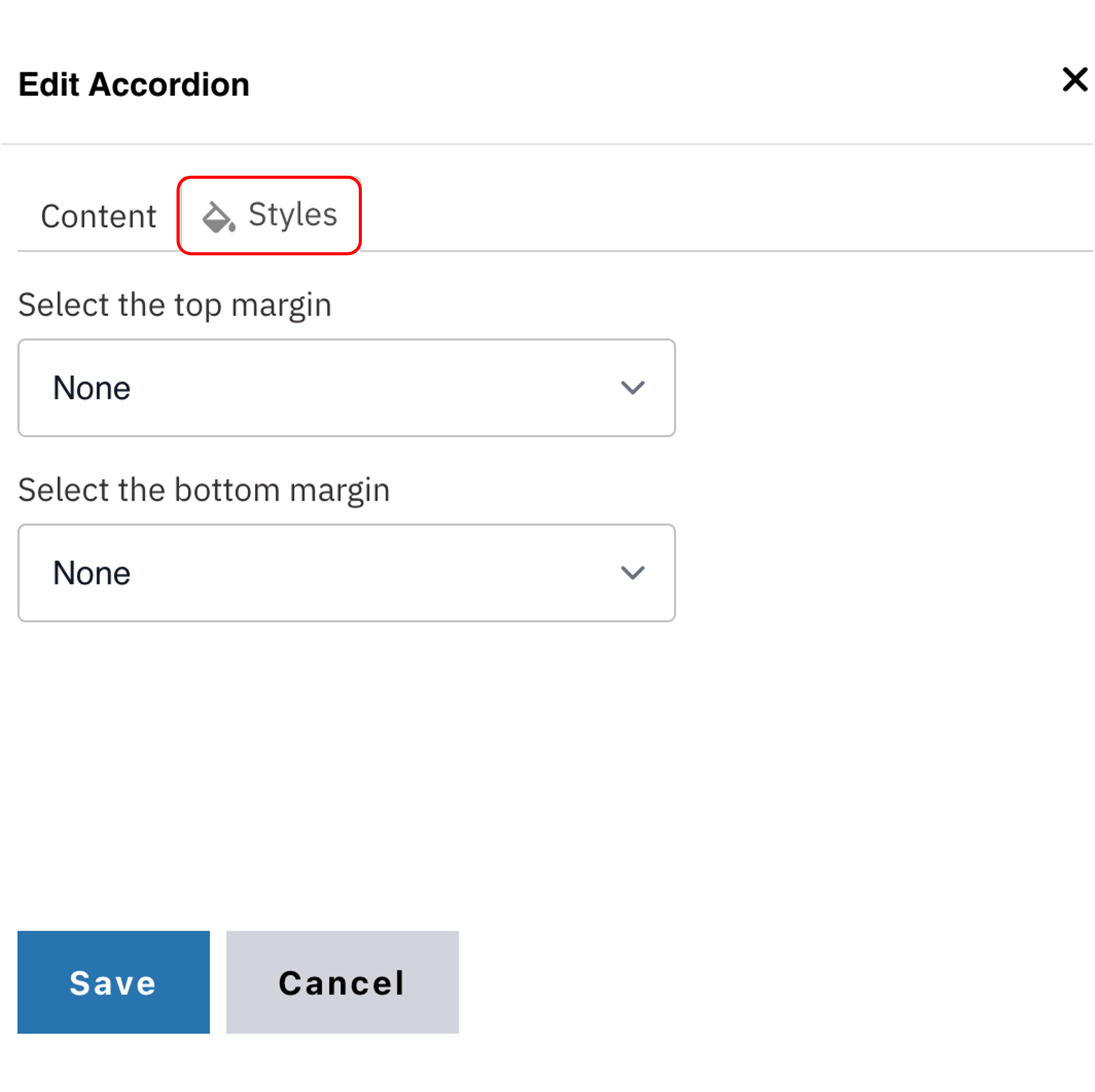
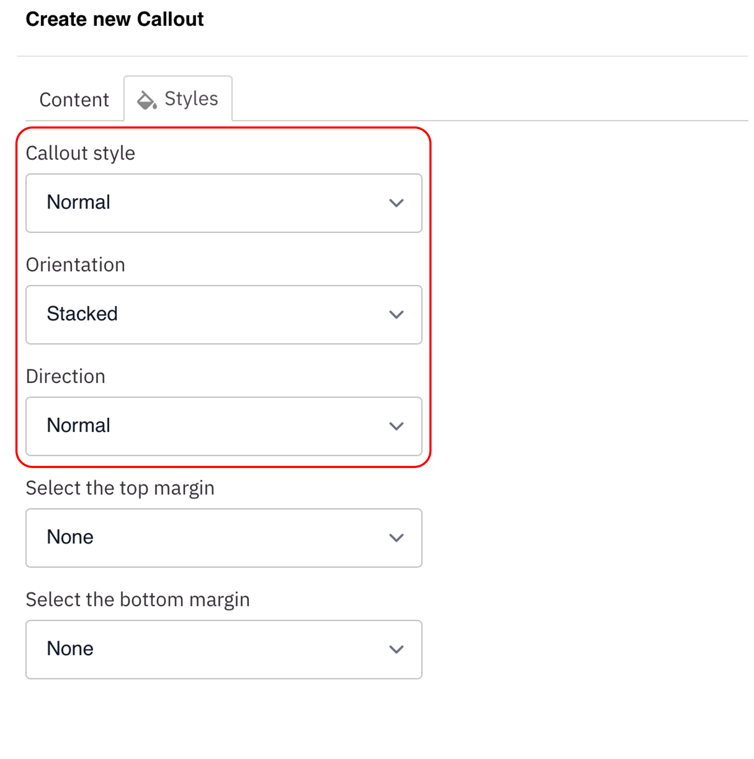
Styles
- Toggle to the Styles tab.
- Select the appropriate Layout Option based on your desired layout. (see below for examples).
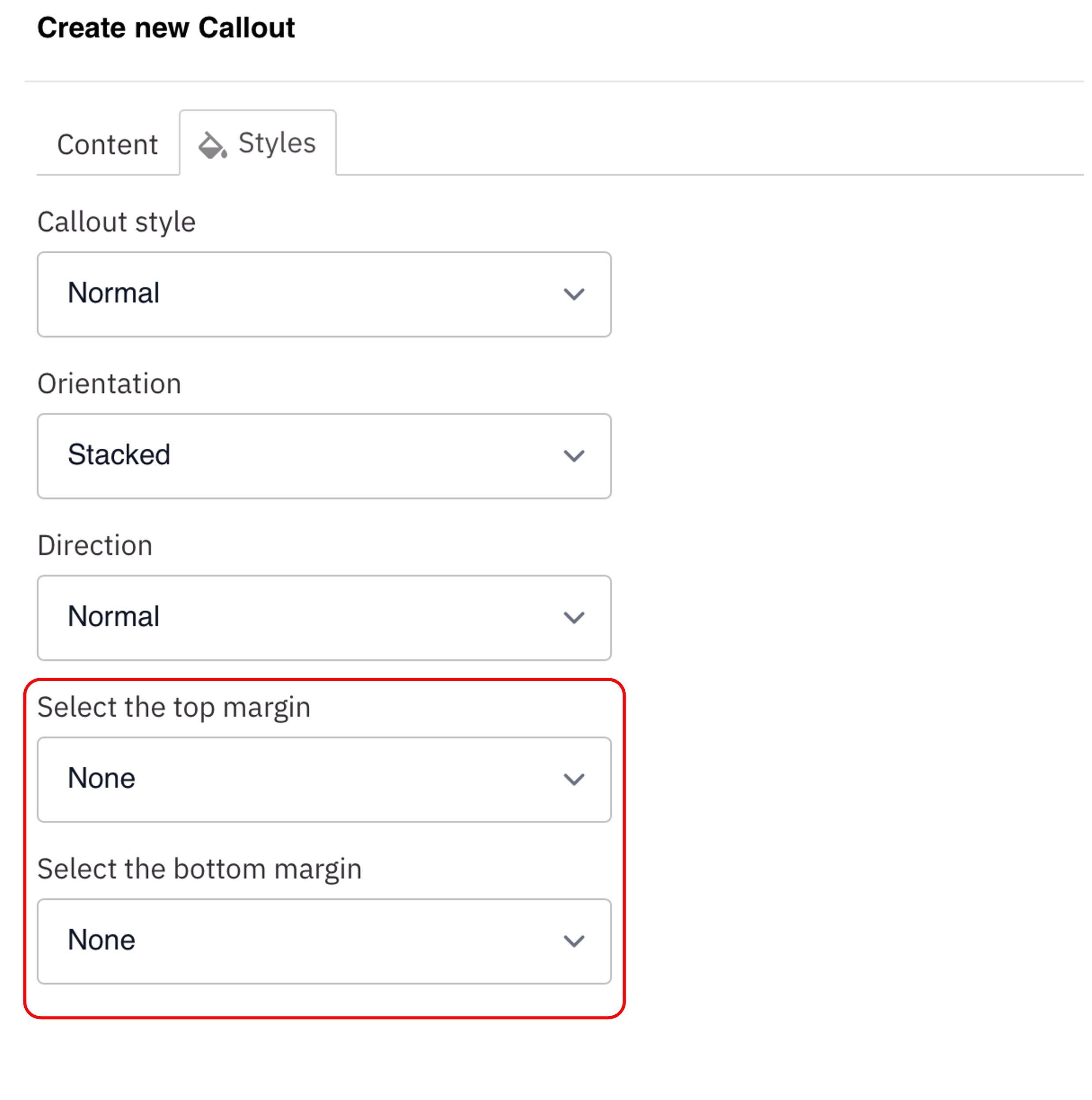
- Select the amount of additional space you would like above the component.
- Select the amount of additional space you would like below the component.
Note: By default, there is no space below a component.
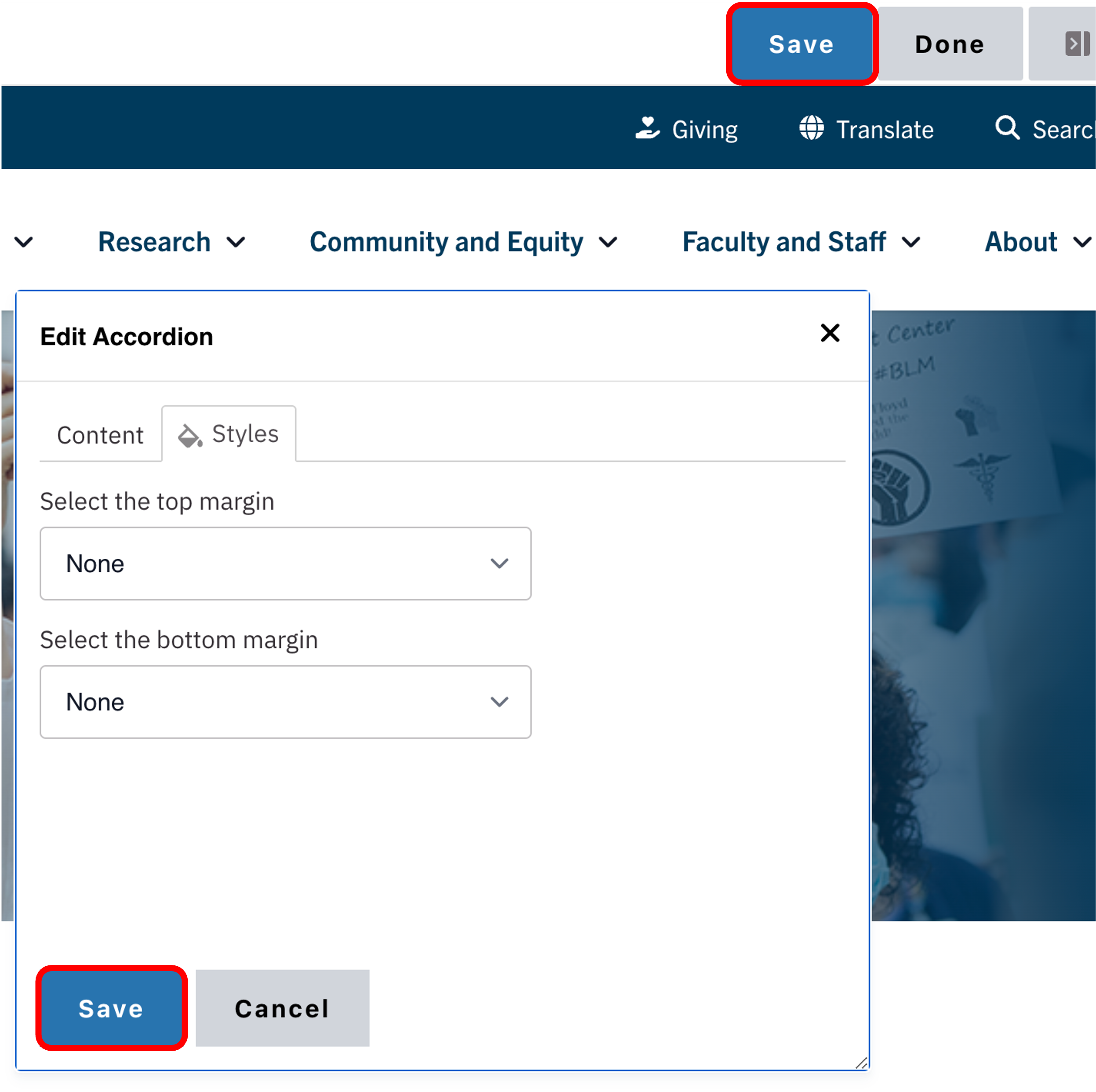
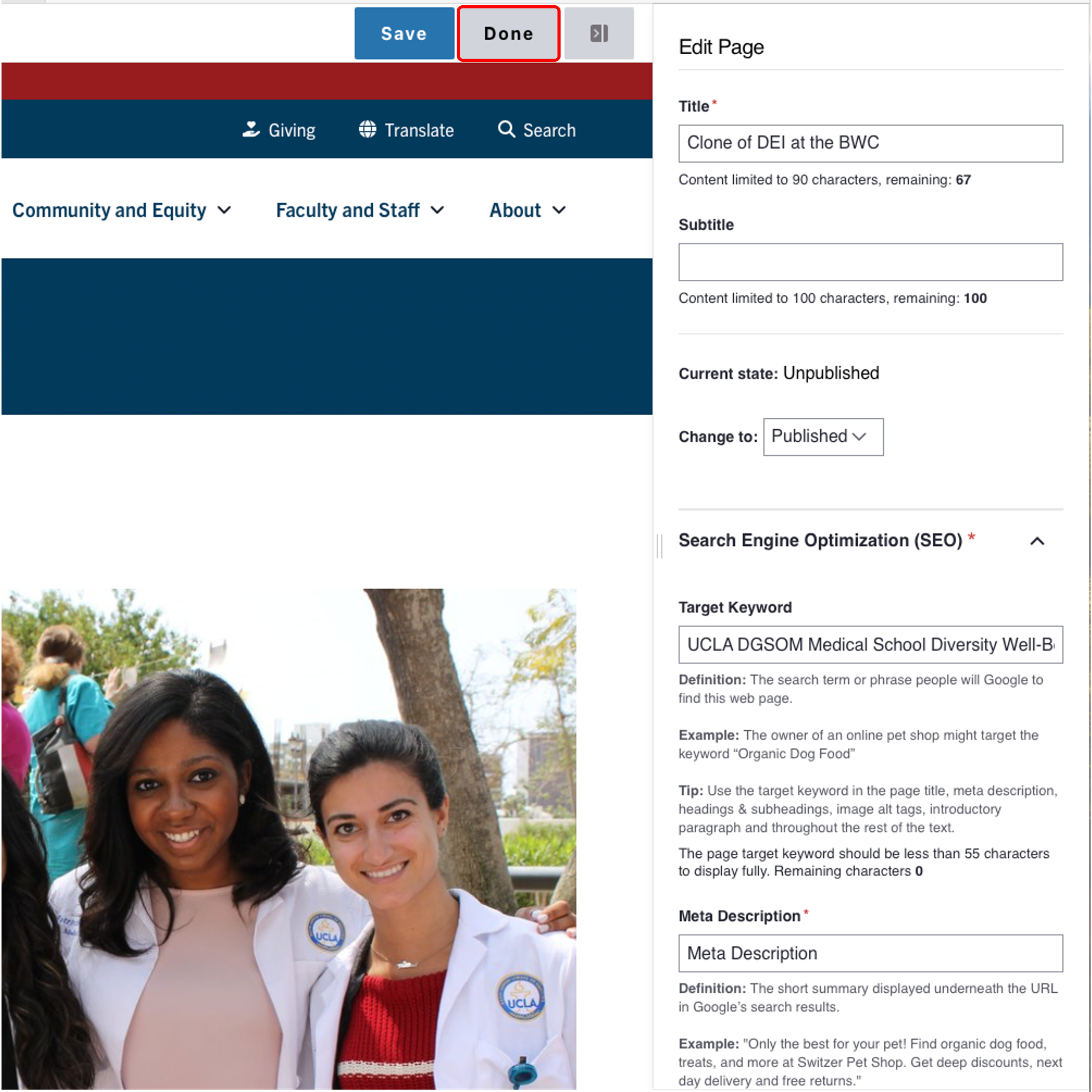
Save
- Click Save.
- Scroll to the top of the page and click Save.
- Click the Done button beside the save button.
Note: This will display the page in the closest representation of how site visitors will view it. All links and actions that are disabled in editing mode will be functional now.
Alert
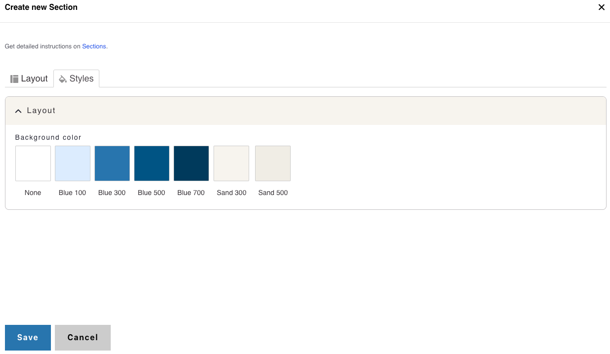
Background Colors
This setting is available only to site owners and should be used sparingly to draw attention to key information.
Note: This applies only to One Column Sections.
How to apply a background highlight:
- Open the Styles tab.
- Choose a background color to highlight your components:
- None (default)
- Blue 100
- Blue 300
- Blue 500
- Blue 700
- Sand 300
- Sand 500
Style options
Example of a Standard Callout Component
- Layout Options settings used to create this component are: Callout style: Normal, Orientation: Stacked and Direction: Normal
Custom Title
Callout Link- Layout Options settings used to create this component are: Callout style: Normal, Orientation: Horizontal and Direction: Normal
Custom Title
Callout LinkExample of Direction Normal Vs Reverse
Custom Title
Callout Link
Custom Title
Callout Link