Article Highlight
Creating Components

Adding an article highlight
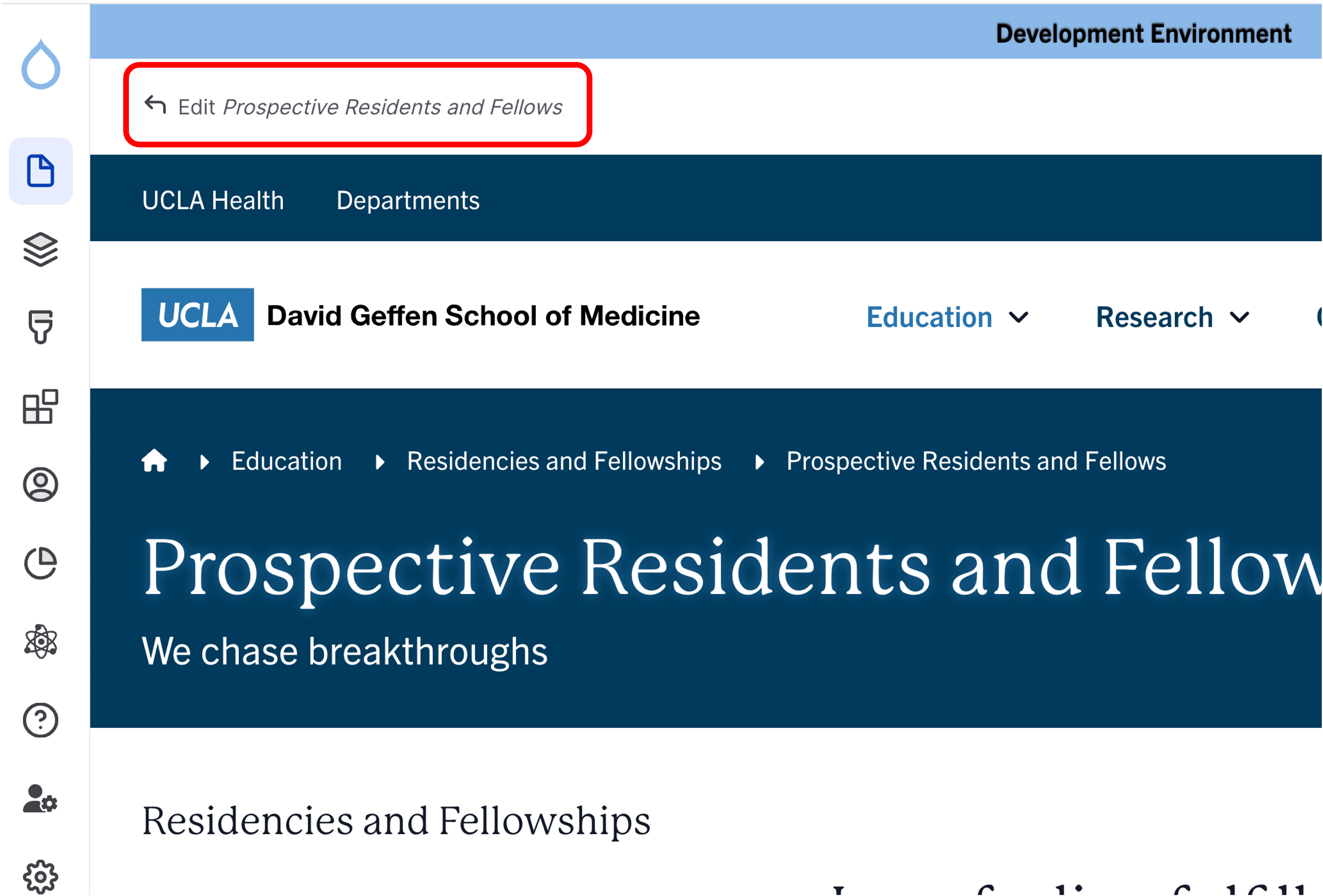
- Click the edit link at the top of the page
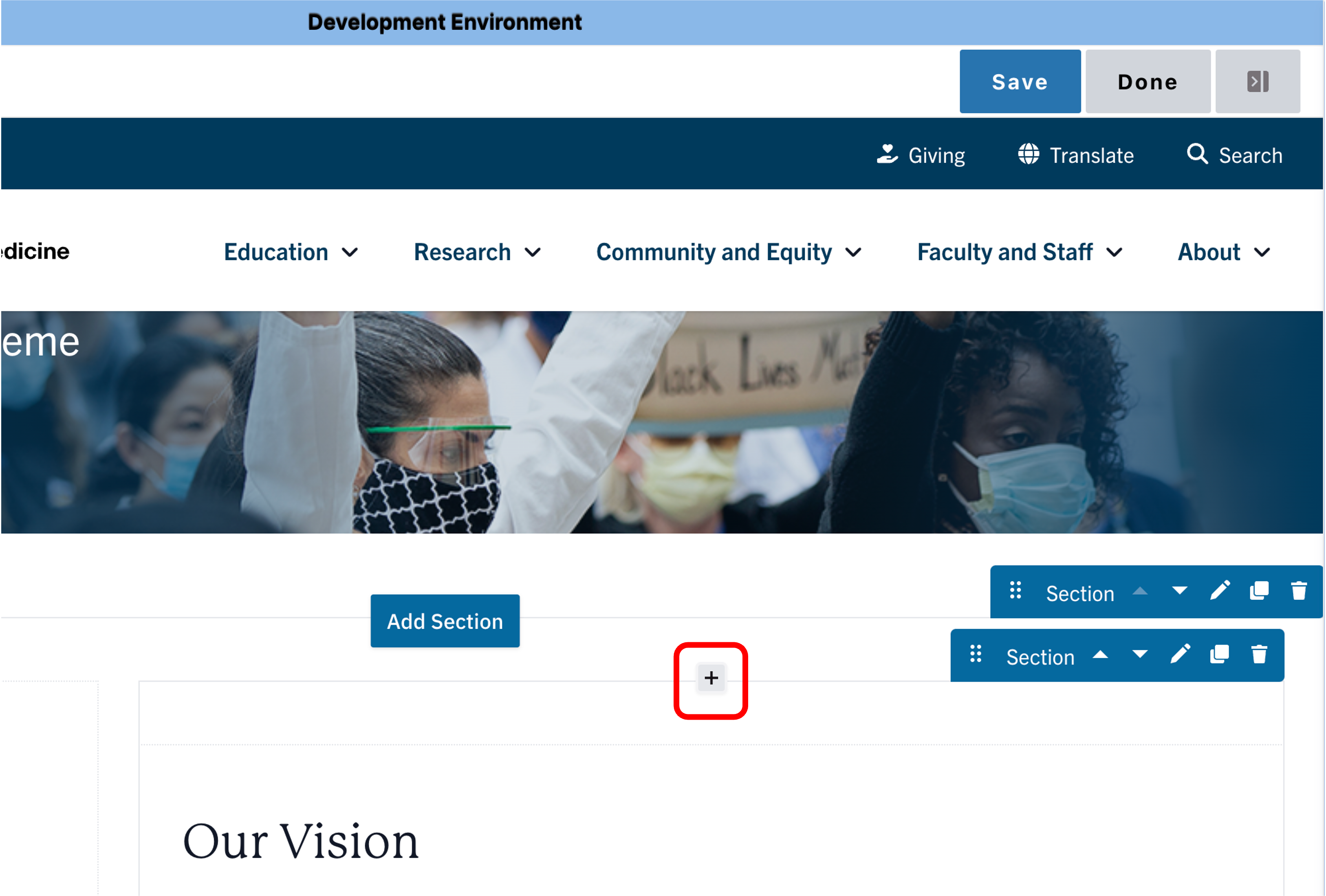
- Move your cursor where you want to place the component.
- Click the plus icon.
- Select Article Highlight from the menu.

Content
- Add a custom Title for your Article Highlight.
Note: Title field text is limited to 70 characters. - Optional: Feature an article at the top of the list. In the Featured article field, start typing the title. Select the title you want to feature.
- Optional: Filter the articles displayed in the view. In the Filter articles by field, start by typing an article type, category, topic, or tag. Select the term.
- Optional: Add a link to all articles. To find a list of all the articles, enter your website and add /articles/search at the end of the path (e.g. medschool.ucla.edu/articles/search).
- Filter the articles by categories and/ or topics.
- Copy and paste the filtered search URL into the URL field.
- Add Link Text for the URL.
Note: Link text is limited to 45 characters.


Save
- Click Save.
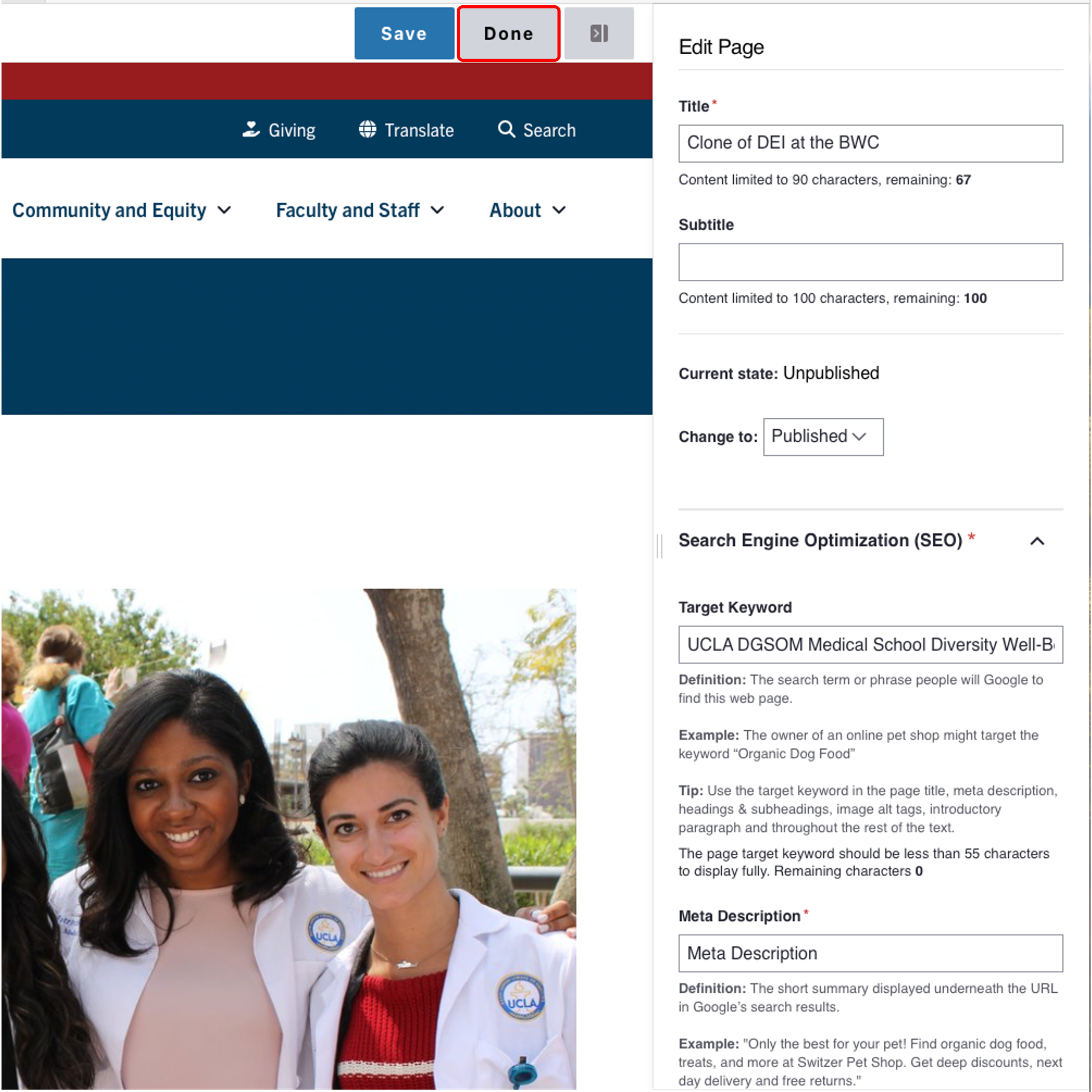
- Scroll to the top of the page and click Save.
- Click the Done button beside the save button.
Note: This will display the page in the closest representation of how site visitors will view it. All links and actions that are disabled in editing mode will be functional now
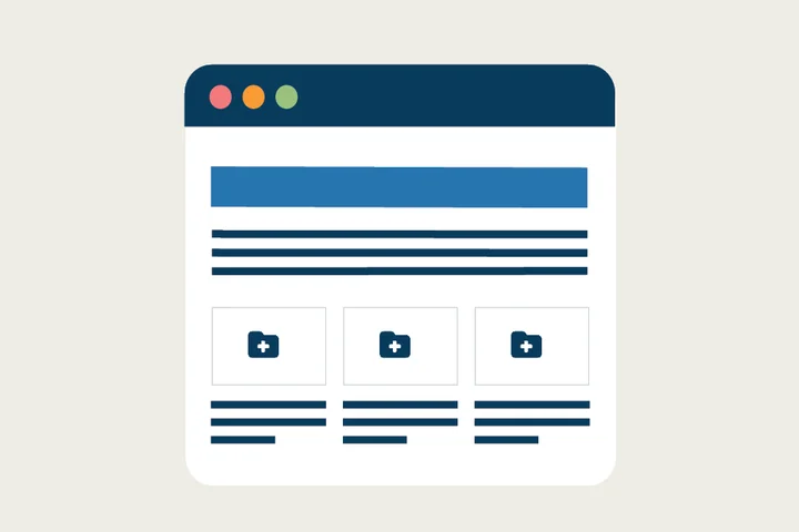
One-Column Article Example
Views for Articles and Events
Users now have more visually appealing options than were previously available.