Icon
Creating Components
What is an Icon?
The Icon allows you to have an icon image with or without text and with or without a URL. This is a great way to attract your readers' attention.
How to add an Icon
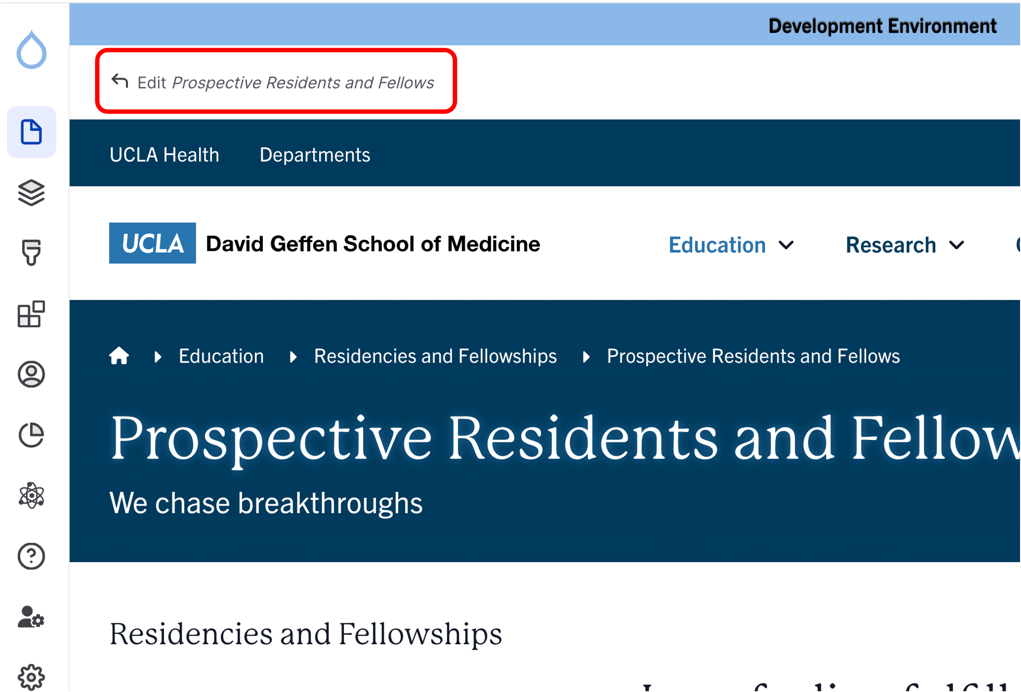
- Click the edit link at the top of the page
- If you are in a One Column Section, you are able to configure the column to display vertically or horizontally. To learn more about how to configure this option, please refer to steps to Add a Section at the top of this page.
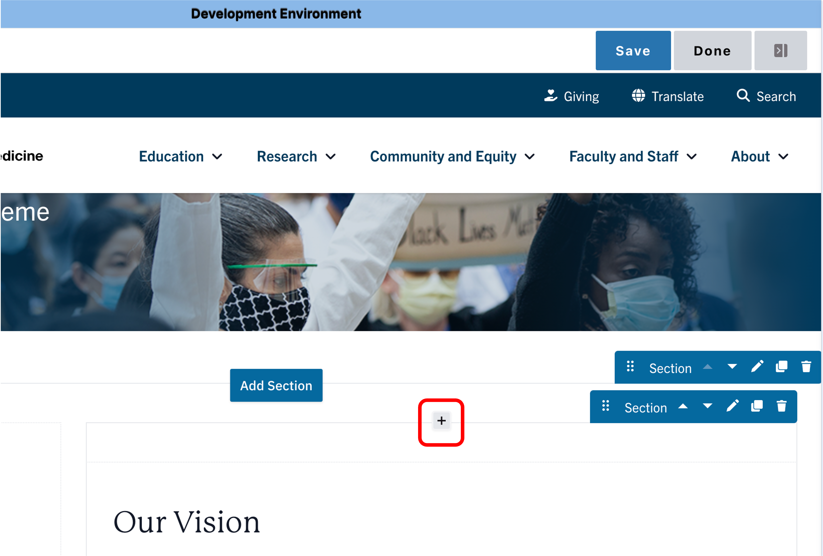
- Move your cursor where you want to place the component. (Add a section if needed).
- Click the plus icon.
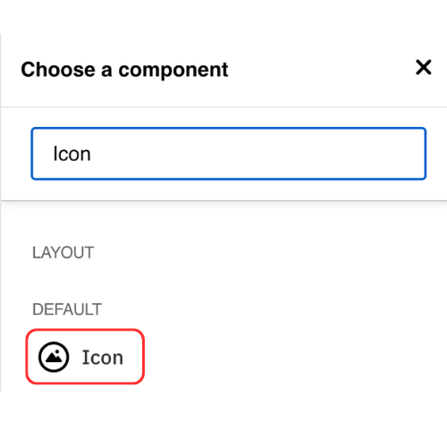
- Select Icon from the menu
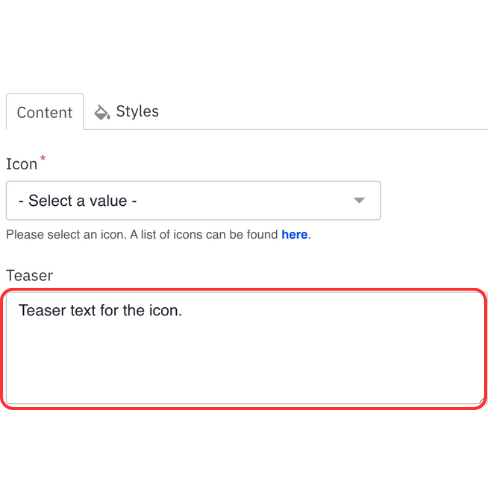
Content
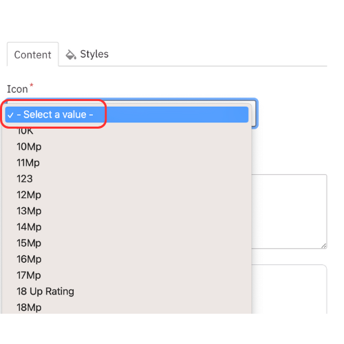
- Select an icon. See examples of each icon type.
- Add Teaser text (optional).
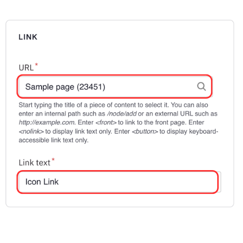
Note: Teaser text is limited to 300 characters - Add an internal page or external link (optional).
Note: Link text is limited to 45 characters.
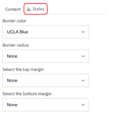
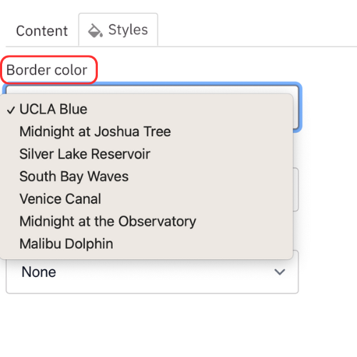
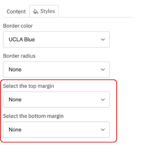
Styles
- Toggle to the Styles tab.
- Select the appropriate layout options based on your desired layout. (see below for examples).
- Select the desired Border color.
- Select the desired Border radius.
- Select the amount of additional space you would like above the component.
- Select the amount of additional space you would like below the component.
Note: By default, there is no space below a component.
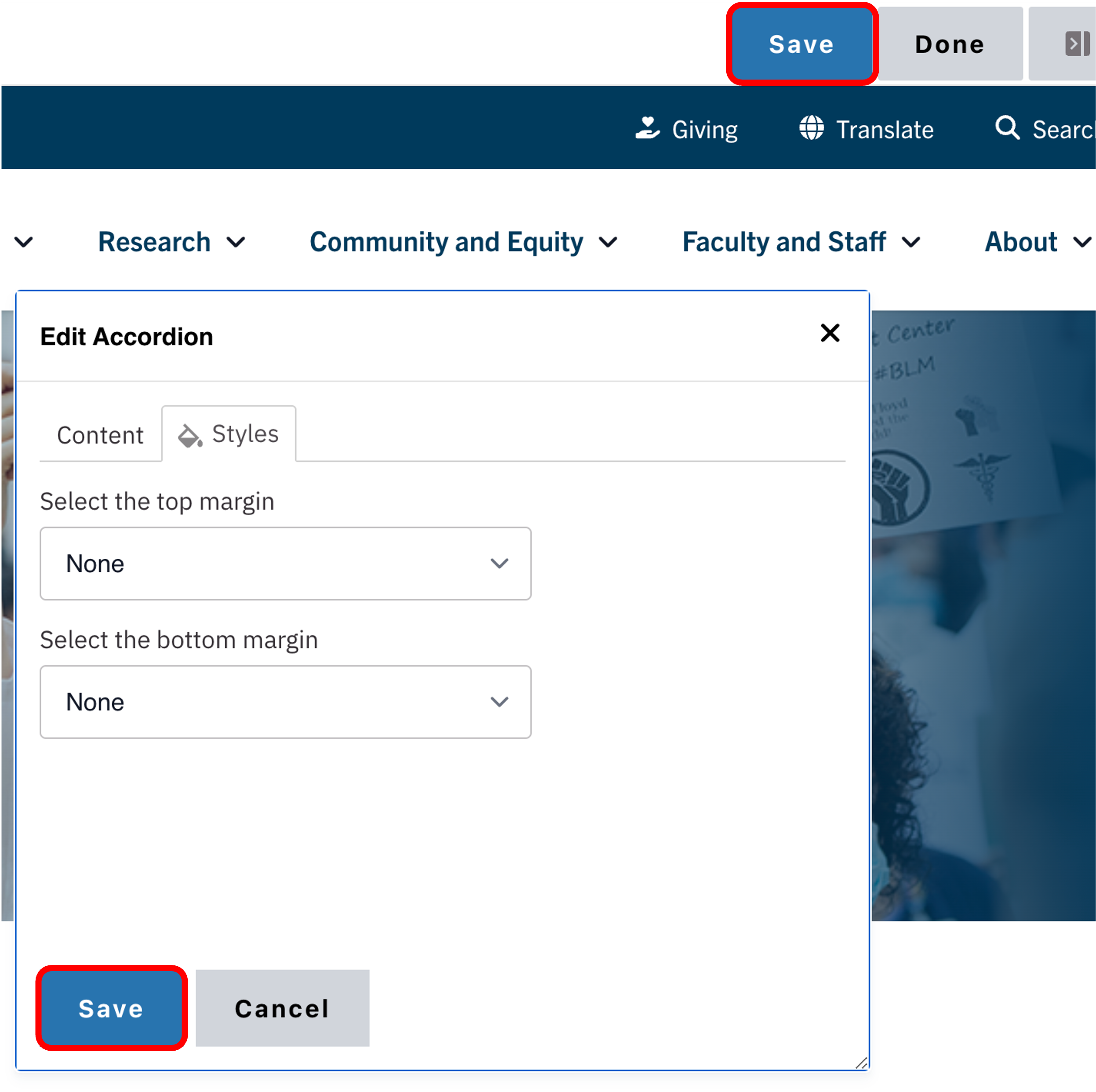
Save
- Click Save.
- Scroll to the top of the page and click Save.
- Click the Done button beside the save button.
Note: This will display the page in the closest representation of how site visitors will view it. All links and actions that are disabled in editing mode will be functional now.