Icon Link
Components
What is an Icon Link?
The Icon Link is a visually appealing component for displaying multiple links in three or four columns to allow for greater flexibility and to guide users through clear navigation choices across a website. They are intended for use with multiple links.

Example of Icon Links
Step-by-Step Instructions
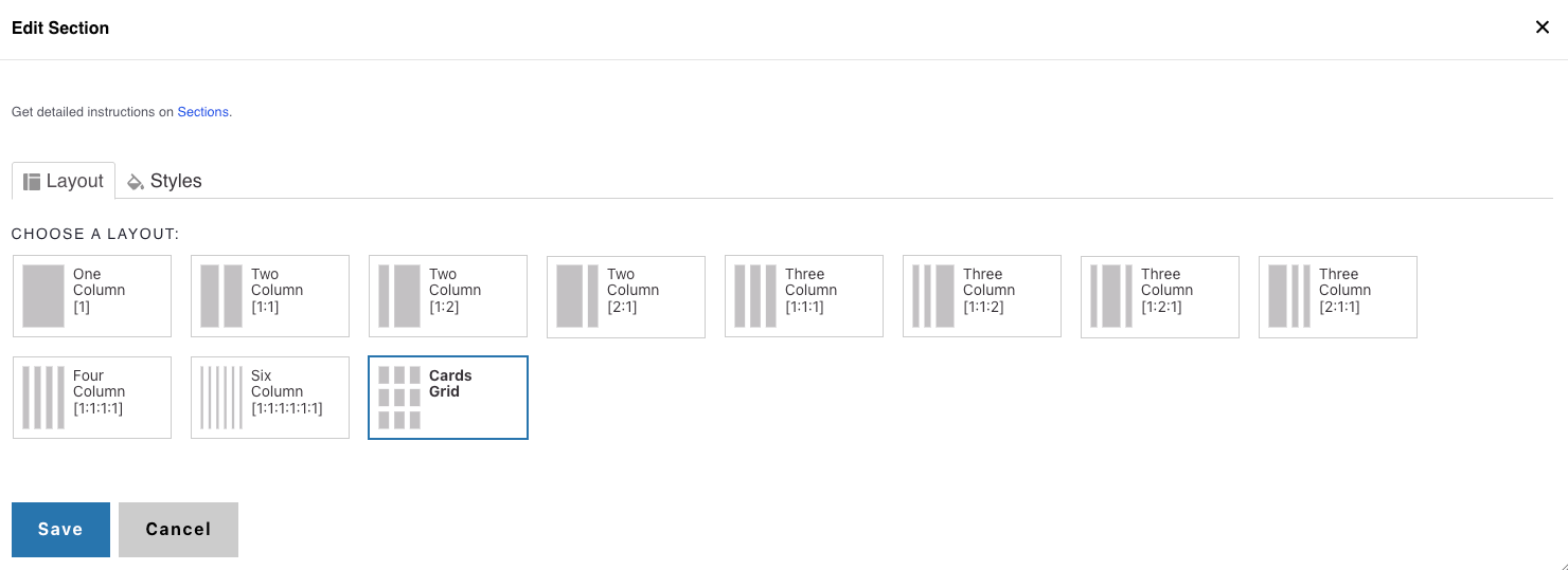
1. Add a Cards Grid Section
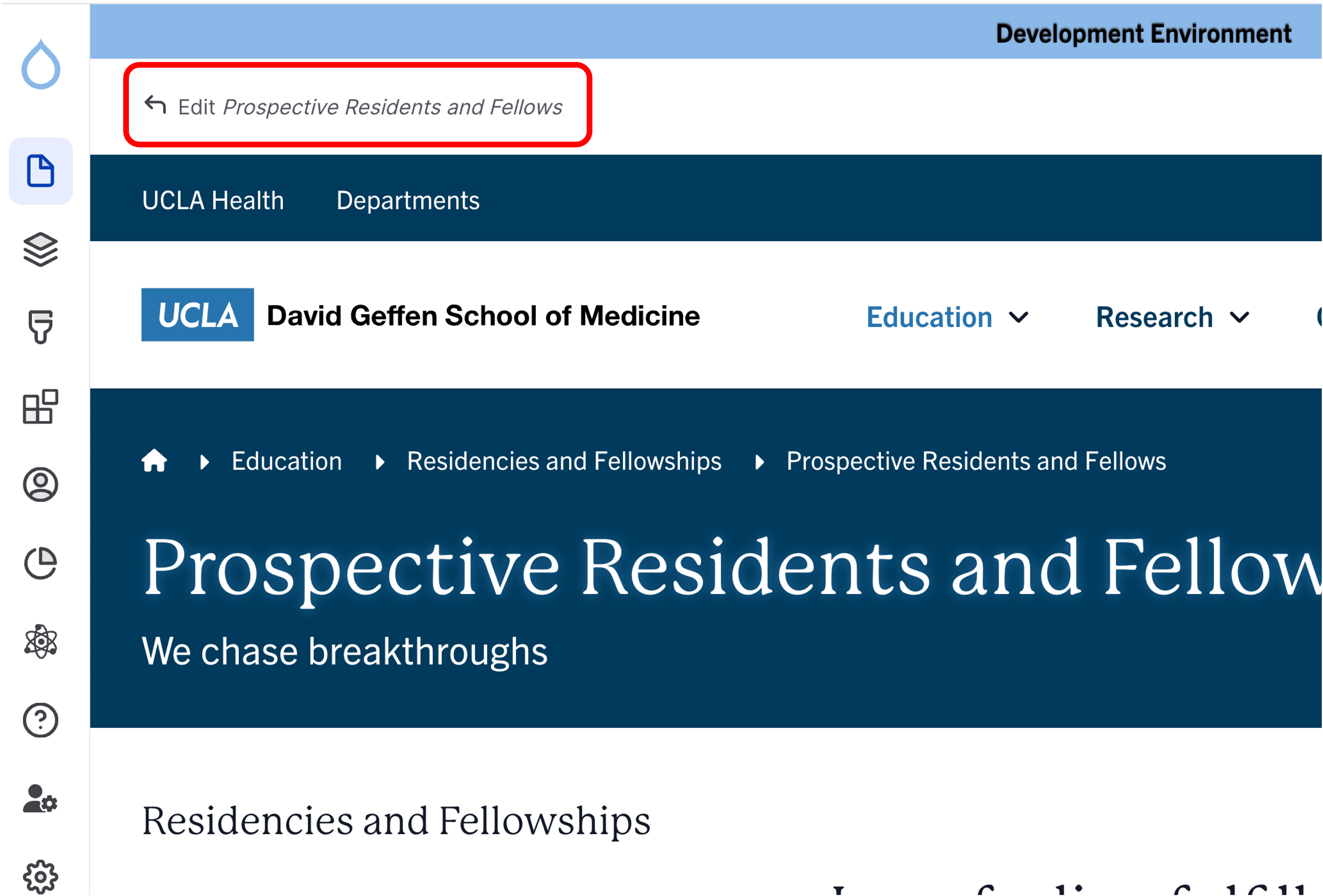
- Click the Edit link at the top of the page.
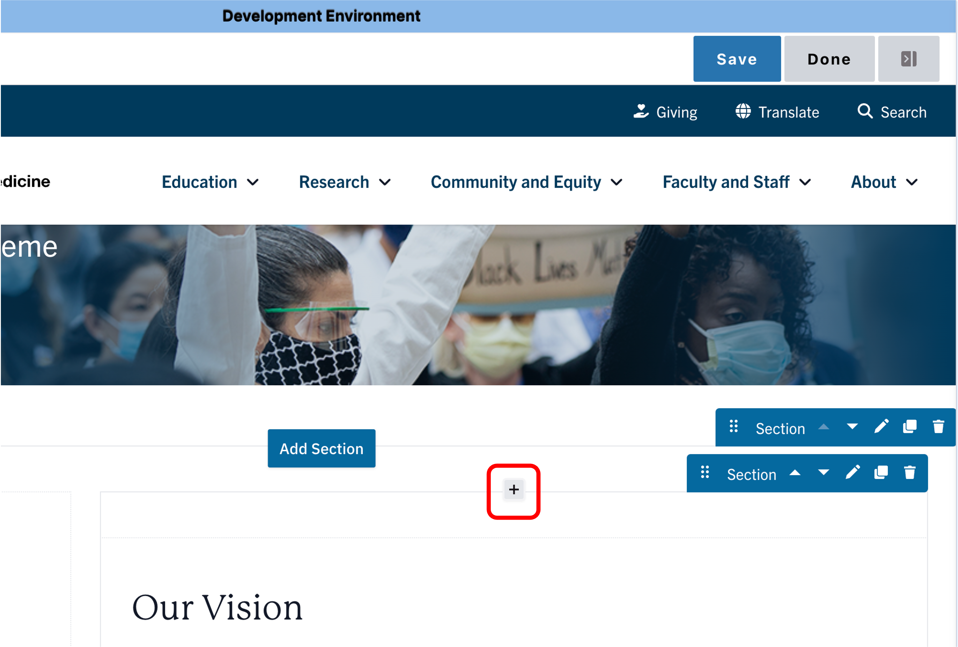
- Place your cursor in the section where you want the cards.
- Click the plus icon → Select Cards Grid.
2. Add a Section Header (Optional)
- (Optional) Add a Section Header above your cards.
- (Optional) Add a teaser that provides supporting context.
- In Styles, set the header level to H3 if needed.


3. Add Icon Links
- Select Icon Link from the list of components which can be found under the Call to Action group
- Select an icon of your choice from the Icon picker widget
- Add desired link text and URL
- Note: Title text is limited to 70 characters
- Click Save

4. Styles
- Click the Styles tab then click the Layout to expand the section
- The layout field set expands showing options for Grid Columns
- The default state of columns is three columns (recommended for link sets of 3, 6, 9, 12, 15, 18, and 21)
- If desired, you can change the Grid columns to four columns (recommended for link sets of 4, 8, 10, 14, 18, 22)
Alert
Background Colors
We recommend working with a Site Administrator to apply background colors to Card Grids and standalone Icon links when you need them to stand out.
Note: Background colors can be applied only within One Column and Card Grid sections.
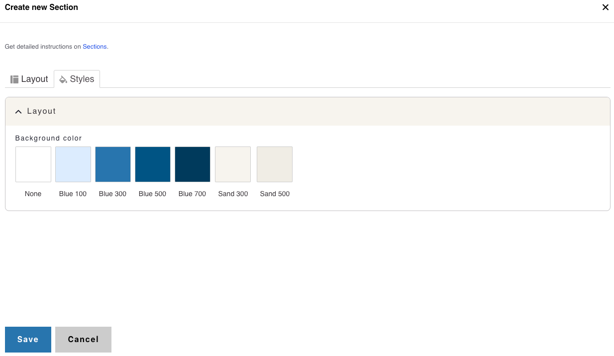
How to Apply a Background Highlight
- Open the Styles tab.
- Choose one of the approved background colors:
- None (default)
- Blue 100
- Blue 300
- Blue 500
- Blue 700
- Sand 300
- Sand 500