Retiring the Tabs Component
Replacing Tabs with the Accordion Component

This article addresses the following topics:
Overview of the Changes
To streamline our component library, we are retiring the tabs component. We will replace all existing tabs components with accordion components.
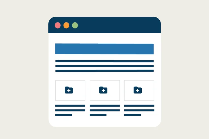
Example of a Tabs Component:

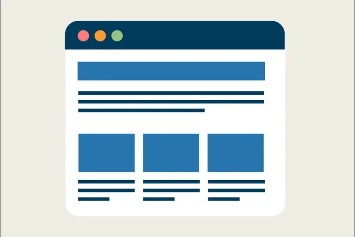
Example of the Accordion component replacement

Why We Are Making This Change
1. Simplifying Component Library
To simplify the user experience for web editors, we are reducing redundancies in our component library. Despite their visual differences, tabs and accordions serve very similar functional purposes: they both organize content into discrete sections, allowing users to view one or more segments without overwhelming the interface.
2. Better Mobile Experience
Tabs often work well on desktops but can become cramped or difficult to use on small screens. The limited horizontal space may cause tabs to wrap awkwardly or require scrolling, which hampers usability. Accordions naturally fit vertical scrolling on mobile devices, making it easier for users to navigate content without horizontal scrolling.
2. Enhanced Accessibility
Accordions provide clearer navigation for screen readers and keyboard users. They also offer clear focus states and keyboard control patterns that can improve user experience for people with disabilities.
3. Improved Content Visibility
Tabs hide all content except for the active tab panel, which can sometimes lead users to miss important information. Accordions display multiple panels stacked vertically, increasing the chances of users noticing more content at once without switching views. Accordions also reduce the cognitive load by allowing users to see multiple sections open simultaneously, making comparison easier and reducing the need to memorize tab content before switching.
Implementation Timeline
The update will take effect on October 21, 2025.
Additional Resources
Co-Working Sessions: Register for the next Co-working Session for answers to your questions about this update.