Curated Content
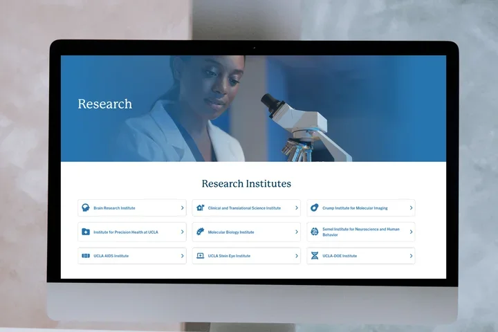
Discover how the new Curated Content component enhances website navigation and content visibility for editors.

This article addresses the following topics:
- Overview
- What is Curated Content
- Implementation Timeline
- Adding the Curated Content Component
- Additional Resources
Overview
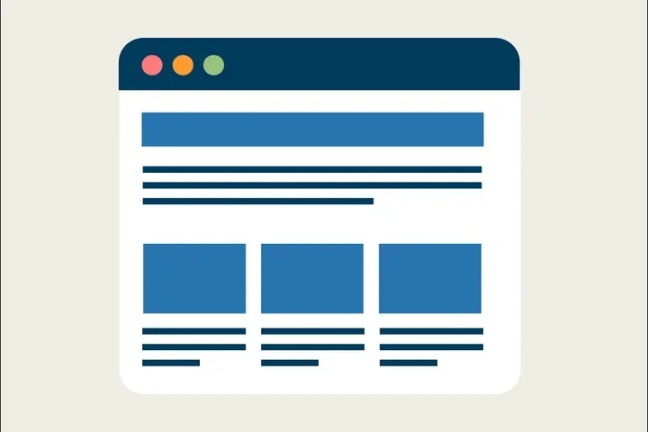
The new Curated Content component allows editors to visually display selected content in a card format, creating an attractive way to link to important pages, articles, and events. Editors can feature a mix of content types within the component. For articles and events, the site will display the associated image. For pages, the social media image is used; if no image is added to the social media option, a UCLA Bruin Bear will appear. This component makes it easy for editors to highlight key content, build landing pages, and showcase related information.
What is Curated Content
The Curated Content component enables you to display a card featuring pages, articles, or events on your website, providing a simple way to highlight related content and improve site navigation.
Implementation Timeline
This feature will be available starting October 28, 2024.
Adding the Curated Content Component
Click the edit link at the top of the page
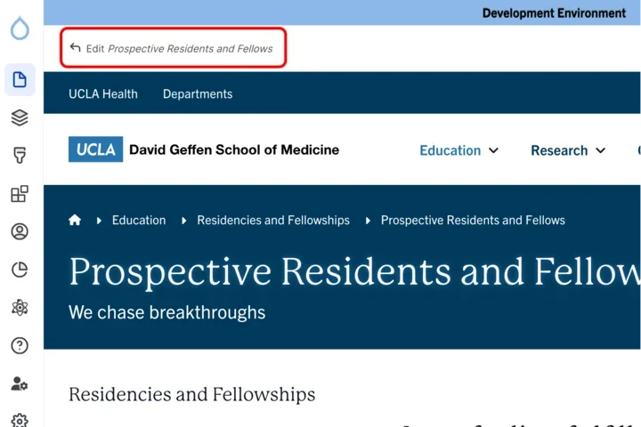
Clicking the edit link at the top of the page - Move your cursor where you want to place the component. (Add a section if needed).
Click the plus icon.
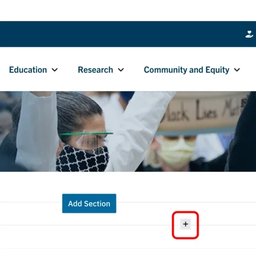
Clicking the plus icon to add a section within a section Select Curated Content from the menu.
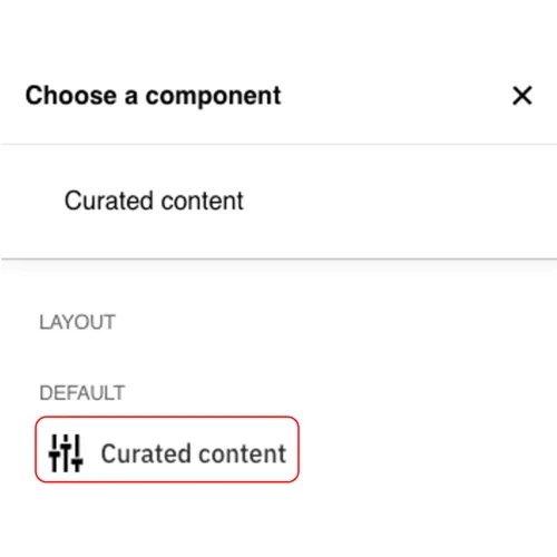
Selecting curated content from menu
Content
Add a Title.
Note: Title field text is limited to 70 characters.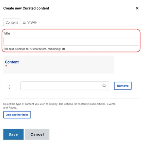
Curated content text field Start typing the name of the page, article or event you would like to add in the Content field.
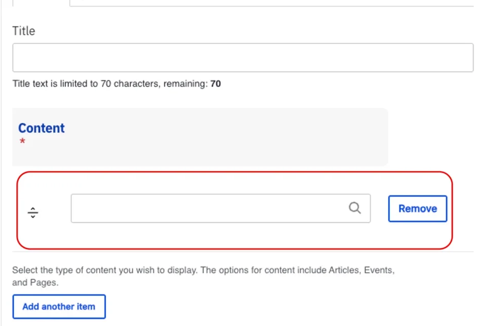
Curated content named field Click the Add another item to add more cards.
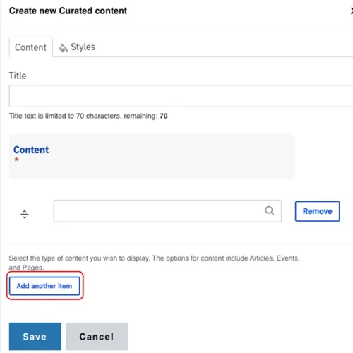
Selecting "Add Another Item" for curated content - Repeat steps 2 to 3 for each item.
Styles
Toggle to the Styles tab.
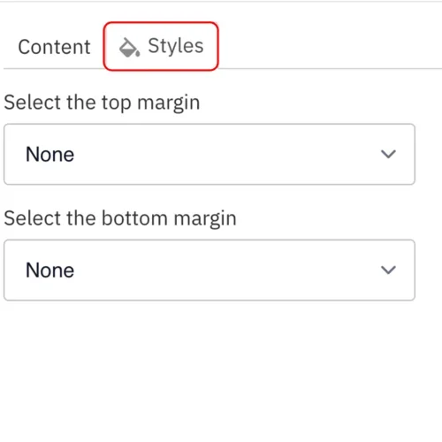
Selecting styles option - Select the amount of additional space you would like above the component.
Select the amount of additional space you would like below the component.
Note: By default, there is no space below a component.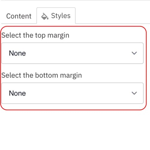
Top and bottom margin drop down
Save
- Click Save.
Scroll to the top of the page and click Save.
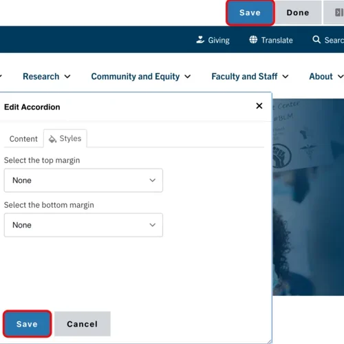
Scrolling to the top of the page and clicking save Click the Done button beside the save button.
Note: This will display the page in the closest representation of how site visitors will view it. All links and actions that are disabled in editing mode will be functional now.
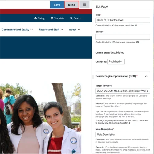
Clicking the Done button beside the save button
Additional Resources
Co-working Sessions
Register for the next Co-working Session for answers to your questions about this update.